Statistical analysis is an important tool in food science. It can uncover patterns and relationships in food and nutrition data, leading to advances in food manufacturing, nutrition counseling, food safety and new product development. Wolfram Language offers built-in functions for all standard statistical distributions. Here, we’ll use some of these functions to evaluate relationships between nutrients and visualize the data distributions with informative plots and histograms.
Interpreter for Food Entities
Interpreter for Food Entities
Use Interpreter to gather and group the entities for the foods you want to explore. The “yellow box” entities contain the nutritional data for each food type:
In[]:=
Interpreter["Food"][{"strawberry","blueberry","blackberry","raspberry","cranberry","elderberry","black currant","red currant","loganberry","gooseberry","boysenberry","cloudberry","huckleberry","mulberry","salmonberry","Ohelo berry"}]
Out[]=
,,,,,,,,,,,,,,,


In[]:=
LengthEntityValue,"Entities"
Out[]=
259
In[]:=
RandomEntity,5
Out[]=
,,,,
In[]:=
berries=,,,,,,,,,,,,,,,;
In[]:=
Interpreter["Food"][{"lemon","orange","lime","mandarin orange","navel orange","kumquat","tangerine","clementine","grapefruit"}]
In[]:=
citrus=,,,,,,,,;
In[]:=
Interpreter["Food"][{"spinach","kale","greens","lettuce","arugula","Swiss chard","kohlrabi","romaine lettuce","collard greens","mustard greens","watercress","cabbage","endive","sorrel","escarole","broccoli raab"}]
In[]:=
greens=,,,,,,,,,,,,,,,;
In[]:=
Interpreter["Food"][{"bacon","beef","chicken","chorizo","duck","ham","mutton","sausage","steak","turkey","goat","frankfurter","bison","prosciutto","pastrami","bratwurst"}]
In[]:=
meats=,,,,,,,,,,,,,,,;
In[]:=
Interpreter["Food"][{"anchovy","salmon","mackerel","pollock","catfish","halibut","seatrout"}]
In[]:=
fish=,,,,,,;
T-Tests for Zinc and Folate
T-Tests for Zinc and Folate
A t-test is a statistical tool used to answer the question “Is the difference in the averages (means) of two groups statistically significant, or are the means different due to random chance?” Let’s use the TTest function to determine if the zinc and folate in berries are significantly different from the zinc and folate in green vegetables.
Berries and green vegetables are not significant sources of zinc, but we can use statistics to evaluate and compare trace amounts of this vital nutrient. Start with the null hypothesis that there’s no meaningful difference between berries and green vegetables in terms of their zinc content. Next, obtain the zinc amounts for each of the food types in both groups. The t-test does not require the sample lengths to be equal. Get only the values, not the units, using the QuantityMagniture function:
In[]:=
berriesZinc=QuantityMagnitude[DeleteMissing[EntityValue[#,"RelativeZincContent"]&/@berries]]//N
Out[]=
{0.001,0.0018,0.0025,0.0041,0.001,0.0011,0.0027,0.0023,0.0034,0.0012,0.0022,0.002,0.0028}
In[]:=
greensZinc=QuantityMagnitude[DeleteMissing[EntityValue[#,"RelativeZincContent"]&/@greens]]//N
Out[]=
{0.0044,0.0021,0.0034,0.0018,0.0047,0.0033,0.0031,0.0023,0.00245,0.0016,0.0011,0.002,0.0016,0.005,0.0074,0.00655}
What is the average (mean) zinc content for each group?
In[]:=
Mean[berriesZinc]
Out[]=
0.00216154
In[]:=
Mean[greensZinc]
Out[]=
0.0033
The t-test does require normal distribution of the data. The TTest function in the Wolfram Language automatically tests for normal distribution, but you can check it yourself using the DistributionFitTest function. This function will return a -value, which is the probability that the data satisfies a given null hypothesis. The default null hypothesis for DistributionFitTest is that the data comes from a normal distribution:
p
In[]:=
DistributionFitTest[berriesZinc]
Out[]=
0.253277
In[]:=
DistributionFitTest[greensZinc]
Out[]=
0.149704
We will use the common significance level of 0.05, or 5%, to determine whether to reject or fail to reject the null hypothesis. Because both of these -values from DistributionFitTest are greater than 0.05, we fail to reject the null hypothesis and conclude that zinc data for berries and green vegetables is normally distributed. Therefore, we know that the t-test is appropriate to use:
α
p
In[]:=
TTest[{berriesZinc,greensZinc}]
Out[]=
0.0433625
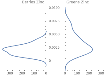
The -value from the t-test is less than 0.05. Therefore, we can reject the null hypothesis and conclude that there is a significant difference in the average zinc content of berries versus green vegetables. Easily visualize this difference using PairedSmoothHistogram:
p
In[]:=
PairedSmoothHistogram[berriesZinc,greensZinc,PlotLabel->"Berries Zinc Greens Zinc"]
Out[]=
Next, we examine the difference in average folate content:
In[]:=
berriesFolate=QuantityMagnitude[DeleteMissing[EntityValue[#,"RelativeFoodFolateContent"]&/@berries]]//N
Out[]=
{0.24,0.07,0.25,0.21,0.01,0.06,0.08,0.26,0.06,0.63,0.06,0.17}
In[]:=
greensFolate=QuantityMagnitude[DeleteMissing[EntityValue[#,"RelativeFoodFolateContent"]&/@greens]]//N
Out[]=
{0.98,0.14,0.27,0.38,0.87,0.09,0.12,1.36,0.745,0.715,0.09,0.43,0.37,0.78,0.77}
In[]:=
DistributionFitTest[berriesFolate]
Out[]=
0.11161
In[]:=
DistributionFitTest[greensFolate]
Out[]=
0.0718978
In[]:=
TTest[{berriesFolate,greensFolate}]
Out[]=
0.00333388
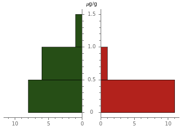
Like zinc, the t-test result below 0.05 confirms that we can reject the null hypothesis because the folate difference between berries and green vegetables is statistically significant. Wolfram Language provides both full and shortened conclusions of the test:
In[]:=
TTest[{berriesFolate,greensFolate},0,"TestConclusion"]
Out[]=
The null hypothesis that the mean difference is 0 is rejected at the 5 percent level based on the T test.
In[]:=
TTest[{berriesFolate,greensFolate},0,"ShortTestConclusion"]
Out[]=
Reject
A paired histogram illustrates this difference in the two datasets:
In[]:=
PairedHistogram[greensFolate,berriesFolate,ChartLegends->{"Greens Folate","Berries Folate"},ChartStyle->{"RoseColors"},AxesLabel->"μg/g"]
Out[]=
Mann–Whitney U Test for Iron
Mann–Whitney Test for Iron
U
There are multiple ways to visualize the distribution of datasets. A number line plot is a compact way to compare the distribution of two datasets:
In[]:=
berriesIron=QuantityMagnitude[EntityValue[#,"RelativeIronContent"]&/@berries]//N
Out[]=
{0.0071,0.0015,0.0077,0.0073,0.,0.016,0.0154,0.01,0.0064,0.0031,0.0081,0.007,0.003,0.0188,0.004,0.0009}
In[]:=
greensIron=QuantityMagnitude[EntityValue[#,"RelativeIronContent"]&/@greens]//N
Out[]=
{0.0188,0.0118,0.0085,0.0085,0.0127,0.0219,0.004,0.0085,0.00795,0.0086,0.002,0.004,0.0024,0.0204,0.00775,0.0214}
In[]:=
NumberLinePlot[{berriesIron,greensIron},PlotLegends{"Berries","Greens"},AxesLabel->"mg/g"]
Out[]=

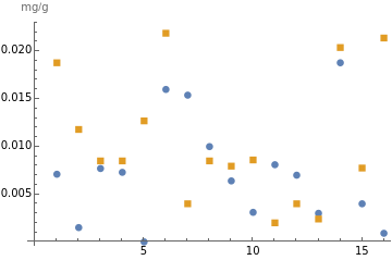
Scatter plots also are effective visuals, with multiple options to customize the plots:
In[]:=
ListPlot[{berriesIron,greensIron},Frame->False,PlotMarkers->Automatic,PlotLegends->{"Berries iron","Greens iron"},AxesLabel->"mg/g"]
Out[]=
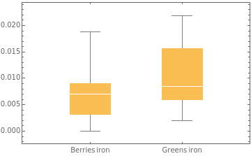
A related plot is a box-and-whisker chart. The box represents the middle 50% of the data values; the white line in the box represents the median. The vertical lines are the whiskers, which show the range of values, excluding any outliers (there is an option to include the outliers in the chart):
In[]:=
BoxWhiskerChart[{berriesIron,greensIron},ChartLabels->{"Berries iron","Greens iron"}]
Out[]=
Let’s evaluate the average iron difference for berries versus green vegetables by first checking for normal distribution:
In[]:=
DistributionFitTest[berriesIron]
Out[]=
0.145185
In[]:=
DistributionFitTest[greensIron]
Out[]=
0.0173513
The green vegetables iron data has a -value below 0.05 and, therefore, is not normally distributed. When the sample data is skewed rather than normally distributed, you can use the Mann-Whitney U test to determine whether two population distributions have roughly the same shape and location. It is called a nonparametric test and does not require a normal distribution like the t-test does:
p
In[]:=
MannWhitneyTest[{berriesIron,greensIron},0,{"PValueTable","ShortTestConclusion"}]
Out[]=
,Do not reject
P-Value | |
Mann-Whitney | 0.0645616 |
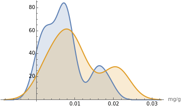
The resulting -value is slightly greater than our chosen significance level of 5%. Therefore, we must fail to reject the null hypothesis and conclude that there is no statistically significant difference in the average iron content of berries versus green vegetables. A smooth histogram is a good way to view the overlap between the two datasets:
p
α
In[]:=
SmoothHistogram[{berriesIron,greensIron},Filling->Axis,PlotLegends->{"Berries Iron","Greens Iron"},AxesLabel->{"mg/g"}]
Out[]=
Use the TrimmedMean function to remove data outliers that may be skewing a result. In this example, we trim the outlying 10% of data from both ends and obtain a new mean:
In[]:=
Mean[greensIron]
Out[]=
0.010575
In[]:=
TrimmedMean[greensIron,0.10]
Out[]=
0.0103786
Analysis of Variance (ANOVA)
Analysis of Variance (ANOVA)
Analysis of variance (ANOVA) compares the means of three or more groups to determine if there are statistically significant differences among them. Let’s load the Analysis of Variance and analyze the means for iron content in berries, meats and fish:
In[]:=
Needs["ANOVA`"]
This ANOVA test is called a one-way analysis of variance because there is one categorical variable in the data. We have already defined berriesIron. We need iron content for meats and fish:
In[]:=
meatsIron=QuantityMagnitude[DeleteMissing[EntityValue[#,"RelativeIronContent"]&/@meats]]//N
Out[]=
{0.,0.02245,0.0086,0.0129,0.027,0.0064,0.019,0.0114,0.0356,0.0071,0.02,0.0106,0.0268,0.0129,0.0193,0.0086}
In[]:=
fishIron=QuantityMagnitude[DeleteMissing[EntityValue[#,"RelativeIronContent"]&/@fish]]//N
Out[]=
{0.024,0.0049,0.0116,0.0032,0.0023,0.00295,0.015}
Like other parametric tests, ANOVA requires a normal distribution of the data:
In[]:=
DistributionFitTest[meatsIron]
Out[]=
0.149704
In[]:=
DistributionFitTest[fishIron]
Out[]=
0.126543
The ANOVA table includes the means of the samples and the overall mean (grand mean) of all the data. In the following example, the -value of less than 0.05 indicates that we can reject the null hypothesis and conclude that there is a significant difference among the means for iron content in berries, meats and fish:
p
In[]:=
ANOVA[Join[Thread[{"Berries",berriesIron}],Thread[{"Meats",meatsIron}],Thread[{"Fish",fishIron}]]]
Out[]=
ANOVA
,CellMeans
DF | SumOfSq | MeanSq | FRatio | PValue | |
Model | 2 | 0.000576961 | 0.00028848 | 4.80936 | 0.0140887 |
Error | 36 | 0.00215939 | 0.0000599832 | ||
Total | 38 | 0.00273635 |
All | 0.0109974 |
Model[Berries] | 0.00726875 |
Model[Fish] | 0.00913571 |
Model[Meats] | 0.0155406 |
ANOVA does not specify which group means are significantly different. After ANOVA, you can use post hoc tests to make pairwise comparisons and determine which groups are statistically different from each other.
Possible settings for PostTests include: Bonferroni, Duncan, Dunnett, StudentNewmanKeuls, and Tukey.
https://reference.wolfram.com/language/ANOVA/tutorial/ANOVA.html
Possible settings for PostTests include: Bonferroni, Duncan, Dunnett, StudentNewmanKeuls, and Tukey.
https://reference.wolfram.com/language/ANOVA/tutorial/ANOVA.html
Linear Correlation
Linear Correlation
Linear correlation is the statistical relationship between two variables in which changes in one variable are associated with proportional changes in another variable. A positive correlation suggests that as one variable increases, the other variable tends to also increase. A negative correlation implies that as one variable increases, the other variable tends to decrease.
Let’s examine the correlation between fat and calories in meats. First, obtain the quantitative data:
In[]:=
meatsFat=QuantityMagnitude[EntityValue[#,"RelativeTotalFatContent"]]&/@meats
Out[]=
{0.4,0.1,0.08,0.3,0.1,0.04,0.2,0.2,0.2,0.02,0.04,0.2,0.1,0.1,0.04,0.3}
In[]:=
meatsCalories=QuantityMagnitude[EntityValue[#,"RelativeTotalCaloriesContent"]]&/@meats
Out[]=
{5.0,2.0,1.8,3.2,2.0,1.1,2.3,3.0,2.7,1.1,1.3,2.9,1.7,2.1,1.3,3.1}
Use the Transpose function to pair the fat and calorie values for each type of meat, and then plot the pairs:
In[]:=
meatsFatCaloriesPairs=Transpose[{meatsFat,meatsCalories}]
Out[]=
{{0.4,5.0},{0.1,2.0},{0.08,1.8},{0.3,3.2},{0.1,2.0},{0.04,1.1},{0.2,2.3},{0.2,3.0},{0.2,2.7},{0.02,1.1},{0.04,1.3},{0.2,2.9},{0.1,1.7},{0.1,2.1},{0.04,1.3},{0.3,3.1}}
In[]:=
ListPlot[meatsFatCaloriesPairs,AxesLabel->{"g/g","Cal/g"}]
Out[]=
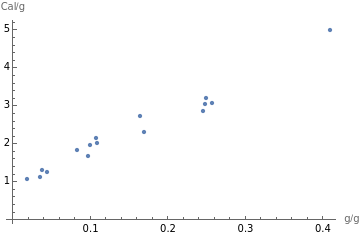
Because the plot points generally slope upward, we can conclude that the fat and calories in meats are positively correlated. As total fat increases, so do calories. If the line slopes generally downward, the variables are negatively correlated. If the points are scattered, with no upward or downward trend, the variables are uncorrelated.
The positive correlation between fat and calories is not surprising, but this process can be replicated to explore a wide range of nutrients. Vitamin C and potassium are vital nutrients in citrus fruits, but are they correlated? They generally are not associated with one another. Is there a hidden statistical correlation?
In[]:=
citrusVitaminC=QuantityMagnitude[EntityValue[#,"RelativeVitaminCContent"]]&/@citrus
Out[]=
{0.5,0.5,0.3,0.2,0.5,0.4,0.3,0.5,0.3}
In[]:=
citrusPotassium=QuantityMagnitude[EntityValue[#,"RelativePotassiumContent"]]&/@citrus
Out[]=
{2.,2.,1.,1.,2.,2.,1.,2.,1.}
In[]:=
citrusVitCPotassPairs=Transpose[{citrusVitaminC,citrusPotassium}]
Out[]=
{{0.5,2.},{0.5,2.},{0.3,1.},{0.2,1.},{0.5,2.},{0.4,2.},{0.3,1.},{0.5,2.},{0.3,1.}}
In[]:=
ListPlot[citrusVitCPotassPairs,AxesLabel->{"mg/g","mg/g"}]
Out[]=
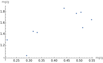
The list plot confirms there is no correlation between the amounts of vitamin C and potassium in citrus fruits.
Linear Regression
Linear Regression
Linear regression is another way of modeling relationships between quantitative variables. The goal of linear regression is to find the best-fitting straight line that represents the relationship between the two variables. Let’s use linear regression to model the relationship between saturated fat and monounsaturated fat in meats:
In[]:=
meatsSatFat=QuantityMagnitude[EntityValue[#,"RelativeTotalSaturatedFatContent"]]&/@meats
Out[]=
{0.15,0.038,0.018,0.089,0.029,0.0089,0.060,0.088,0.051,0,0.011,0.086,0.035,0.054,0.018,0.091}
In[]:=
meatsMonounsatFat=QuantityMagnitude[EntityValue[#,"RelativeTotalMonounsaturatedFatContent"]]&/@meats
Out[]=
{0.17,0.039,0.035,0.18,0.039,0.025,0.046,0.093,0.052,0.012,0.017,0.12,0.032,0.070,0.020,0.10}
In[]:=
meatsSatMonounsatPairs=Transpose[{meatsSatFat,meatsMonounsatFat}]
Out[]=
{{0.15,0.17},{0.038,0.039},{0.018,0.035},{0.089,0.18},{0.029,0.039},{0.0089,0.025},{0.060,0.046},{0.088,0.093},{0.051,0.052},{0,0.012},{0.011,0.017},{0.086,0.12},{0.035,0.032},{0.054,0.070},{0.018,0.020},{0.091,0.10}}
The following input uses the LinearModelFit function to model the relationship using a straight line:
In[]:=
bestfit1[x_]=LinearModelFit[meatsSatMonounsatPairs,{1,x},x]["BestFit"]
Out[]=
0.0042+1.2x
In[]:=
Show[ListPlot[meatsSatMonounsatPairs],Plot[bestfit1[x],{x,0,10},PlotStyle->Red],AxesLabel->"g/g"]
Out[]=
Use the Correlation function to get the correlation coefficient, which indicates the strength and direction of the linear relationship between two variables. The coefficient is a number between –1 and 1, where 1 indicates perfect positive correlation and –1 indicates perfect negative correlation. A general guideline is that correlation above 0.5 or below –0.5 is strong correlation, and –0.5 to 0.5 is weak correlation or no correlation:
In[]:=
Correlation[meatsSatFat,meatsMonounsatFat]
Out[]=
0.9
The correlation coefficient of 0.9 indicates a strong positive correlation between the amount of saturated fat and monounsaturated fat in meats. Easily visualize this relationship with SmoothHistogram3D:
In[]:=
SmoothHistogram3D[meatsSatMonounsatPairs]
Out[]=

Not all correlations are positive. We can reasonably assume that the correlation between sugar and fiber in breakfast cereals is a negative one—as sugar goes up, fiber goes down. Let’s test if our assumption is correct. First, use Interpreter to get the implicit entity (“yellow box”) for the food type “breakfast cereal.” The implicit entity is a compilation of the nutrition data for the more than 200 specific breakfast cereals that make up the entity:
In[]:=
Interpreter["Food"]["breakfast cereal"]
Out[]=
In[]:=
Length//EntityList
Out[]=
232
In[]:=
RandomEntity,4
Out[]=
,,,
Next, request the EntityList of the breakfast cereals attached to the yellow box. We use the semicolon after EntityList so that the actual (very long) list will be suppressed:
In[]:=
breakfastCereals=//EntityList;
In[]:=
cerealEntities=Keys@DeleteMissing[AssociationThread[breakfastCereals,EntityValue[#,"RelativeTotalFiberContent"]&/@breakfastCereals]];
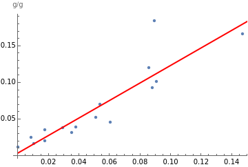
As we did in the previous examples, we get the relative sugar and fiber values for each of the 200+ breakfast cereals, then transform those values into a list of pairs:
In[]:=
cerealSugar=QuantityMagnitude[EntityValue[#,"RelativeTotalSugarContent"]]&/@cerealEntities;
In[]:=
cerealFiber=QuantityMagnitude[EntityValue[#,"RelativeTotalFiberContent"]]&/@cerealEntities;
In[]:=
cerealSugarFiberPairs=Transpose[{cerealSugar,cerealFiber}];
Test the correlation:
In[]:=
Correlation[cerealSugar,cerealFiber]
Out[]=
-0.4
In[]:=
bestfit2[x_]=LinearModelFit[cerealSugarFiberPairs,{1,x},x]["BestFit"]
Out[]=
0.12-0.17x
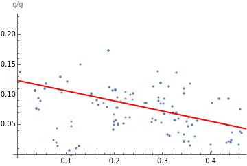
The correlation coefficient of –0.4 confirms a negative correlation, although it’s somewhat weak. The linear regression “best-fit” model illustrates the intercept (0.12) and slope (–0.17) of the line:
In[]:=
Show[ListPlot[cerealSugarFiberPairs],Plot[bestfit2[x],{x,0,10},PlotStyle->Red],AxesLabel->"g/g"]
Out[]=
Documentation for NonlinearModelFit function:
https://reference.wolfram.com/language/ref/NonlinearModelFit.html
https://reference.wolfram.com/language/ref/NonlinearModelFit.html
Learn More at Wolfram U
Learn More at Wolfram U
To learn more about statistical analysis with Wolfram Language, visit Wolfram U to choose from the free, self-paced Wolfram Language statistics courses on basic (elementary algebra) to more advanced (statistical distributions) topics. Other related online courses include:
CITE THIS NOTEBOOK
CITE THIS NOTEBOOK
Nutrients by the Numbers: Food and Nutrition Statistics with Wolfram Language
by Gay Wilson
Wolfram Community, STAFF PICKS, January 17, 2024
https://community.wolfram.com/groups/-/m/t/3104670
by Gay Wilson
Wolfram Community, STAFF PICKS, January 17, 2024
https://community.wolfram.com/groups/-/m/t/3104670