This is a quick guide to create dynamic interface to show a small project including GIS, weather data and time series object. There is no analytic information included because I would like to focus on the very basic work flow in this short article.
Import sample file and preprocess data
Import sample file and preprocess data
The raw CSV data is already imported and saved in this notebook.
In[]:=
rawData=;
Convert the data into Dataset object. Also I need to convert year number string into DateObject for DateListPlot and TimeSeries
In[]:=
{head,ds1}=With[{data=rawData},{data[[1]],Dataset[Association[Thread[data[[1]]->#]]&/@Rest[data]][All,{"Year"->(DateObject[{#}]&)}]}];
In[]:=
Out[]=
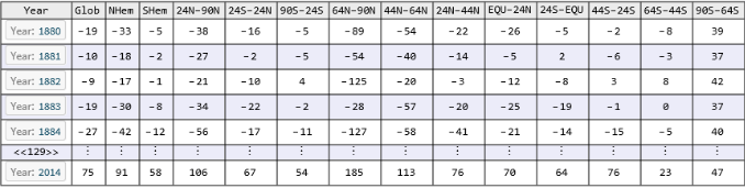
It is also convenient to extract the first column to use repeatedly later:
In[]:=
chooseYear=Flatten[ds1[All,{"Year"}][[Values]]//Normal];
In[]:=
chooseYear[[1]]
Out[]=
Band regions
Band regions
Of course you can choose to use programming method to create the bands. I do not think these things change often, so manual way is not bad either. I will feed them into GeoRegionValuePlot later:
In[]:=
(*Northhemisphere*)regionBand["EQU-24N"]=Polygon[{GeoPosition[{0,-180}],GeoPosition[{0,180}],GeoPosition[{24,180}],GeoPosition[{24,-180}]}];regionBand["24N-44N"]=Polygon[{GeoPosition[{24,-180}],GeoPosition[{24,180}],GeoPosition[{44,180}],GeoPosition[{44,-180}]}];regionBand["44N-64N"]=Polygon[{GeoPosition[{44,-180}],GeoPosition[{44,180}],GeoPosition[{64,180}],GeoPosition[{64,-180}]}];regionBand["64N-90N"]=Polygon[{GeoPosition[{64,-180}],GeoPosition[{64,180}],GeoPosition[{90,180}],GeoPosition[{90,-180}]}];regionBand["24N-90N"]=Polygon[{GeoPosition[{24,-180}],GeoPosition[{24,180}],GeoPosition[{90,180}],GeoPosition[{90,-180}]}];regionBand["NHem"]=Polygon[{GeoPosition[{0,-180}],GeoPosition[{0,180}],GeoPosition[{90,180}],GeoPosition[{90,-180}]}];
In[]:=
(*Southhemisphere*)regionBand["24S-EQU"]=Polygon[{GeoPosition[{0,-180}],GeoPosition[{0,180}],GeoPosition[{-24,180}],GeoPosition[{-24,-180}]}];regionBand["44S-24S"]=Polygon[{GeoPosition[{-24,-180}],GeoPosition[{-24,180}],GeoPosition[{-44,180}],GeoPosition[{-44,-180}]}];regionBand["64S-44S"]=Polygon[{GeoPosition[{-44,-180}],GeoPosition[{-44,180}],GeoPosition[{-64,180}],GeoPosition[{-64,-180}]}];regionBand["90S-64S"]=Polygon[{GeoPosition[{-64,-180}],GeoPosition[{-64,180}],GeoPosition[{-90,180}],GeoPosition[{-90,-180}]}];regionBand["SHem"]=Polygon[{GeoPosition[{0,-180}],GeoPosition[{0,180}],GeoPosition[{-90,180}],GeoPosition[{-90,-180}]}];
In[]:=
(*Equatorband*)regionBand["24S-24N"]=Polygon[{GeoPosition[{-24,-180}],GeoPosition[{-24,180}],GeoPosition[{24,180}],GeoPosition[{24,-180}]}];
Latitude band temperature spectrum given a year
Latitude band temperature spectrum given a year
Only these are needed for my diagram:
In[]:=
bands={"90S-64S","64S-44S","44S-24S","24S-EQU","EQU-24N","24N-44N","44N-64N","64N-90N"};
Use Dataset[Select[pred]] syntax to extract a row w.r.t. a given year. Then associated the values in each column to the proper latitude band name to create spatial spectrum of temperature across the world map. Notice that Style function is still working with geographics polygon and I use EdgeForm function to eliminate unwanted boundaries of each band:
In[]:=
DynamicModule{yr},ManipulateWith[{data=ds1[Select[#Year==yr&],bands][[1]]//Normal},GeoRegionValuePlot[Style[regionBand[#]->data[#],EdgeForm[Transparent]]&/@bands,PlotStyleOpacity[0.4],GeoRange->{{-90,90},{-170,170}},ColorFunction"ThermometerColors",PlotLabel"Latitude band temperature spectrum given a year"]],yr,,"Year",chooseYear,TrackedSymbols{yr},SaveDefinitionsTrue
Out[]=
Time series for average annual temperature in each band
Time series for average annual temperature in each band
This time I am looking at history of temperature in fixed location. Therefore I have to use column-wise method to extract data because each row it is corresponding to a particular time spot.
In[]:=
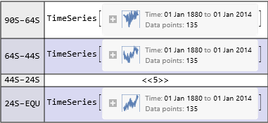
tsAsso=Association[#->TimeSeries[ds1[All,#]//Normal,{chooseYear}]&/@bands];
In[]:=
Out[]=
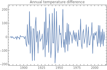
The other group of time series is to show the differences between consecutive years:
In[]:=
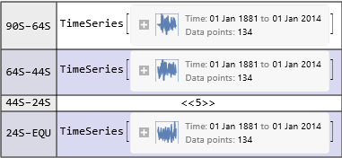
tsAssoDiff=Association[#->Differences[TimeSeries[ds1[All,#]//Normal,{chooseYear}]]&/@bands];
In[]:=
Out[]=
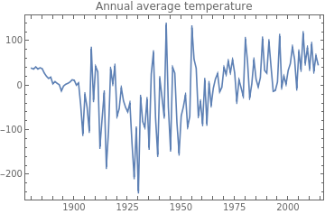
Use CheckboxBar to make multiple selection possible. Here is the plot for annual average temperature:
In[]:=
Manipulate[Dynamic[DateListPlot[tsAsso/@b,PlotLegendsb,ImageSizeMedium,PlotLabel"Annual average temperature"]],{{b,{"90S-64S"},""},bands,CheckboxBar,Appearance"Vertical"},ControlPlacementLeft,SaveDefinitionsTrue]
Out[]=
A similar the plot for annual average temperature:
In[]:=
Manipulate[Dynamic[DateListPlot[tsAssoDiff/@b,PlotLegendsb,ImageSizeMedium,PlotLabel"Annual temperature difference"]],{{b,{"90S-64S"},""},bands,CheckboxBar,Appearance"Vertical"},ControlPlacementLeft,SaveDefinitionsTrue]
Out[]=
Summary
Summary
◼
◼
◼
◼
Convert temperature date into TimeSeries/TemporalData for easy visualization and time series analysis
◼
CheckboxBar is helpful for multiple choice of curves in the same diagram