CITE THIS NOTEBOOK: FOMC raising rates: model for an inverted yield curve by Robert Rimmer. Wolfram Community NOV 28 2022.
The Federal Reserve Open Market Committee [FOMC] has been raising rates for most of the past year. The market response to the FOMC rate increases have resulted in an inverted yield curve since July. Nobody has a clear idea how this effort to quash inflation will inevitably play out. Since the shape of the yield curve has successfully predicted recessions since WWII, it would be nice to have a mathematical model for that shape to track the evolution of the yield curve as the FOMC continues to raise rates and after it stops. The following model was developed in conjunction with managing a Treasury portfolio with maturities upto 10 years.
The model
The model
In a healthy economy, when the FOMC is not actively manipulating rates, the Treasury yield curve has a shape similar to a scaled exponential distribution. In the model the exponential distribution has a positive parameter, a. The distribution is scaled in range by interest rates, r0, which should be close to the FOMC overnight rate and a maximal asymptotic rate, r. r0 is the lowest possible rate in the model, but it is possible for markets to find lower rates for long term securities if the expectation is that rates will be declining in the future. The model cannot fit such points accurately.
The distribution function is multiplied by an exponential decay function with a positive rate, c. As the parameter, c, increases the peak moves toward t = 0. As c approaches zero, the peak moves to larger values of t, and at c = 0 the decay function disappears leaving a pure scaled exponential distribution shape, where r > r0. The Manipulate function shows how the shape of the curve changes with the parameters.
The distribution function is multiplied by an exponential decay function with a positive rate, c. As the parameter, c, increases the peak moves toward t = 0. As c approaches zero, the peak moves to larger values of t, and at c = 0 the decay function disappears leaving a pure scaled exponential distribution shape, where r > r0. The Manipulate function shows how the shape of the curve changes with the parameters.
In[]:=
yModel=r0+(r-r0)(1-Exp[-at])UnitStep[t]Exp[-ct];
In[]:=
ManipulatePlotr0+(r-r0)(1-Exp[-at])UnitStep[t]Exp[-ct],{t,0,10},,
Out[]=


The location and magnitude of the peak of the model can be found from the first derivative.
In[]:=
Refine[D[yModel,t],t>0]//Simplify;Solve[%==0,t,Reals,Assumptions->a>0&&c>0][[1]]yModel/.%//Simplify
Out[]=
t
Log
a+c
c
a
Out[]=
r0+
a(r-r0)UnitStep
-
c
a
a+c
c
Log
a+c
c
a
a+c
Fitting the model
Fitting the model
Fit a Treasury portfolio dataset. Prices are from Schwab at the end of the day labeled, “Evaluated Price”, which appear to be between last bid and asked prices. The price data are generally given to six or more significant figures so presumably they are thought to be quite accurate.
In[]:=
treasuryDS0=UncompressByteArrayToStringByteArray;dataDate=DateObject[{2022,11,25},"Day"];
Use FinancialBond[] to calculate the yields to maturity. Securities with Rate = 0. are all Treasury Bills so CouponInterval is set to 1 so there will be no payment compounding.
In[]:=
treasuryDS=treasuryDS0[All,<|"Symbol"->#Symbol,"Description"->#Description,"Maturity"->#Maturity,"Rate"->#Rate,"Price"->#Price,"Yield"->y/.Quiet@FindRoot[FinancialBond[{"FaceValue"->100,"Coupon"->#Rate,"CouponInterval"->If[#Rate==0.,1,1/2],"Maturity"->#Maturity},{"Settlement"->dataDate,"InterestRate"y,"DayCountBasis"->"ActualICMA"}]#Price,{y,0.05}]|>&]
Out[]=
Get maturity and yield data and convert maturity to time to maturity in years. Also combine duplicate times as NonlinearModelFit doesn’t like duplicate abscissa points.
In[]:=
yData0=treasuryDS[All,{"Maturity","Yield"}]//Normal//Values;yData={DateDifference[dataDate,#1,"Year"][[1]],#2}&@@@yData0;yData1={First[#[[All,1]]],Mean[#[[All,2]]]}&/@Split[Sort[yData],#1[[1]]==#2[[1]]&];Length[yData1]
Out[]=
74
Calculate and display the fit which is quite good to a real portfolio.
In[]:=
nlm=NonlinearModelFit[yData1,yModel,{r0,r,a,c},t];nlm["BestFitParameters"]ShowPlotnlm[t],{t,0,10},,ListPlot[yData1],PlotRange->Allnlm["AdjustedRSquared"]
Out[]=
{r00.0377273,r0.0816022,a0.57854,c0.693093}
Out[]=
Out[]=
0.995922
Apply model to Treasury yield curves
Apply model to Treasury yield curves
Import the current year of daily Treasury yield curves.
In[]:=
ycurves0=Import["https://home.treasury.gov/resource-center/data-chart-center/interest-rates/daily-treasury-rates.csv/2022/all?type=daily_treasury_yield_curve&field_tdr_date_value=2022&page&_format=csv","CSV"];
The first row is the header, and the following rows are in reverse order by date
In[]:=
ycurves0[[1]]ycurves0[[2]]
Out[]=
{Date,1 Mo,2 Mo,3 Mo,4 Mo,6 Mo,1 Yr,2 Yr,3 Yr,5 Yr,7 Yr,10 Yr,20 Yr,30 Yr}
Out[]=
{11/28/2022,4.11,4.29,4.41,4.52,4.72,4.76,4.46,4.22,3.88,3.8,3.69,3.97,3.74}
For most of the data set the 4 Mo column is missing, so it is removed..
In[]:=
ycurves1=Transpose[Delete[Transpose[ycurves0],5]];yieldDS=AssociationThread[ycurves1[[1]],#]&/@Rest[ycurves1]//Dataset
Out[]=
Numerical values for the times in years for each rate.
In[]:=
times=,,,,1,2,3,5,7,10,20,30;
1
12
1
6
1
4
1
2
In[]:=
ycurves={DateObject[DateList[{#[[1]],{"Month","Day","Year"}}],"Day"],Transpose[{times,Rest[#]}]}&/@Reverse[Rest[ycurves1]];
ycurves is list with the date and the yield curve points.
In[]:=
ycurves[[-1]]
Out[]=
,,4.11,,4.29,,4.41,,4.72,{1,4.76},{2,4.46},{3,4.22},{5,3.88},{7,3.8},{10,3.69},{20,3.97},{30,3.74}
1
12
1
6
1
4
1
2
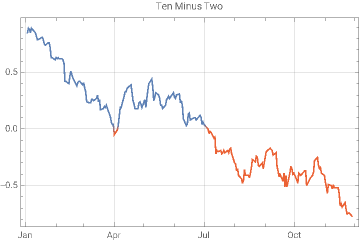
This plot shows the history of yield curve inversion using the ten year rate minus the two year rate as the criterion for yield curve inversion. When the ten minus two is zero or less, the difference is red on the plot.
In[]:=
DateListPlotTranspose[{ycurves[[All,1]],#10[[2]]-#6[[2]]&@@@ycurves[[All,2]]}],
Out[]=
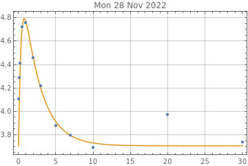
Here is the fit to the last curve in the data. The last two points at 20 and 30 years maturity are not close to the model so they are dropped for the fit over the rest of this data example.
In[]:=
nlm=NonlinearModelFit[Take[ycurves[[-1]][[2]],10],yModel,{r0,r,a,c},t];nlm["BestFitParameters"]Show[Plot[nlm[t],{t,0,30},PlotStyle->ColorData[97][2],PlotRange->All,GridLines->Automatic,Frame->True,PlotLabel->DateString[ycurves[[-1]][[1]]]],ListPlot[ycurves[[-1]][[2]]],PlotRange->All]
Out[]=
{r03.70875,r5.46796,a2.54812,c0.429922}
Out[]=
This function will be used to fit the data and output the fit as an Association for each curve.
In[]:=
Clear[modelCurve];modelCurve[data_]:=Module[{nlm},nlm=NonlinearModelFit[Take[data,10],yModel,{{r0,data[[1]][[2]]/2},{r,2data[[-1]][[2]]},a,c},t];Association[nlm["BestFitParameters"]]]
Fit all the curves for the year.
In[]:=
alist={};Do[ya=Quiet@modelCurve[ycurves[[i]][[2]]];AppendTo[alist,Join[Association["date"->ycurves[[i]][[1]]],ya,Association["yieldCurve"->ycurves[[i]][[2]]]]],{i,Length[ycurves]}]
In[]:=
Length@alist
Out[]=
226
The model was not appropriate for all the yield curves for the year. Bad fits often have negative values for the a-parameter. Only the fits where a>0 are selected.
In[]:=
alist1=Select[alist,#[a]>0&];Length@alist1
Out[]=
200
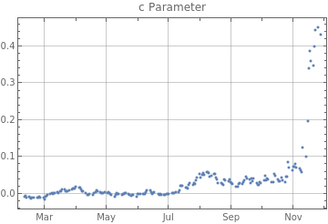
Here are the fits to the c-parameter, recall that when this parameter moves toward zero the yield curve is normalizing in shape. The selection criterion for alist1 shows curves before July with c near 0, and some less than zero, which would be non-inverted curves. The yield curve has become more distorted in November. The market response to the FOMC is becoming more dramatic.
In[]:=
cdata={#["date"],#[c]}&/@alist1;DateListPlotcdata,,PlotLabel->"c Parameter"
Out[]=
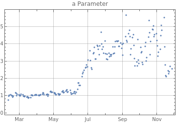
The a-parameter is the parameter for the implicit exponential distribution underlying the model. The fits where it is near 1 have a more normal appearance. Recently it is becoming more volatile.
In[]:=
adata={#["date"],#[a]}&/@alist1;DateListPlotadata,,PlotLabel->"a Parameter"
Out[]=
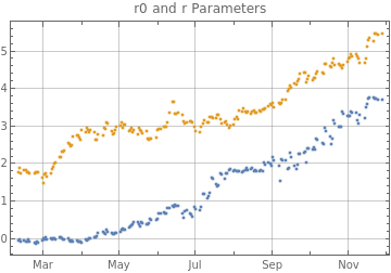
The r0 and r-parameters do not change the shape of the yield curve, but they change its location and scaling on the y-axis of the plot. The r0-parameter should follow the FOMC overnight rate. The market appears to wait for the FOMC to act, rather than anticipating its action. The r-parameter, which is the maximal rate for the implied exponential distribution function, rose more rapidly when the FOMC began its operation. It will be interesting to follow this to see if it exceeds the inflation rate.
In[]:=
r0data={#["date"],#[r0]}&/@alist1;rdata={#["date"],#[r]}&/@alist1;DateListPlot{r0data,rdata},,PlotLabel->"r0 and r Parameters"
Out[]=
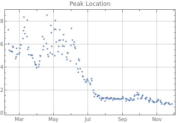
Here is the point in time of the peak. It is currently moving earlier, which is a sign that the yield curve shape is not improving. The peaks before July were far enough out on the yield curve that they probably do not indicate full yield curve inversion, but they may add some information about how an inversion evolves. For some of the points on the next two graphs the functions appear not to be giving real results so the plot is shown for the absolute values, which seem to give continuity to the plots.
In[]:=
peakdata=#["date"],Abs@&/@alist1;DateListPlotpeakdata,,PlotLabel->"Peak Location"
Log[(#[a]+#[c])/#[c]]
#[a]
Out[]=
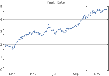
The peak rate of the function is rising, its future behavior should be interesting.
In[]:=
peakRatedata=#["date"],yModel/.#/.t->Abs@&/@alist1;DateListPlotpeakRatedata,,PlotLabel->"Peak Rate"
Log[(#[a]+#[c])/#[c]]
#[a]
Out[]=
To view plots of all of the alist1 fits, uncomment and evaluate the cell below. The 20 and 30 year points are far away from all of the fits, but the timing of the peak and the shape of the fit to the first ten years of points is good. The code below can also be applied to the curves not selected. Those mostly do not show much inversion, and all of them have r0 which is also the rate when t = 0 that is too high relative to the rest of the curve points. Thus selecting fits with a valid a-parameter > 0 is an effective strategy to select useful fits.
In[]:=
(*Print[Show[Plot[yModel/.#,{t,0,30},PlotStyle->ColorData[97][2],PlotRange->All,GridLines->Automatic,Frame->True,PlotLabel->DateString[#["date"]]],ListPlot[#["yieldCurve"],PlotRange->All]]]&/@alist1;*)
Closing comments and a model for quantitative easing
Closing comments and a model for quantitative easing
The rates used in the demonstration above are decimal or percentage rates. Since the model is based on exponential functions it may be more appropriate to use continuous rates where,
continuousRate=log(decimalRate+1).
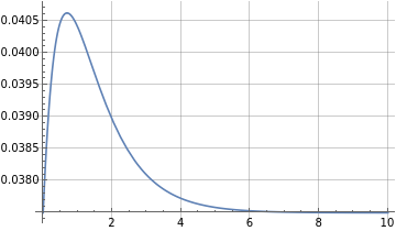
When the FOMC began a lengthy process of quantitative easing in late 2013, it manipulated the yield curve into a very different shape. Here is a model for that shape which was developed from a pricing model for zero coupon Treasury bonds. It turned out to be very accurate for yield curve modeling nine years ago, and may again become useful if the FOMC causes a recession. r0 and r are continuous rates in the model. Use the Manipulate to see how the shape varies with the k-parameter. I posted the derivation of this 9 years ago, so an updated notebook showing the derivation and the 2014 data is at the end of the post.
In[]:=
ZBondYield[t,{r0_,r_,k_}]:=UnitStep[t]r-;
(r-r0)(Gamma[1+k]+tGamma[k,t]-Gamma[1+k,t])
tGamma[k]
In[]:=
ManipulatePlotUnitStep[t]r-,{t,0,30},,{{r0,0.01},0,0.05},{{r,0.025},0,0.07},{{k,1},0,6},SaveDefinitions->True
(r-r0)(Gamma[1+k]+tGamma[k,t]-Gamma[1+k,t])
tGamma[k]
Out[]=
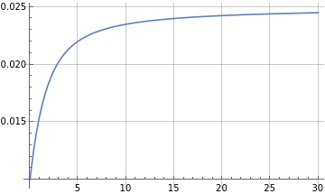
When k = 1, in this model, the distribution function effectively becomes a scaled ExponentialDistribution[1]. Note that in the above Treasury data, when the yield curve was normal the value of the a-parameter was close to 1.
In[]:=
Collect[Refine[ZBondYield[t,{r0,r,1}],t>=0]//FunctionExpand//ExpandAll,t]
Out[]=
r+
-r+r+r0-r0
-t
-t
t
When k = 0, it becomes a linear constant rate, r.
In[]:=
Limit[ZBondYield[t,{r0,r,k}],k->0]
Out[]=
|
|
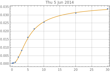
While the FOMC was engaging in active quantitative easing, the model seemed to work very well, despite having only 3 parameters. Here is an example of the Treasury yield curve and fit on 24 Jan 2014.
In[]:=
rate24Jan2014=,0.04`,,0.04`,,0.06`,{1,0.11`},{2,0.37`},{3,0.75`},{5,1.58`},{7,2.2`},{10,2.75`},{20,3.4`},{30,3.64`};
1
12
1
4
1
2
In[]:=
crates={#1,Log[1+#2/100]}&@@@rate24Jan2014;zbondParameters={{r0,crates[[1]][[2]]},{r,crates[[1]][[2]]+0.005},{k,0.1}};yieldFit=NonlinearModelFit[crates,{ZBondYield[t,{Abs[r0],Abs[r],Abs[k]}]},zbondParameters,t,MethodAutomatic];yieldFit["BestFitParameters"]ShowPlotyieldFit[t],{t,0,30},,ListPlot[crates]
Out[]=
{r0-0.000460418,r0.0401169,k3.31086}
Out[]=
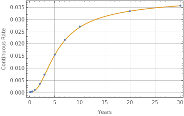
The ZBondYield showed a much tighter fit than the present model, but at the time, the FOMC directed market actions were operating on the entire yield curve, creating a designer yield curve. The ZBondYield model does not work at all now. Currently the FOMC is only setting the overnight rate, and for quantitative tightening simply not repurchasing some maturing securities. The present yModel doesn’t need to be highly accurate; if it is able to capture the direction of movement of parameters like c-parameter, it should add more information about the state of the Treasury market than the ten minus two rate.
Yield Curve 2014
Yield Curve 2014
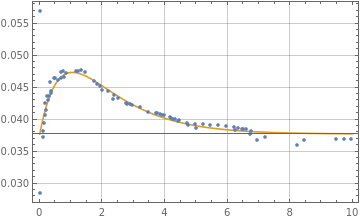
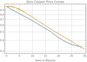
This section reviews what U. S. Treasury yield curves looked like in 2014 and derives a price and yield formula developed in 2013. First is a look at two price curves from zero coupon Treasury bonds on 22 Nov 2022 and 24 Jan 2014. The prices instead of percentages are divided by 100 so that a maximal price of 1 would occur at t = 0 years. The idea is to begin to think of the price curve in 2014 as a statistical survival curve. In 2014 it had a concave bend in the initial part of the curve, then became linear on a log plot. Now initially there is a bend in the opposite direction and another convex bend at the end of the curve.
In[]:=
tzero=UncompressByteArrayToStringByteArray;ListLogPlottzero,
Out[]=
Derive the price formula
Derive the price formula
A price curve for the 2014 data was modeled with a differential equation of the form below, where rate[t] was a scaled GammaDistribution.
DSolve[{P[0]1,P'[t]-rate[t]P[t]},P[t],t]
In[]:=
CDF[GammaDistribution[k,1],t]//FunctionExpand
Out[]=
|
So the differential equation for price can be solved; r0 and r are continuous rates, with r0 < r, and k is a GammaDistribution parameter, such that when k = 1 this is an ExponentialDistribution[1].
In[]:=
DSolveP[0]1,P'[t]-r0+(r-r0)1-P[t],P[t],t//Simplify
Gamma[k,t]
Gamma[k]
Out[]=
P[t]
-rt+
(r-r0)(tGamma[k,t]+Gamma[1+k,0]-Gamma[1+k,t])
Gamma[k]
In[]:=
ZBondPrice[t,{r0_,r_,k_}]:=UnitStep[t];
-rt+
(r-r0)(tGamma[k,t]+Gamma[1+k,0]-Gamma[1+k,t])
Gamma[k]
Fit the price formula
Fit the price formula
In[]:=
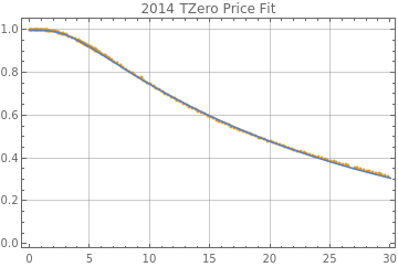
nlmp=NonlinearModelFit[tzero[[2]],ZBondPrice[t,{Abs@r0,Abs@r,Abs@k}],{r0,r,k},t];#1->Abs[#2]&@@@nlmp["BestFitParameters"]ShowListPlottzero[[2]],,Plot[nlmp[t],{t,0,30}]
Out[]=
{r00.000595273,r0.0442103,k3.41516}
Out[]=
Derive the yield formula
Derive the yield formula
The continuous yield formula then can be derived by price and time as:
In[]:=
Refine[Log[1/ZBondPrice[t,{r0,r,k}]]/t,t>=0]//PowerExpand//Simplify;FullSimplify[%,k>=0]
Out[]=
r-
(r-r0)(Gamma[1+k]+tGamma[k,t]-Gamma[1+k,t])
tGamma[k]
In[]:=
ZBondYield[t,{r0_,r_,k_}]:=UnitStep[t]r-;
(r-r0)(Gamma[1+k]+tGamma[k,t]-Gamma[1+k,t])
tGamma[k]
In[]:=
ManipulatePlotUnitStep[t]r-,{t,0,30},,{{r0,0.01},0,0.05},{{r,0.025},0,0.07},{{k,1},0,6},SaveDefinitions->True
(r-r0)(Gamma[1+k]+tGamma[k,t]-Gamma[1+k,t])
tGamma[k]
Out[]=
Obtain 2014 yield curves from the Treasury Department
Obtain 2014 yield curves from the Treasury Department
In[]:=
ycurves0=Import["https://home.treasury.gov/resource-center/data-chart-center/interest-rates/daily-treasury-rates.csv/2014/all?type=daily_treasury_yield_curve&field_tdr_date_value=2014&page&_format=csv","CSV"];
In[]:=
ycurves0[[1]]ycurves0[[2]]
Out[]=
{Date,1 Mo,3 Mo,6 Mo,1 Yr,2 Yr,3 Yr,5 Yr,7 Yr,10 Yr,20 Yr,30 Yr}
Out[]=
{12/31/2014,0.03,0.04,0.12,0.25,0.67,1.1,1.65,1.97,2.17,2.47,2.75}
In[]:=
yieldDS=AssociationThread[ycurves0[[1]],#]&/@Rest[ycurves0]//Dataset
Out[]=
Numerical values for the times in years for each rate.
In[]:=
times=,,,1,2,3,5,7,10,20,30;
1
12
1
4
1
2
The rates are converted to continuous rates for the ZBondYield formula.
In[]:=
ycurves={DateObject[DateList[{#[[1]],{"Month","Day","Year"}}],"Day"],Transpose[{times,Log[Rest[#]/100+1]}]}&/@Reverse[Rest[ycurves0]];
ycurves is list with the date and the yield curve points.
In[]:=
ycurves[[1]]
Out[]=
,,0.000099995,,0.000699755,,0.000899595,{1,0.00129916},{2,0.00389241},{3,0.00757127},{5,0.0170538},{7,0.0238142},{10,0.0295588},{20,0.036139},{30,0.0384512}
1
12
1
4
1
2
Fit the yield curves
Fit the yield curves
Reevaluate the cell below many times to see the fit to a random sampling of the 2014 data. The fits are all remarkably good.
In[]:=
ydata=RandomSample[ycurves,1];nlm=NonlinearModelFit[ydata[[-1]][[2]],ZBondYield[t,{Abs@r0,Abs@r,Abs@k}],{{r0,ydata[[-1]][[2]][[1]][[2]]},{r,ydata[[-1]][[2]][[-1]][[2]]},{k,5}},t];#1->Abs[#2]&@@@nlm["BestFitParameters"]ShowPlotnlm[t],{t,0,30},,ListPlot[ydata[[-1]][[2]]],PlotRange->All
Out[]=
{r00.000332415,r0.0371987,k3.06532}
Out[]=