This is too good to be coincidence. And yet this is not the end of story. Now let’s move on to some data from real life, starting with the populations of countries.
Make a histogram of the first digits of the populations of all the countries in the world:
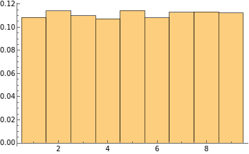
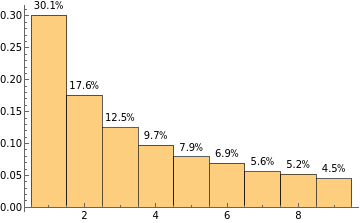
The distribution is generally similar. What about the total areas of countries?
Make a histogram of the first digits of the total areas of all the countries in the world in various units:
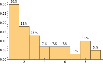
Does this pattern apply to any set of data? Let’s take a look at the heights of the tallest structures in the world.
Make a histogram of the first digits of the heights of the top 1,000 tallest structures in the world in various units:
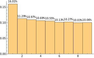
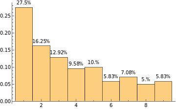
Although the general trend holds in some histograms, most are quite divergent from the pattern that we saw previously. The final example is the lengths of the longest rivers in the world.
Make a histogram of the first digits of the lengths of the top 1,000 longest rivers in the world in various units:
Curiously, the pattern seems to return. Is there a reason behind all this? The answer is Benford’s law.