Exploring Pandemic Data
Exploring Pandemic Data
Basic Data Exploration
Basic Data Exploration
In[]:=
rawCovidData=ResourceData["Epidemic Data for Novel Coronavirus COVID-19"];
Show the data available for each region:
In[]:=
rawCovidData[1/*Keys]
Out[]=
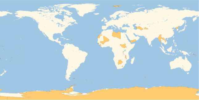
Show which countries have not reported cases so far:
In[]:=
GeoListPlot[Complement[EntityList["Country"],Normal@Keys@rawCovidData[GroupBy["Country"],Total,"ConfirmedCases"]]]
Out[]=
Generate the time series of confirmed cases, totaled by country:
In[]:=
countryTs=Normal[rawCovidData[GroupBy["Country"],Total,"ConfirmedCases"]];
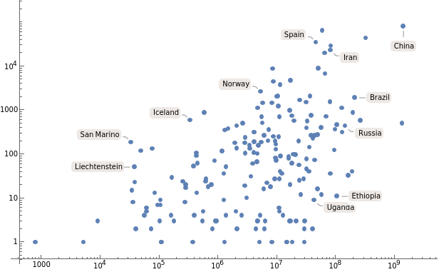
Make a log-log plot of the latest reported number of cases as a function of population:
In[]:=
ListLogLogPlot[AssociationThread[Keys[countryTs],Transpose[{EntityValue[Keys[countryTs],"Population"],#["LastValue"]&/@Values[countryTs]}]],PlotRangeAll]
Out[]=
Basic Time Series
Basic Time Series
Find the raw numbers of confirmed cases for each country:
In[]:=
countryValues=#["Values"]&/@countryTs;
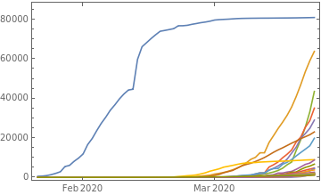
Show growth for the 25 countries with the largest current number of reported cases:
In[]:=
DateListPlot[TakeLargestBy[countryTs,#["LastValue"]&,25],PlotRangeAll]
Out[]=
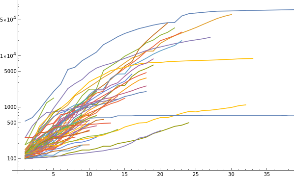
Make a log plot of the number of cases as a function of time, in each case starting when the number of cases first exceeded 100:
(Countries are indicated by tooltips)
(Countries are indicated by tooltips)
In[]:=
ListLogPlot[KeyValueMap[Tooltip[#2,#1]&,DeleteCases[Select[GreaterThan[100]]/@N@countryValues,{}]],JoinedTrue]
Out[]=
Daily Growth Rates
Daily Growth Rates
Show the ratio of cases for each country on successive days (starting when each country first identified more than 100 cases):
In[]:=
ListLinePlot[DeleteCases[Ratios/@Select[GreaterThan[100]]/@N@countryValues,{}],PlotRange{{0,30},{1,All}}]
Out[]=
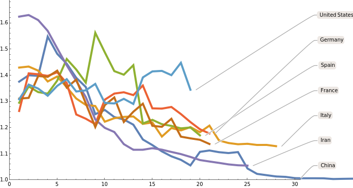
Show daily ratios for countries with more than 10000 cases, smoothed with a radius of 2 days:
In[]:=
ListLinePlot[KeyValueMap[Callout[#2,#1]&,DeleteCases[MeanFilter[Ratios[#],2]&/@Select[GreaterThan[100]]/@N@Select[countryValues,Max[#]>10000&],{}]],PlotRange{{0,30},{1,All}},PlotStyleThickness[0.007]]
Out[]=
Include all countries with more than 5000 cases:
Find the mean daily ratio across countries with more than 5000 cases:
Find the mean daily ratio across all countries reporting cases:
Find the mean across all countries, with the values for each country starting with the country first reported more than 50 cases:
Average over countries with more than 5000 cases, but do not take the mean across days:
Average over all countries reporting cases, but do not take the mean across days:
Investigating Results
Investigating Results
We wanted to understand the seemingly linear decrease in average daily ratios.
Find the linear term in a fit of the first 30 days of the data:
This corresponds to change of average daily ratio with a slope of about 1 in 111 days:
Summarizing Country Daily Ratio Data
Summarizing Country Daily Ratio Data
Show daily ratio by country, together with the average over all reporting countries:
Include only countries with more than 5000 cases reported:
Compare results for all countries, and countries with more than 5000 cases:
Show results successively dropping certain countries:
Show how many countries are included in the averages for each day, including only countries with more than 5000 current cases:
Show how many countries are included in the averages for each day, including all countries reporting cases:
Possible Model for Results
Possible Model for Results
In the standard SIR continuum epidemiological model, the number of infected people is i[t], and there is a “force of infection” β.
Solve assuming an infinite supply of susceptible people, and fixed force of infection; the result is a pure exponential:
Solve assuming a force of infection that varies linearly with time:
A typical model is that the distribution of times between becoming infected and showing symptoms is an exponential distribution.
Show the PDF for an exponential distribution:
The ratio of successive values will be given roughly by the log of the PDF:
More accurately, it is the ratio of PDF to CDF:
Network-Based Modeling
Network-Based Modeling
The continuum SIR model does not accurately represent human contacts, especially when they are limited by social distancing. It is better to consider a network, although it is not clear what the correct network should be.
Generate a typical example of network that models certain features of human networks:
At larger scales, human networks will tend to reflect actual geographical (i.e. spatial) relations, and so will have features of random planar networks.
Generate an example of a random planar network:
Make larger examples of these types of graphs:
For the model human network, the graph diameter is still quite small:
Starting from one node in the graph (i.e. one person) this shows the number of nodes reached after n steps in the random planar graph:
Data from Actual Contagion Networks
Data from Actual Contagion Networks
Singapore has carefully tracked cases, and generated a network giving information on contagion.
Import the data:
Show the network from this data:
Find cases of person-to-person transmission, giving the case numbers involved:
Plot case numbers for transmission pairs:
This data seems to indicate that most transmissions are found by backtracing. The analysis should be repeated with actual report times included.
Analysis of Government Responses
Analysis of Government Responses
Import a dataset of measures implemented by governments:
Show counts of measures implemented:
Show a word cloud of measures taken:
Show a date histogram of when measures were implemented:
Show a histogram of when the first measure was implemented for each country:
Show a histogram of the average time when measures were implemented:
Compute when general lockdown was implemented in each country:
Find how many countries have implemented general lockdown so far:
Make a histogram of when general lockdown was implemented:
Comparing with Cases
Comparing with Cases
Compute when each country first reported more than 100 cases:
Make a date histogram of when more than 100 cases were first reported:
Compare when countries first implemented measures vs. when they first reported 100 cases:
Compare the average of when countries implemented their various measures vs. when they first reported 100 cases:
Compare the difference in time between reporting 100 cases, and the first measure being implemented:
Compare the difference in time between reporting 100 cases, and the average of when measures were implemented:
Posted Graphic
Posted Graphic