The population size of migratory monarchs in eastern North America has dwindled from roughly 300-900 million in the 1990s to 33-200 million in recent years (Reppert & de Roode, 2018, p. R1018). The question is not why. The question is how. Specifically, how does temperature , wind speed and/or direction or other factors affect their population and lead to its decline and shifting migratory patterns? This project aims to further investigate the effects of temperature and wind speed and direction on Monarch Butterfly populations and migratory patterns. This is done by synthesizing preexisting datasets and creating map visualizations of temperature with population and another visualization of wind vectors and population. Along with qualitative analysis of the maps , temperature and population has been plotted on a double axis chart for further quantitative analysis.
Introduction
Introduction
Context
Context
Monarch Butterflies, scientifically known as Danaus plexippus, are pollinators that perform annual migration. The main eastern North American population migrates from Southern Ontario/Northeastern America south to Mexico. They overwinter in Central Mexico and lay their eggs on the milkweed plants there. Throughout their journey back to the north, Monarch butterflies take multiple generations to make it back. It takes roughly 3-4 generations of offspring to make the journey back. This phenomenon is caused by the difference in life span in Monarch Butterflies born in different seasons. Butterflies born in the winter tend to live longer as they have to survive the 2-month long migration from Canada to Mexico. Meanwhile, butterflies born in the summer live only 2-8 weeks as adults as they are constantly reproducing and taking advantage of warm temperatures in Mexico. However, it remains unclear how temperature and wind rates are affecting Monarch migration patterns over time. This computational essay aims to visualize the migration of Monarch Butterflies from 2021 - 2026 using an animated interactive time series plot that takes into account the temperature and wind pattern. This end product’s objective is to reveal how temperature and wind rate play a role in the shift in migration patterns over time. Many factors influence their migration: temperatures, wind direction and speed, internal biological systems and habitat . Monarch butterflies require moderate temperatures to survive. In addition, they keep track of their 3000 mile migration journey through their internal directionality systems. Research suggests that they use the position of the sun to guide them and possibly they may be sensitive to the Earth’s geomagnetic field and use it as a compass for themselves. In addition, their roosting sites require specific conditions and species to be present. In particular, monarch butterflies strictly require milkweed and they find roosting sites with oyamel fir trees.
Definitions
Definitions
Roosting Sites - resting places where monarch butterflies stop at overnight or for an extended period of time during their migration journey for a break
Phenology - the study of recurring cyclical events in biological life cycles and how they are influenced by seasonal and climate variations
Overwintering - the process of organisms surviving the winter through different biological tactics (e.g. hibernation, migration, etc.)
Phenology - the study of recurring cyclical events in biological life cycles and how they are influenced by seasonal and climate variations
Overwintering - the process of organisms surviving the winter through different biological tactics (e.g. hibernation, migration, etc.)
Scope
Scope
The scope of this project is to analyze temperature changes from 2021 to 2026 as well as wind speed and direction. With those external variables, they will be synthesized and compared against population count and distribution of Monarch butterflies to see how they affect changes in migration pattern or not. Furthermore, a brief qualitative analysis on milkweed population distribution and monarch population distribution can set the stage for deeper analysis of these butterflies in the future.
Extracting Monarch Butterfly Data
Extracting Monarch Butterfly Data
I downloaded the data necessary and identified key data points that I wanted to use. The dataset ranged from 2021 to 2026; however I chose to focus on 2021 to 2026 butterfly data (Motus Wildlife Tracking System - Explore Data, 2022) . Key data points that were important were the station they were observed in, the coordinates of the observation site, and the start date. The end date was not used as the visualization aims at monthly intervals and yearly intervals rather than daily intervals.
Import the main dataset of Monarch Butterflies
In[]:=
monarchData=CloudGet["https://www.wolframcloud.com/obj/fanav/WSRP-2026/monarch-data"];
These eastern Monarch Butterfly data points are only in Canada and United States. However, Monarch butterflies migrate from Canada to Mexico and so the next step is to acquire a dataset on Monarchs located in Mexico.
Import the dataset of Monarch Butterflies in Mexico (Monarch Watch Monarch Tagging Program, 2026a)
In[]:=
mexicoMonarchData=CloudGet["https://www.wolframcloud.com/obj/fanav/WSRP-2026/mexicomonarch-data"];
Processing the data points together
Processing the data points together
It is important analyze population in each location throughout the years. Fluctuations and changes in population will be later on combined with temperature and wind vector data to understand their relationship. Some key steps to processing is to know where the butterflies were observed (in which country and/or US State) and then categorize when they were observed.
Filter for the relevant data points (latitude , longitude)
coords=GeoPosition[#[[{4,3}]]]&/@monarchData;
These coordinate points will be important later on when I begin plotting out the population count on GeoGraphics.
Plotting the Monarch Population
Plotting the Monarch Population
With the coordinates sorted in months and years, the next step is to plot them onto a map of North America to fully visualize their migration pattern. This visualization is not extensive, however it is significant as it illustrates the general migration pattern over the years. The map will be animated as it goes through the months and the points on the map will vary in size depending on population density in the specific area. This visualization is solely for the purpose of qualitative analysis.
pointSize is a function that sets a point on the map a specific size depending on the Monarch butterfly population density.
In[]:=
pointSize[list_]:=Module[{listOfPoints},listOfPoints=list;Which[0<listOfPoints<=20,AbsolutePointSize[3],20<listOfPoints<=50,AbsolutePointSize[5],50<listOfPoints<=80,AbsolutePointSize[7],80<listOfPoints<=110,AbsolutePointSize[9],110<listOfPoints<=140,AbsolutePointSize[11],140<listOfPoints<=190,AbsolutePointSize[13],190<listOfPoints<=300,AbsolutePointSize[15],True,AbsolutePointSize[20]]];
The higher the population density, the larger the point. This allows for qualitative data analysis.
densityReveal is a function that reveals how many Monarch butterflies were observed in one specific coordinate points. The argument that is fed into it is the categorized coordinates by month.
In[]:=
densityReveal[list_]:=Counts[list];
monarchPlotOnly plots each map by month. The plotting takes into account the population density and location of points on the map.
monarchPlotOnly[list_]:=Module{points},points=KeyValueMap[#1->pointSize[#2]&,densityReveal[list]];GeoGraphicsList[Values[#],Orange,Point[Keys[#]]]&/@points,GeoRange->,,;
Mapping the list of coordinates onto the monarchPlotOnly function to get list of individual plots
listOfMonarchPopMaps=monarchPlotOnly[#]&/@Values[coordinates]
In[]:=
listOfMonarchPopMaps=CloudGet["https://www.wolframcloud.com/obj/fanav/WSRP-2026/monarchpopmaps-data"];
Monthly Motion Video of Monarch Butterfly Migration
In[]:=
AnimatedImage[Import["/Users/meowc/Downloads/WSRP_2026_listOfMonarchPopMaps_gif.gif"],FrameRate->1]
Out[]=
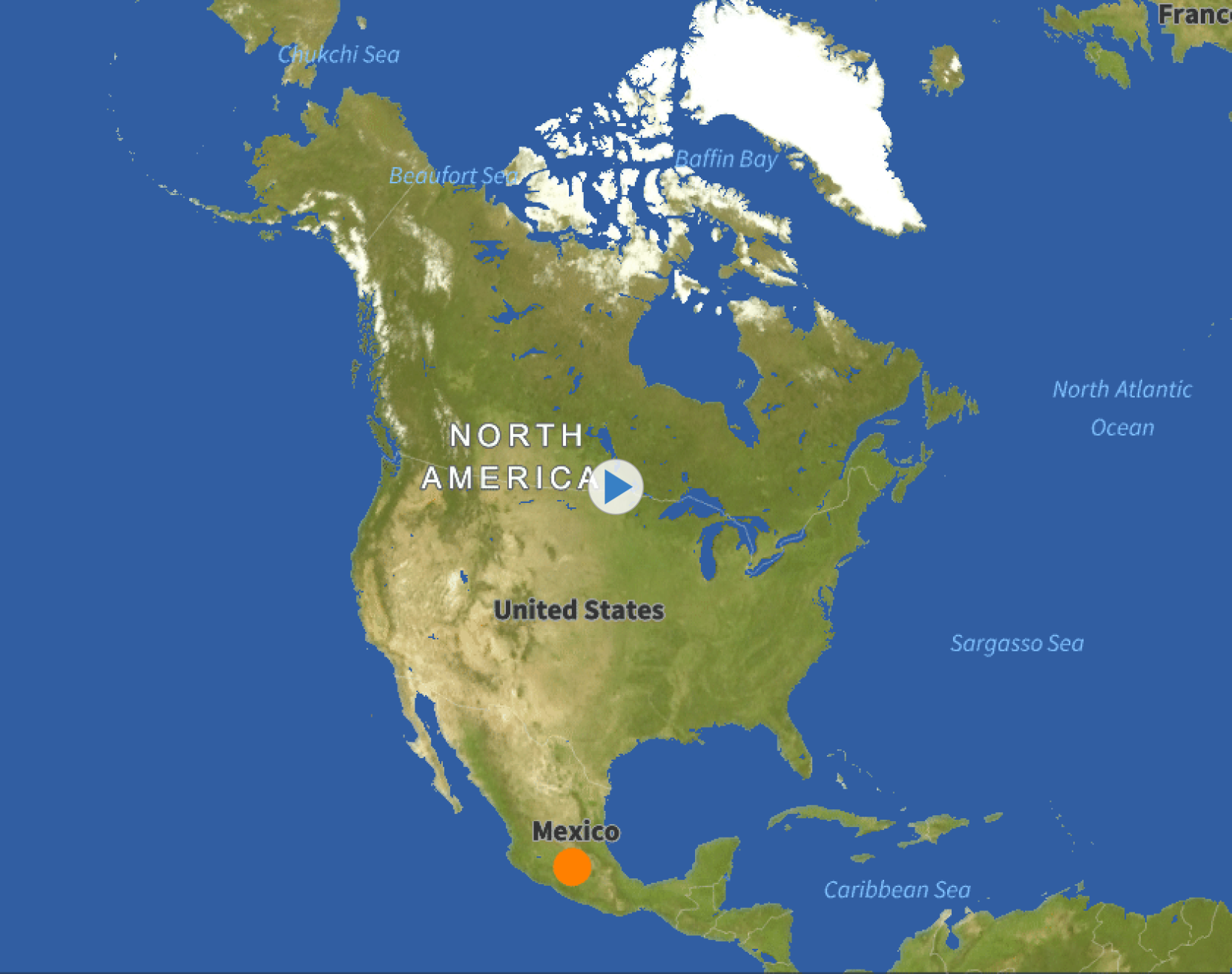
Mapping the list of coordinates onto the monarchPlotOnly function to get individual plots:
monarchPlotOnly[#]&/@Values[coordinates]
Monarch Population Map in Sep 2021
This is an example of when the butterflies appear more north. Though the shift is not drastic, these slight shifts are important to note. Majority of these maps visualize the butterflies being at Southern Ontario. However, this map shows the monarchs residing mid-Quebec. This shift in phenology can affect the health of ecosystems, especially since Monarchs are pollinators and many ecosystems depend on them.
This is an example of when the butterflies appear more north. Though the shift is not drastic, these slight shifts are important to note. Majority of these maps visualize the butterflies being at Southern Ontario. However, this map shows the monarchs residing mid-Quebec. This shift in phenology can affect the health of ecosystems, especially since Monarchs are pollinators and many ecosystems depend on them.
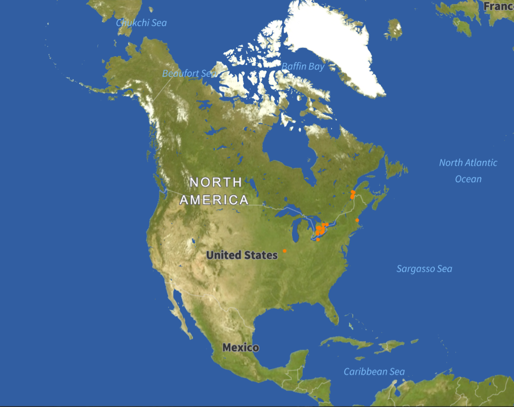
Monarch Population Map in Nov 2025
By November, monarch butterflies are in the midst of their migration journey as it is already in the winter season. Below we see the dots following a sort of diagonal pattern down towards Mexico. It is also visible that eastern Monarch butterflies reside in northeastern US as well.
By November, monarch butterflies are in the midst of their migration journey as it is already in the winter season. Below we see the dots following a sort of diagonal pattern down towards Mexico. It is also visible that eastern Monarch butterflies reside in northeastern US as well.
Temperature Mapping: Combining it with Eastern Monarch Plot
Temperature Mapping: Combining it with Eastern Monarch Plot
Mapping the temperature over Canada, US and Mexico provides a smooth surface of visual color analysis of different temperature ranges. As the map is combined with eastern Monarch plot, it is easier to see the monthly temperature at the time the butterflies have been observed. This can help directly assess the relationship between temperature and Monarch population.
Importing a list of all the relevant months in DateObject form
Import list of only coordinates for data processing
In addition to population over the years, getting to understand how temperature changes can further the analysis. The goal of this part is to produce of visualization on a map of temperatures in different locations with the points of the eastern Monarch butterflies.
The temperature data is going to be pulled from the Wolfram datasets using the function WeatherData. Beforehand, the data needs to be cleaned as some data points could be missing. That is also considered a limitation.
The temperature data is going to be pulled from the Wolfram datasets using the function WeatherData. Beforehand, the data needs to be cleaned as some data points could be missing. That is also considered a limitation.
The latRnage and lonRange encapsulates Canada, US and Mexico.
Extract the exact coordinates within the range of coordinates. This creates a list of coordinates that can be used throughout the coding process.
Checks the list of data points for missing values and deletes those cases
This is an example of pulling weather data. This is done in specification to the coordinate points that are relevant.
This process is done in intervals because the data of Monarch butterfly populations is not being recorded continuously throughout the year. The pattern is that the data is collected from August to October or December (not considering the Mexico data that was added onto the first dataset on the basis of external research).
Note that the mean temperature encapsulates several times throughout one day. This includes the cooler measurements at dawn and dusk.
The function meanConvert takes in the lists of data like tempsATlatLONG1 and cleans the TimerSeries values within the sublists and then calculates the mean of each TimeSeries to get the mean temperature of the month in that specific coordinate. Lastly, it creates a nested list of coordinates with their respective mean temperature.
Therefore , a future function can process the data accordingly.
The meanConvert function is mapped onto each list of data points and turned into an Object like below:
mapTemperature takes the formatted data from meanConvert and feeds it into the ListDensityPlot function to create a heat map of Canada, US and Mexico. This is then put on a GeoImage with a bar legend of values at the side.
As ListAnimate will be used later on to create a motion video, individual heat maps for every month are being made using the Table function on top of the map Temperature function.
Below is how the small lists of temperature maps were combined. First calls the actual data from the Iconized object and Flatten takes away the sublist structures.
Below is an example of the motion video of just Temperatures being mapped. (run the allMapsData again)
The monarchPlot function differs from the monarchPlotOnly function.
The added option of GeoBackground None allows the overlay function to combine the monarch population points with the temperature map seamlessly. In addition, the points are now black to optimize visibility.
listofMaps is a list of all the monarch population points by month.
The Table function iterates through all the coordinates and months as both are arguments to the function. It is expected that the number of coordinates equals to number of months.
Monthly Motion Video of Temperature and Population Together
Qualitative Analysis: Temperature and Monarch Population
Qualitative Analysis: Temperature and Monarch Population
Temperature and Population Plot in September 2024
In this diagram, the monarch butterflies have not started their migration yet as they are residing in the north and not progressing down the south of United States. Despite the temperatures being cooler at this time, the points (butterflies) are strictly in the white zone rather than the brighter blue. This demonstrates their requirements for moderate temperatures.
Temperature and Population Plot in September 2025
This shows a different phenology and pacing entirely from the previous year. The points show that the butterflies have begun migration already as the points appear in the southern parts of United States. They are still staying in the white and yellow zone where moderate temperatures lie. This reveals the shifting phenology of monarch butterflies which is of great environmental significance. If the timing of migration changes from year to year, the ecosystems that monarch butterflies visit can be affected as well since they are pollinators. A possible hypothesis: The earlier they appear in the ecosystem, the plants may not have bloomed and for that year there will be less pollinated plants which endangers many ecosystems.
Quantitative Analysis: Temperature vs. Population
After visualizing the migration pattern, the next step is to analyze it through the fluctuating population count and temperature values. The goal here is to determine a mathematical relationship between population count and temperature. This is significant because it can generalize and better define how temperature affects Monarch population.
The plot will aim to visualize the change in population count in a specific location over time against the change in temperature in that specific location.
The plot will aim to visualize the change in population count in a specific location over time against the change in temperature in that specific location.
The coordsList association formats the coordinates and population in a way where the population over time for every coordinate point .
The goal is to choose locations that have the most data on population and assess their population change. This is because not every location has consistently collected data; this is a limitation in the dataset being used.
From the coordinates that have been formatted, the first two coordinates that I choose to analyze are both in Mexico and in different states of Mexico.
Using GeoIdentify to recognize the state that each coordinate resides in.
The first analysis will be of the State of Mexico, Mexico which displays a wide range of fluctuation in population over the years.
Import association of coordinates with corresponding month
stateofMexPop grabs the values of populations associated with the coordinate.
dateSearch goes back to the coordinates association and takes out any Key(labeled with the month)that is associated with the specific coordinates.
ToString turns the Key into a string and then the outer Table function takes every one of those strings and turns them into a DateObject.
Both data points with lots of observations come from different states in Mexico. This may imply either that the monarchs are easier to be observed in Mexico because of higher activity levels.
dataPair is a function that retrieves the temperature data from the months that are inserted in the argument.
WeatherData takes the temperature from the Wolfram dataset . dataPair cleans the function twice, once in the TimeSeries itself and once in the sublists with the coordinates as sometimes there is no TimeSeries Data available at all.
Temps is the object for the temperatures that occurred in the State of Mexico (specified through the GeoPosition function).
These measurements of Temps is going to be the mean of the temperature throughout the day. This explains why the mean temperature is lower than expected for Mexico as dawn and dusk can have lower temperatures.
Take the mean of each TimeSeries within the sublist.
Temps1 is the object that represents the temperatures for Michoacan, Mexico—the second hotspot of observation for Monarch butterflies.
The population will be plotted through points (which is achieved rather than a line graph as the observations are not constant. Note that the count that is being visualized may not be the exact population count of butterflies at a specific location at the time as eastern Monarch butterflies travel in clusters.
Transpose pairs up the population and dates into sublists for the DateListPlot to process the data.
Joined -> False option in the DateListPlot turns a line graph into scatter plot format. The varying visibility in Frame prepares the plot to be overlaid.
Joined -> False option in the DateListPlot turns a line graph into scatter plot format. The varying visibility in Frame prepares the plot to be overlaid.
Meanwhile, temperature will be portrayed in a line graph as the data is continuous and it is easier to visualize their fluctuations in such a way.
Note: the missing points are assumed to be migrating back North after their overwintering period.
Eastern Monarch Population and Temperature (2021-2024) in State of Mexico
The great dips in population correlate with the big dips in temperature every year. At the start, with maximum temperature, the population was at its max and then it decreased significantly when the temperature reached its lowest points. However, from 2023 to 2024, despite the temperature rising back up, the butterfly population barely increased or stayed the same. A hypothesis for this is perhaps the butterflies found another location in Mexico to overwinter but the question is why? and Where?
Eastern Monarch Population and Temperature (2021-2024) in State of Mexico
The great dips in population correlate with the big dips in temperature every year. At the start, with maximum temperature, the population was at its max and then it decreased significantly when the temperature reached its lowest points. However, from 2023 to 2024, despite the temperature rising back up, the butterfly population barely increased or stayed the same. A hypothesis for this is perhaps the butterflies found another location in Mexico to overwinter but the question is why? and Where?
Eastern Monarch Population and Temperature (2021-2025) in Michoacan Mexico
The temperature changes here are similar to that of the State of Mexico (previous plot); while the population count pattern is different. It is not significant to focus too much on the actual individual values of population as each observation center is different and have different circumstances when it comes to recording. This population change goes along with the fluctuations in temperature: as the temperature rises, the population rises back up. Comparing population in State of Mexico at the start of 2023 with the population in Michoacan at the start of 2023, most of the butterflies are in Michoacan (despite similar temperatures). The similar decrease in population during Jan 2024 in both states suggest either their phenology changing and they are migrating back sooner or the butterflies found a new location in Mexico. However, it is important to note that out of the Mexico dataset, these two states were the hotspots in population throughout 2022 to 2025.
The temperature changes here are similar to that of the State of Mexico (previous plot); while the population count pattern is different. It is not significant to focus too much on the actual individual values of population as each observation center is different and have different circumstances when it comes to recording. This population change goes along with the fluctuations in temperature: as the temperature rises, the population rises back up. Comparing population in State of Mexico at the start of 2023 with the population in Michoacan at the start of 2023, most of the butterflies are in Michoacan (despite similar temperatures). The similar decrease in population during Jan 2024 in both states suggest either their phenology changing and they are migrating back sooner or the butterflies found a new location in Mexico. However, it is important to note that out of the Mexico dataset, these two states were the hotspots in population throughout 2022 to 2025.
Is there a relationship between temperature and shifting migration patterns?
Is there a relationship between temperature and shifting migration patterns?
Through looking at the charts plotted, it is unclear if there is a relationship between the two variables temperature and population count. Therefore, a Pearson Correlation Coefficient test can be run for further conclusions.
The Pearson Correlation Coefficient is a value that dictates the magnitude and existence of a correlation between two variables. The formula takes in the two variables that match together and calculates that value, known as the r-value.
If the r value is positive, it suggests a positive correlation between the variables. As one variable increases, the other variable increases as well. (or it can happen with variables decreasing too) If the r value is zero, it suggests no correlation between the two variables. If the r value is negative, it suggests a negative correlation between the variables. As one variable increases, the other variable decreases. The greater the magnitude of the r value, the stronger the correlation (whether positive or negative).
The Pearson Correlation Coefficient is a value that dictates the magnitude and existence of a correlation between two variables. The formula takes in the two variables that match together and calculates that value, known as the r-value.
If the r value is positive, it suggests a positive correlation between the variables. As one variable increases, the other variable increases as well. (or it can happen with variables decreasing too) If the r value is zero, it suggests no correlation between the two variables. If the r value is negative, it suggests a negative correlation between the variables. As one variable increases, the other variable decreases. The greater the magnitude of the r value, the stronger the correlation (whether positive or negative).
Preparing the data points
Preparing the data points
First, the data points from the plots must be matched together. The matching temperature value needs to be paired up with the matching population count. Matching as in on the same x value (time frame) as one another.
State of Mexico Data Analysis
Using TimeSeriesThread, the data points that match on the plot are paired together into sublists. QuantityMagnitude turns the DegreesCelsius objects to values that the CorrelationTest function can use.
This function does the calculation for the r-value and p-value.
Another value that the function calculates is the p-value. This is a measurement of the probability of data occurring because of random chance. If the p-value is less than or equal to 0.05 , the data is most likely to have a relationship and reason to occur. If the p value is greater 0.05, the data is most likely to be random.
The 0 added tells the function to test a null hypothesis which means testing if the data is not correlated at all.
Looking at the r-value(Statistic), it is positive but of low magnitude. There is a possibility that temperature and the population in State of Mexico is positively correlated. However, when looking at the p-value, it is significantly greater than 0.05. Therefore, the data has most likely occurred from random chance.
Michoacan Data Analysis
The same procedure is done here
Comparing to the data in the State of Mexico, the chances of correlation are even lower.
Therefore, it can be concluded that temperature is not a main factor for the shifting migration destinations and phenology of monarch butterflies.
Therefore, it can be concluded that temperature is not a main factor for the shifting migration destinations and phenology of monarch butterflies.
Plotting Wind Speed and Direction
After analyzing temperature, wind speed and direction is the next variable. The goal is similar: to plot wind vectors onto a map to see how specific locations have different wind speed and direction. These are known to be direct factors to how eastern monarch butterflies navigate themselves. This plotting will reveal how wind speed and direction can specifically change patterns.
dataHelp grabs the wind vector data from Wolfram dataset by specifying location and month. Table iterates through the gridPoint list and months.
This is an example of how each specific dataset for the relevant months is collected.
In[]:=
AugtoOct2021WindData = Iconize[Table[dataHelp[x], {x, 3}], "AugtoOct2021WindData"];
Setting the RegionFunction and GeoRange to the same coordinate range as other plots allows the plot to be overlaid. Automatic VectorScaling varies the size of the arrows with respect to the wind speed.
Monthly Motion Video with Wind Vectors and Eastern Monarch Population
Qualitative Analysis: Wind Vectors and Population
Qualitative Analysis: Wind Vectors and Population
Wind Vectors and Population Map in September 2024
(most arrows are small in magnitude, so direction will be the focal point of analysis) In September 2024, the eastern Monarch butterflies are starting to migrate down south. The wind directions pointing down aligns with the claim that they use wind to their advantage. It is important to note that the winds are point down south in the north but in central United States, they start veering to the left and going up. Therefore, it can be concluded that these winds provide temporary support rather than long term advantages for the butterflies. They have to count on the winds for the next few days to be in their favor. Going back to the motion video, in November 2024, the population density in Mexico was one of the lowest records throughout the dataset.
(most arrows are small in magnitude, so direction will be the focal point of analysis) In September 2024, the eastern Monarch butterflies are starting to migrate down south. The wind directions pointing down aligns with the claim that they use wind to their advantage. It is important to note that the winds are point down south in the north but in central United States, they start veering to the left and going up. Therefore, it can be concluded that these winds provide temporary support rather than long term advantages for the butterflies. They have to count on the winds for the next few days to be in their favor. Going back to the motion video, in November 2024, the population density in Mexico was one of the lowest records throughout the dataset.
Wind Vectors and Population Map in September 2025
In September 2025, the winds are all going upwards and veering to the right. The butterflies cleverly take advantage of these winds and change paths to go by the east coast and down south where the winds finally descend down. These winds are also slightly weaker than the winds in September 2025 which can explain their progress through the migration journey despite adversary winds. Fast forward to November 2025, the population density in Mexico was significantly higher than 2024.
Therefore, a new hypothesis is that the wind direction can dictate how soon the butterflies get to their destinations and how many get to their destinations as well. However this must be further tested as the data here is not extensive enough for a deep timeline analysis.
Milkweed and Monarch Analysis
Eastern Monarch migration roosting sites are dictated by many factors as these butterflies require specific microclimate requirements. For example, they need moderate temperatures and milkweed. In fact, eastern Monarch butterflies rely solely on this plant for food , resting places and laying eggs. Aside from temperature and wind speed/direction, another important factor that may be explaining the shifting migration patterns of these butterflies is the abundance of milkweed and their distribution.
This analysis is not as extensive since the data collected has been published in 2024 and so it cannot be confirmed when these observations were made exactly. Nonetheless, visualizing the data will help contextualize and compare eastern Monarch population versus Milkweed population (US Counties Monarch and Milkweed Presence View, 2026).
Note: these populations are separate from the ones being analyzed and have been collected in conjunction with the milkweed population from the same source. This is why we can confidently make this comparison. In addition, the date is not specified on these. It could have been data points collected over a time period.
This analysis is not as extensive since the data collected has been published in 2024 and so it cannot be confirmed when these observations were made exactly. Nonetheless, visualizing the data will help contextualize and compare eastern Monarch population versus Milkweed population (US Counties Monarch and Milkweed Presence View, 2026).
Note: these populations are separate from the ones being analyzed and have been collected in conjunction with the milkweed population from the same source. This is why we can confidently make this comparison. In addition, the date is not specified on these. It could have been data points collected over a time period.
stateRules takes in the dataset values in Association form and extracts the milkweed count and the states separately. The states are then converted to entity values .
With the newly formatted data, GeoRegionValuePlot is used to create a map using colors to express varying population densities of milkweed.
Note: the darker colors do indicate NO MILKWEED
Common Milkweed Population by State
The common milkweed, Asclepias syriaca, seems very concentrated in the west coast of California. This explains why the small population of Monarch Butterflies in California do not migrate. Besides that, the majority of the milkweed resides in the northeastern coast. This explains why part of their habitat is in Canada and northeastern United States. The diagonal descent from northeast to Texas and onwards Mexico has a slight decrease in milkweed concentration.
The common milkweed, Asclepias syriaca, seems very concentrated in the west coast of California. This explains why the small population of Monarch Butterflies in California do not migrate. Besides that, the majority of the milkweed resides in the northeastern coast. This explains why part of their habitat is in Canada and northeastern United States. The diagonal descent from northeast to Texas and onwards Mexico has a slight decrease in milkweed concentration.
Eastern Monarch Population by State
There are no eastern Monarch butterflies observed in the west coast at all. This could be because the associated observation stations were not there but note that most monarch butterfly populations do reside in Northeastern United States. The data here matches with the abundance of milkweed data. They reside in areas where milkweed is most abundant. Given the ambiguity of when the data was collected, the data sort of connects with the visual motion video where points were descending from the Canada-US border to the southeastern coast. Therefore, there is a significant correlation between milkweed and monarch populations.
There are no eastern Monarch butterflies observed in the west coast at all. This could be because the associated observation stations were not there but note that most monarch butterfly populations do reside in Northeastern United States. The data here matches with the abundance of milkweed data. They reside in areas where milkweed is most abundant. Given the ambiguity of when the data was collected, the data sort of connects with the visual motion video where points were descending from the Canada-US border to the southeastern coast. Therefore, there is a significant correlation between milkweed and monarch populations.
Conclusion
Conclusion
In conclusion, through a qualitative and quantitative analysis of temperature, wind vectors and monarch butterfly populations over the seasons in monthly intervals, temperature is not the factor to a decrease in population. The Pearson Correlation Test confirms the absence of temperature’s affect on the shifts in migratory patterns. The mathematical weight of the test leads to a firm conclusion of the null hypothesis. It makes sense as milkweed is adaptable at any temperature and so there can still be suitable roosting sites and habitat for the butterflies to be in. The significance of milkweed is established through the milkweed and Monarch butterfly population analysis. Through that brief analysis, there is a strong positive correlation between concentration of milkweed population and Monarch population. However, wind direction and speed could possibly have an influence on the shifting phenology of butterfly migration. Looking at the adverse winds visualized in the September 2024 plot, it can serve as a possible explanation to the small population that ended up in Mexico in November. The wind direction can have the power to dictate how soon the butterflies arrive at their destination. Given the small size of Monarch butterflies, adverse winds may possibly also have the ability to harm these butterflies .
Future Directions
Future Directions
Despite the findings made in this research, there can still be more done around the topic of Monarch Butterfly Migration and their phenology. There was a brief overview of the milkweed population vs. the monarch butterfly population but further research and analysis should be done with more precise data. Furthermore, more research done on oyamel fir trees and their populations and distributions can reveal more about monarch migration patterns and help identify potential roosting sites for preventative maintenance and mitigation in the future.
Lastly, in a more modern perspective, another possible factor that affects shifting migration patterns are the industrialization trends in Mexico. Construction is increasing and moving more to the north of Mexico. WIth the increasing range of construction sites (inactive or active), the amount of open space for milkweed to grow decreases as well. This project gave possible answers to changing phenology but the question on the specific reasons for decreasing population remains. As seen in the last section, less milkweed equals less monarchs. Therefore, in the future, industrialization trends in Mexico can be further studied alongside monarch butterfly population data (Instituto Nacional de Estadistica y Geografia , 2024) .
Lastly, in a more modern perspective, another possible factor that affects shifting migration patterns are the industrialization trends in Mexico. Construction is increasing and moving more to the north of Mexico. WIth the increasing range of construction sites (inactive or active), the amount of open space for milkweed to grow decreases as well. This project gave possible answers to changing phenology but the question on the specific reasons for decreasing population remains. As seen in the last section, less milkweed equals less monarchs. Therefore, in the future, industrialization trends in Mexico can be further studied alongside monarch butterfly population data (Instituto Nacional de Estadistica y Geografia , 2024) .
Acknowledgements
Acknowledgements
Being able to do this project means a lot to me. I would like to thank Stephen Wolfram for the opportunity to do such research. I would like to thank my advocate and mentor Renata Toro for unwavering support and believing in me. I would also like to thank all the directors who helped me debug. Thank you Eryn, Megan and Rory. Lastly, I would like to thank all the TAs that helped me along the way. Thank you Max, Kaavya, Aanya and Eileen.
References
References
Gallagher, M. (2024, July 2). Ideal Growing Conditions For Milkweed Plants - Green Packs. GreenPacks. https://greenpacks.org/where-do-milkweed-plants-grow/
Google.(2026,Jul 9).Pearson Correlation Normality Test Warning[Generative AI chat].Gemini 3.5 Flash.google.com
Instituto Nacional de Estadistica y Geografia . (2024). Censos Económicos 2024. Resultados oportunos. Inegi.Org.Mx. https://www.inegi.org.mx/programas/ce/2024/
Monarch Watch Monarch Tagging Program. (2026a). Monarchwatch.Org. https://monarchwatch.org/tagging/index.html
Motus Wildlife Tracking System - Explore Data. (2022). Motus.Org. https://motus.org/dashboard/#e=profile&d=species&s=252456&f=%7b%22dtstart%22%3a%222025-06-29%22%2c%22dtend%22%3a%222026-06-29%22%7d
National Park Service. (2017). Pollinators - Monarch Butterfly (U.S. National Park Service). Nps.Gov. https://www.nps.gov/articles/monarch-butterfly.htm
Reppert, S. M., & de Roode, J. C. (2018). Demystifying Monarch Butterfly Migration [Doi: 10.1016/j.cub.2018.02.067]. Current Biology, 28(17), R1009–R1022. https://doi.org/10.1016/j.cub.2018.02.067
Taylor, C. (2023, March 27). Monarch Numbers: Trends Due to Weather and Climate - Monarch Watch. Monarch Watch. https://monarchwatch.org/blog/2023/03/27/monarch-numbers-trends-due-to-weather-and-climate/
CITE THIS NOTEBOOK
CITE THIS NOTEBOOK
Investigating shifting monarch butterfly migratory patterns
by Ava Fan
Wolfram Community, STAFF PICKS, July 9, 2026
https://community.wolfram.com/groups/-/m/t/3752821
by Ava Fan
Wolfram Community, STAFF PICKS, July 9, 2026
https://community.wolfram.com/groups/-/m/t/3752821