Wolfram 視覺化 | 值得嘗試的事情
Wolfram 視覺化 | 值得嘗試的事情
透過點擊程式碼內部並按下 可以編輯並執行任何程式碼.
+
科學、資料和函數視覺化。Wolfram 視覺化功能簡化並自動創建用在了解個人探索、報告和已發表論文的所有資料和函數的繪圖。
以視覺方式探索資料
以視覺方式探索資料
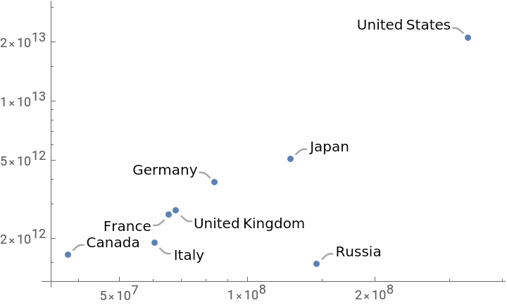
使用數十種可用的繪圖類型來視覺化資料趨勢: |
ListPlot[{"Population","GDP"}]["Name"],ScalingFunctions{"Log","Log"}

Out[]=
使用圓餅圖輕鬆地將比例視覺化: |
PieChart["Population"],ChartLabels->["Name"]
使用長條圖輕鬆比較不同類別的資料: |
BarChart["Population"],ChartLabels->["CountryCode"]
在多階層組織中標記並視覺化資料: |
BarChart,,ChartLabels->["CountryCode"],None,ChartLegends->{"2005","2020"}

設計您的圖表
設計您的圖表
定義與繪製一組函數: |
functions=Table[BesselJ[n,x],{n,4}];Plot[Evaluate[functions],{x,0,10}]
使用 |
Plot[Evaluate[functions],{x,0,10},PlotTheme->"Detailed"]
建立一個顯示不同主題的列表,方便比較: |
Table[Plot[Evaluate[functions],{x,0,10},PlotTheme->theme,PlotLabel->theme],{theme,{"Minimal","Marketing","Monochrome"}}]
單獨設定選項或將選項與整體主題組合: |
Plot[Evaluate[functions],{x,0,10},PlotTheme->"Marketing",PlotLegends->"Expressions"]
標示您的圖表
標示您的圖表
使用 |
countrydata=,;countrynames=["Name"];
視覺化檢索到的資料: |
ListLogLogPlot[countrydata]
使用元資料自動標籤每個資料點(不適合的標籤會自動產生為提示框): |
ListLogLogPlot[countrydata->countrynames]
包括框架和整體標題的標籤以完成視覺化: |
ListLogLogPlot[countrydata->countrynames,Frame->True,PlotLabel->"Per capita GDP vs. Population for all Countries",FrameLabel->{"People","USD per person per year"}]
繪圖函數
繪圖函數
在指定域內繪製單變數函數: |
Plot[Tan[x],{x,-3Pi/2,3Pi/2}]
在指定的參數範圍內繪製參數函數: |
ParametricPlot[{Cos[Pit]*GoldenRatio^t,Sin[Pit]*GoldenRatio^t},{t,0,6}]
使用 3D 版本的繪圖函數: |
ParametricPlot3D{Cos[πt](+Cos[v]),(+Cos[v])Sin[πt],4t-Sin[v]},{t,0,5},{v,0,2Pi},
t
GoldenRatio
t
GoldenRatio
使用選項製作函數的風格化 3D 繪圖: |
Plot3DTan+,{x,y}∈Disk[{0,0},10,{Pi/2,3Pi/2}],
2
x
2
y
使視覺化具有互動性
使視覺化具有互動性
輕鬆建立互動式顯示: |
ManipulateParametricPlot3D,{t,0,tmax},{v,0,vmax},,{{vmax,2Pi,"Maximum v parameter"},Pi/2,2Pi},{{tmax,3,"Maximum t parameter"},1,5},ControlPlacement->Top,SaveDefinitions->True,TrackedSymbols:>{vmax,tmax}
Out[]=


視覺化向量場
視覺化向量場
視覺化偶極子的電場線: |
In[]:=
StreamPlot3D-,{x,-3,3},{y,-3,3},{z,-3,3}
{x,y,z-1}
3
Norm[{x,y,z-1}]
{x,y,z+1}
3
Norm[{x,y,z+1}]
繪製複數函數
繪製複數函數
視覺化體積資料
視覺化體積資料
創建地理圖形
創建地理圖形