Wolfram 知識ベース | 試してみよう
Wolfram 知識ベース | 試してみよう
コードはどれも,コード内をクリックしてから,編集したり, を押して実行したりできます.
+
現実世界のデータへの迅速なアクセス 何百もの重要な領域において注意深く精選され,今も増加し続けるデータのコレクションは,Wolfram言語全体にシームレスに統合されており,これを使って計算や可視化を行うことができます.
地理データを使った計算
地理データを使った計算
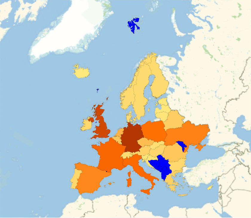
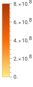
地理データを使って地図を作成する(この評価には時間がかかる場合がある): |
In[]:=
GeoRegionValuePlot->"GreenhouseGasEmissions",MissingStyle->Blue

Out[]=
各国のデータの集合を取得する: |
In[]:=
rawdata=EntityValueEntityClass["Country","Countries"],,,,;

欠損データを削除し,大陸別にグループ分けする: |
In[]:=
cleandata=GroupBy[DeleteMissing[rawdata,1,1],Last,MapApply[Function[{pov,gdp,pop},{pov,QuantityMagnitude[gdp],pop}]]];
きれいになったデータをプロットする: |
In[]:=
BubbleChartcleandata,
物理数量を使った計算
物理数量を使った計算
スペクトル線のクラスについての波長を取得する: |
In[]:=
wavelengths=EntityValue,;
これらの線を可視スペクトルでプロットする: |
In[]:=
GraphicsMap[{ColorData["VisibleSpectrum"][#],Line[{{#,0},{#,1}}]}&,QuantityMagnitude[wavelengths,"Nanometers"]],
物質についての熱力学データを取得する: |
In[]:=
substances={"Water","Methanol","Octane"};temps=Quantity[Range[1,130],"DegreesCelsius"];densitydata=Table[{temps,ThermodynamicData[substance,"Density",{"Temperature"->temps}]}//Transpose,{substance,substances}];
取得したデータを可視化する: |
In[]:=
ListLinePlot[densitydata,AxesLabel->Automatic,PlotLegends->substances]
プロットの中の急激な密度低下と既知の沸点を比較する: |
In[]:=
EntityValue[Interpreter["Chemical"][substances],"BoilingPoint","Association"]
生物・生態データを使った計算
生物・生態データを使った計算
解剖学的構造の部位を3Dでプロットする: |
In[]:=
AnatomyPlot3D,
解剖学の実体を比較する: |
In[]:=
organs=,,;properties={"Mass","CellCount"};ListPlot[EntityValue[organs,properties,"Association"],AxesLabel->properties]
生体分子配列を定義してその構造的特性を調べる: |
In[]:=
insulin=;MoleculePlot[Molecule[insulin]]
データ取得のための実体クラスを定義する: |
In[]:=
endangeredMammal=EntityClass"TaxonomicSpecies",->,->;
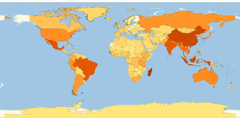
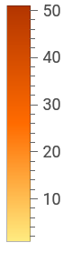
絶滅危惧種の哺乳類の生息数を国別に可視化する: |
In[]:=
GeoRegionValuePlot[EntityValue[endangeredMammal,"ObservationCountries"]//Flatten//Tally]
Out[]=
金融データの解析
金融データの解析
金融データを取得して,標準形式で提示する: |
In[]:=
TradingChart["GE",{"Volume","SimpleMovingAverage","BollingerBands"}]
テキストから金融実体を解釈する: |
In[]:=
stocks=Interpreter["Financial"][{"GOOGL","MSFT","AAPL"}]
時間の経過に伴うこれらの実体の資産を比較する: |
In[]:=
property=;DateListPlotEntityValuestocks,Datedproperty,Interval,Yesterday,PlotLegendsCommonName[stocks]
社会文化データを使った計算
社会文化データを使った計算
ある芸術家の作品のジャンルを可視化する: |
In[]:=
genres=EntityValueEntityClass"Artwork","Artist"->,"ArtGenre"//Flatten;PieChart[Counts[genres],ChartLabels->Automatic]
非明示的に定義された城のクラスから,建築着工日を取得する: |
In[]:=
castleAndYear=EntityValueEntityClass"Castle",->,"ConstructionStartDate","NonMissingEntityAssociation";
時代による傾向を見る: |
In[]:=
DateHistogram[castleAndYear,{{900},{1300},"Decade"}]
特に活発な時代からのデータを整理する: |