Audio Spectrogram
Audio Spectrogram
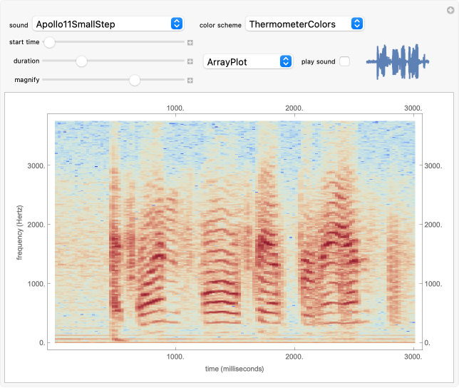
The spectrum of a signal shows how the signal can be decomposed into its constituent sinusoidal elements. This is typically shown as a plot of frequency (on the horizontal axis) versus magnitude (on the vertical axis). Missing from this description is the idea that the signal may change as time passes: speech changes rapidly from syllable to syllable, music changes with each new phrase, most things do indeed change with time. This can be captured using the short-time Fourier transform (STFT), which breaks a signal apart into small pieces and analyzes the pieces with the standard Fourier method. The output of the STFT is plotted as a spectrogram: time moves on the horizontal axis, frequency is on the vertical axis, and magnitude is shown by color (usually hue or brightness). This Demonstration provides a concise spectrogram function and applies it to the sounds in the Wolfram-curated dataset.
Details
Details
The spectrogram is a classic signal processing technique that shows how the spectral content of a signal changes over time. The horizontal axis represents time (in this implementation time is displayed in milliseconds) while the vertical axis represents frequency (in Hz). The magnitude of each frequency component is shown by the color. With the default "ThermometerColors," large amplitudes are red while small amplitudes are blue, though you can change the color scheme using the "color scheme" dropdown menu. The sound to be analyzed can be any of the curated sounds in the Wolfram library. One slider controls when the display starts and another controls the duration of the display, and the sound can be heard (assuming you have speakers or headphones attached to the computer) by clicking the "play sound" checkbox. Adjacent to this box is a small plot of the time waveform of the signal that is analyzed in the larger display area. The "magnify" slider scales the vertical (frequency) axis and acts as a kind of zoom into the low frequency region. Finally, the plot can displayed as an ArrayPlot, a MatrixPlot, a ReliefPlot, or a ContourPlot.
External Links
External Links
Permanent Citation
Permanent Citation
William Sethares
"Audio Spectrogram"
http://demonstrations.wolfram.com/AudioSpectrogram/
Wolfram Demonstrations Project
Published: June 3, 2012