COVID-19—The Swedish Experiment

Is It Working?
Jan Brugård
CEO Wolfram MathCore
May 15, 2020
In this document, I try to cover the spread of COVID-19 in Sweden and how it has correlated with statements and decisions from the Public Health Authority of Sweden. In doing so, I have used publicly available data from their site as well as media (references given in the text).
So let me start by loading data for Sweden:
In[]:=
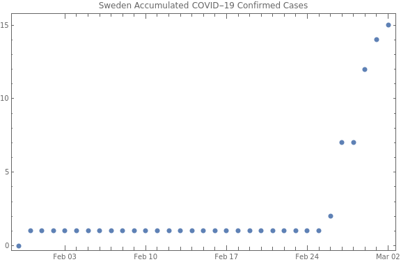
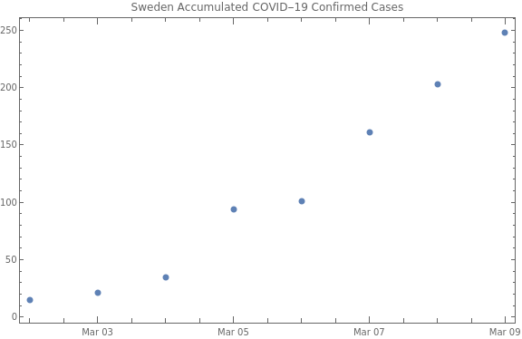
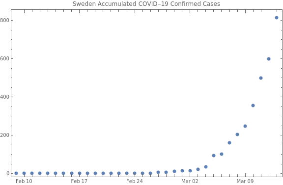
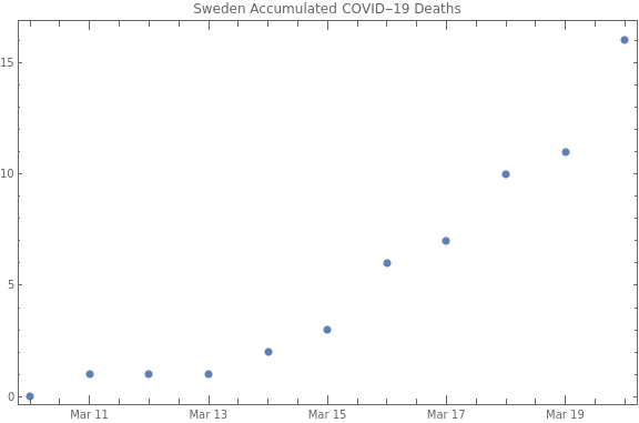
rawCovidData=ResourceData["Epidemic Data for Novel Coronavirus COVID-19"];​​confirmedCases=Normal[rawCovidData[GroupBy["Country"],Total,"ConfirmedCases"]];​​confirmedDeaths=Normal[rawCovidData[GroupBy["Country"],Total,"Deaths"]];​​confirmedCasesSweden=TimeSeriesWindow[confirmedCases[[Key[CountryData["Sweden"]]]],{{2020,1,30},{2021,1,28}}];​​confirmedDeathsSweden=TimeSeriesWindow[confirmedDeaths[[Key[CountryData["Sweden"]]]],{{2020,1,30},{2021,1,28}}];
The first known case of COVID-19 in Sweden was reported on January 31. The infected person had just returned from a trip to China. On February 5, the Swedish authorities announced that people returning from trips in China should contact healthcare in case they showed any symptoms. On February 25, the authorities upgraded the risk of finding infected people in Sweden to high. One day later, on February 26, the second case was reported. This time it was a person returning to Gothenburg from Italy. The day after, five new cases were reported. Two of them had been found through tracing and had been infected by the second patient, one had been infected in Italy, one in Germany and one in Iran. The latter was the first known case in Stockholm. This is what the initial period looked like:
In[]:=
DateListPlot[TimeSeriesWindow[confirmedCasesSweden,{{2020,1,30},{2020,3,2}}],​​ImageSizeLarge,PlotRangeAll,JoinedFalse,​​PlotLabel"Sweden Accumulated COVID-19 Confirmed Cases"]
Out[]=
On March 2, the Public Health Authority of Sweden requested that IranAir's flights from Iran be canceled to prevent spread from Iran. The same day, they announced that the risk of encountering new cases in Sweden was increased to very high. The day after, they recommended testing of all people returning from northern Italy if they showed any symptoms within 14 days, and on March 6, the Foreign Ministry of Sweden issued a recommendation to avoid travels to northern Italy. At the same time, the number of reported cases started to increase:
In[]:=
DateListPlot[TimeSeriesWindow[confirmedCasesSweden,{{2020,3,2},{2020,3,9}}],​​ImageSizeLarge,PlotRangeAll,JoinedFalse,​​PlotLabel"Sweden Accumulated COVID-19 Confirmed Cases"]
Out[]=
On March 9, a total of 250 people had tested positive, and on March 10, the Public Health Authority stated that they could now see a broader spread (SAMHLLSSPRIDNING) in Sweden. They made it clear that anyone, especially the elderly, who showed any symptoms should limit their social interaction. The day after, on March 11, a recommendation to limit public gatherings to a maximum of 500 people was issued. The same day the WHO declared COVID-19 a pandemic. On March 13, they declared a new phase in the fight against the pandemic. The focus was on delaying the spread and protecting the elderly. The country’s chief epidemiologist, Anders Tegnell, stated:
The important thing is that everyone takes their responsibility and stays at home when they are not healthy and for safety two days after one has become healthy and not shown any symptoms at all.
At this time, a total of 800 people had tested positive:
In[]:=
DateListPlot[​​TimeSeriesWindow[confirmedCasesSweden,{{2020,2,9},{2020,3,13}}],​​ImageSizeLarge,PlotRangeAll,JoinedFalse,​​PlotLabel"Sweden Accumulated COVID-19 Confirmed Cases"]
Out[]=
The first death from COVID-19 in Sweden had been reported two days earlier, i.e. on March 11, and deaths started to slowly grow from there:
In[]:=
DateListPlot[​​TimeSeriesWindow[confirmedDeathsSweden,{{2020,3,10},{2020,3,20}}],​​ImageSizeLarge,PlotRangeAll,JoinedFalse,​​PlotLabel"Sweden Accumulated COVID-19 Deaths"]
Out[]=
On March 16, persons over 70 years were recommended to restrict their social contacts as much as possible, and a recommendation to work from home if possible was issued. On March 17, high schools and colleges were recommended to begin remote teaching. The following days new recommendations were added, including travel recommendations (March 19), limitations for restaurants (March 24) and further restrictions on gatherings, limiting them to a maximum of 50 people (March 27). As you probably have noted by now, the measures taken were mainly recommendations and almost no bans.
At this time, media around the world had started to write about the Swedish experiment, as in these articles:
"Sweden bucks global trend with experimental virus strategy"
(Financial Times, March 25), New York Times, "Sweden goes against the current: full means of transport and open offices" (Repubblica, March 26, in Italian) and "The Swedish exception" (El País, April 3, in Spanish).
During April, there were only minor adjustments to the recommendations. So how has the Swedish experiment worked so far?
In[]:=
Column[​​{​​DateListPlot[​​TimeSeriesWindow[confirmedCasesSweden,{{2020,1,31},{2020,5,10}}],​​ImageSizeLarge,PlotRangeAll,JoinedFalse,​​PlotLabel"Sweden Accumulated COVID-19 Confirmed Cases"],​​DateListPlot[​​TimeSeriesWindow[confirmedDeathsSweden,{{2020,1,31},{2020,5,10}}],​​ImageSizeLarge,PlotRangeAll,JoinedFalse,​​PlotLabel"Sweden Accumulated COVID-19 Deaths"]​​}​​]
Out[]=
The periodic trend that is seen (the step-like behavior in deaths) is explained by underreporting during weekends and holidays. There have been more than 3,000 fatalities as of this writing, which is among the highest reported rates per capita in the world. If we count per known case, the rate is also very high:
That is, there is a case fatality rate of more than 10%, so it looks like Sweden is not doing that well. But is that the whole truth?
The New York Times has a continuously updated feature in which they compare the excess deaths and official COVID-19 numbers for several countries, including Sweden. If there is a big difference between these, then it is likely due to some problem in the COVID-19 reporting. For instance, Ecuador (where I grew up) reported 1,561 COVID-19 fatalities during March and April. However, they had 10,100 fatalities more than normal during this same period. In contrast, Sweden reported 2,996 COVID-19 deaths from March 16 to May 3, compared to 3,300 excess deaths. In other words, the reliability of reported numbers seems to vary a lot from one country to another. This is the full table from the New York Times:
So let us look a a bit more at the data from Sweden. On May 11, Statistics Sweden reported that the excess deaths in Sweden were going down (but with variations throughout the country). This trend is easier to spot in a logarithmic plot:
However, let us compare the numbers with the total number of deaths in Sweden this year, compared to other years. This data is continuously provided by Statistics Sweden, so I downloaded the data as an Excel spreadsheet on May 14. Let’s import that data:
The sudden drop on day 60 in some years is because it represents February 29, and the drop near day 130 for 2020 is likely due to a lag in reporting. For the first 80 days, i.e. until March 20, the death toll is quite average, or actually even less than average. Thus, when the media started to write about the Swedish experiment, death tolls were still as expected. However, after that it is obvious that we have been way above the average, even though lately, just as Statistics Sweden says, the death tolls are getting closer to normal again. Note that there is always a couple of days delay in the reporting, so the last couple of points are less reliable.
An interesting thing to look at is how we compare in the total for each year. So let us take the total for the first 125 days (January 1 through May 4):
Note that the leap years, i.e. 2016 and 2020, have one extra day compared to the others. 2020 is slightly higher than the second worst year, but as can be seen, the difference is not striking.
One thing to notice is that Sweden's population has increased during this period, so to be fair one should take this into account. Using the population at the end of the previous year (as reported by Statistics Sweden) to normalize data, we get this graph:
However, if you go back to the graph for daily number of deaths in Sweden, it is clear that Sweden has had a clearly higher death rate than normal in April this year.
So, does this mean that the Swedish Experiment is working? Not necessarily, as it all depends on how far we have come through the pandemic. There is probably still a long way to go, and until we have reliable numbers on the total number of infected, it is not possible to render a verdict.
More on that later.