COVID-19 Progress in Peru Macro Regions: Coast vs. Mountain vs. Jungle

Francisco Rodríguez
Wolfram|Alpha

Background

Every day I’m taking a look at Peru data about COVID-19, and something I have found quite interesting is the fact that the disease has developed very differently in different regions of Peru.
In this repository: https://github.com/jincio/COVID_19_PERU, promoted by José Incio, we’ve been gathering all official data released by the Peruvian government, which can be found here: https://covid19.minsa.gob.pe/sala_situacional.asp.

About Peru Regions

I’ve prepared an EntityStore to handle Peruvian statistical regions (“departamentos”), which are almost exactly the top-level administrative divisions, except the Lima department, which is the union of “Lima” (city) and “Lima Provincias”. So, in this EntityStore, the main difference is that the polygons and values for “Lima” (department) are the union of the “Lima” and “Lima Provincias” entities. There is also information about how these departments can be classified.
Register EntityStore “Departamento”:
EntityRegister[CloudGet["https://www.wolframcloud.com/obj/franciscoj/Published/EntityStoreDepartamentos.m"]]
In[]:=
{Departamento}
Out[]=

Import Data

We will gather the data from the repository and clean it up to get the times series for each department and group of departments (macro region).

Raw data

Import the data from the source:
dashboardDepartamentosBase=Import["https://github.com/jincio/COVID_19_PERU/raw/master/data/otras_fuentes.xls",{"Sheets","Fuente-Dashboard-Departamentos-v2"}];
In[]:=

Data cleanup

Remove empty rows and columns, which may be created when importing data from Excel:
rawData1=DeleteCases[Transpose[DeleteCases[dashboardDepartamentosBase,{""..}]],{""..}];
In[]:=
Get the dates with only a day granularity:
dates=DateObject[Take[DateList[#],3]]&/@rawData1[[1]][[2;;]];
In[]:=
Clean the data. “NA” means not available, and empty values are going to be shown as zero; also, split the column label as field-Departamento, to get the field and form the EntityStore “Departamento” standard name:
rawData2=Replace[{StringSplit[#[[1]],"-"],(#[[2;;]]/.{""0,"NA"Missing["DataNotAvailable"]})},{{t_,e_},v_}{Entity["Departamento",e],tv}]&/@rawData1[[2;;]];
In[]:=
Group data by “Departamento” and convert dated values to time series:
dataByDepartamentoTS=GroupBy[rawData2,FirstLast,Association[Replace[#,(t_v_)(tTimeSeries[Transpose[{dates,Take[v,Length@dates]}],MissingDataMethod{"Interpolation",InterpolationOrder1}]),{1}]]&];
In[]:=
Get aggregated time series for each EntityClass in the “Departamento” EntityStore:
dataClasses=AssociationMap[Function[class,(Total[Values[#]]&/@Transpose[dataByDepartamentoTS[[Key/@EntityList[class]]]])],EntityClassList["Departamento"]];
In[]:=

Classes of classes

Define groups of EntityClass instances in the “Departamento” EntityStore:
classMacro=
Macro Región Centro
DEPARTAMENTO
,
Macro Región Norte
DEPARTAMENTO
,
Macro Región Sur
DEPARTAMENTO
,
Macro Región Oriente
DEPARTAMENTO
,
Lima y Callao
DEPARTAMENTO
;​​classTradicional=
departamentos de la costa
DEPARTAMENTO
,
departamentos de la sierra
DEPARTAMENTO
,
departamentos de la selva
DEPARTAMENTO
;
In[]:=
Create new groups adding the Perú EntityClass:
classMacroPeru=PrependclassMacro,
Perú
DEPARTAMENTO
;​​classTradicionalPeru=PrependclassTradicional,
Perú
DEPARTAMENTO
;
In[]:=
Define a color for plotting each EntityClass:
plotStyleByClass=
Perú
DEPARTAMENTO
Red,
Macro Región Centro
DEPARTAMENTO
Darker@Brown,
Macro Región Norte
DEPARTAMENTO
Blue,
Macro Región Sur
DEPARTAMENTO
Darker@Magenta,
Macro Región Oriente
DEPARTAMENTO
Darker@Green,
Lima y Callao
DEPARTAMENTO
Darker@Yellow,
departamentos de la costa
DEPARTAMENTO
Darker@Yellow,
departamentos de la sierra
DEPARTAMENTO
Darker@Brown,
departamentos de la selva
DEPARTAMENTO
Darker@Green;
In[]:=
Variable to include the primary data source:
datasource=Style["Source: https://covid19.minsa.gob.pe/sala_situacional.asp",Tiny];
In[]:=

Traditional Macro Regions

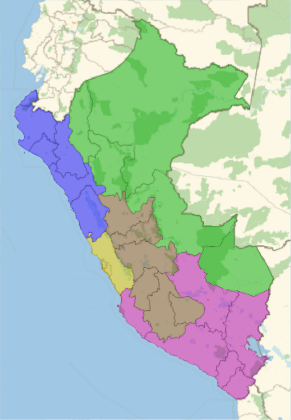
Traditional macro regions in Peru, as they used to be taught in the 1980s, split Peru basically into three regions: costa (coast), sierra (mountain) and selva (jungle). Even though this division is outdated (because not all the mountain region is the same, or not all the jungle shares the same features), we can still group departments using that division to do some statistics. This is how it is split:
GeoListPlot[classTradicional,PlotStyle(classTradicional/.plotStyleByClass),PlotLegendsSwatchLegend[classTradicional]]
In[]:=
departamentos de la costa
departamentos de la sierra
departamentos de la selva
Out[]=
A bit more modern division is to split Peru into different macro regions:
GeoListPlot[classMacro,PlotStyle(classMacro/.plotStyleByClass),PlotLegendsSwatchLegend[classMacro]]
In[]:=
Macro Región Centro
Macro Región Norte
Macro Región Sur
Macro Región Oriente
Lima y Callao
Out[]=

Plot Code

This is the code to do a nice “log plot” with “logarithmic lines” showing how fast each slope is.
Set options for the main plotting function:
Options[referenceNiceListLogPlot]={​​"Size"800,​​"StartValue"10,​​"Lines"{1,2,3,4,5,7,14},​​"PlotStyleRules"None,​​"Copyright"Nothing,​​"Title"None,​​"FrameLeft"Automatic,​​"FrameBottom"Automatic,​​"FrameTop"Automatic,​​"ExtraOptions"{},​​"Language""es"​​};
In[]:=
Create the main plot function. It prepares the data, and then after plotting it, using the real range options, computes the logarithmic slope lines and where to place each label:
referenceNiceListLogPlot[data_,options:OptionsPattern[]]:=Module[{plot1,plotRangebase,plotRangebase2,propRanges,nFinal,​​angles,xTextPos,texts,aspect,b,epilog,​​plotRangesDiff,size,lines,plotStyle​​},​​b=OptionValue["StartValue"];​​size=OptionValue["Size"];​​lines=OptionValue["Lines"];​​plotStyle=OptionValue["PlotStyleRules"];​​plot1=With[{datafinal=prepareDataPoints[data,b]},​​ListLogPlot[datafinal,OptionValue["ExtraOptions"],PlotLabels->None,​​PlotLegendsPlaced[Automatic,Below],ImageSize->size,Joined->True,​​PlotStyle->Replace[plotStyle,{None->Automatic,rules:({(_Rule|_RuleDelayed)..}|_Association):>Replace[Keys[datafinal],rules,{1}]}],​​FrameLabel->{{Replace[OptionValue["FrameLeft"],Automatic->"casos totales"],​​None},{Column[{Replace[OptionValue["FrameBottom"],{Automatic:>"días a partir del caso "<>​​IntegerString[b],t_TemplateObject:>t[<|"base"->b|>]}],OptionValue["Copyright"]},​​Alignment->Center],​​Replace[OptionValue["FrameTop"],Automatic:>​​Column[{Style["tendencia del total de casos COVID-19",​​Large],Style["nacional y por departamento",Larger]},​​Alignment->Center]]}},​​Frame->​​True]];​​plotRangebase=PlotRange/.AbsoluteOptions[plot1];​​plotRangebase2=MapAt[Exp,plotRangebase,{2}];​​plotRangesDiff=Subtract@@@plotRangebase;​​propRanges=Divide@@(plotRangesDiff);​​nFinal=plotRangebase2[[1,2]]//Round;​​aspect=AspectRatio/.AbsoluteOptions[plot1];​​angles=Table[ArcTan[1/propRanges,aspectLog[2^(1/line)]],{line,lines}];​​xTextPos=Table[Min[1+lineLog[2,plotRangebase2[[2,2]]/b],nFinal],{line,lines}];​​texts=MapThread[​​ Text[​​ Rotate[Style[lineToText[OptionValue["Language"],#1],FontSize->Scaled[10/size]],#2],​​ {#3,Log[b2^((#3-1)/#1)]},​​ {1,1}+If[#2<.2,.1,.15]{1,-1/Tan[#2]}​​ ]&,{lines,angles,xTextPos}];​​epilog={{Opacity[.8],Directive[Black,Dashed],Table[HalfLine[{{1,Log[b]},{2,Log[b]+Log[2]/d}}],{d,lines}]},Opacity[.5],texts};​​Show[plot1,Epilogepilog]​​];
In[]:=
Create an auxiliary function to convert days to a nice-looking text (in Spanish and English):
lineToText["es",1]:="duplica cada día";​​lineToText["es",7]:="duplica cada semana";​​lineToText["es",i_]:=If[Mod[i,7]===0,​​ "duplica cada "<>IntegerName[i/7,{"Spanish","Cardinal"}]<>" semanas",​​ "duplica cada "<>IntegerName[i,{"Spanish","Cardinal"}]<>" días"​​];​​lineToText["en",1]:="doubles every day";​​lineToText["en",7]:="doubles every week";​​lineToText["en",i_]:=If[Mod[i,7]===0,​​ "doubles every "<>IntegerName[i/7,{"English","Cardinal"}]<>" weeks",​​ "doubles every "<>IntegerName[i,{"English","Cardinal"}]<>" days"​​];
In[]:=
Create an auxiliary function to clean the time series and shift the points to the initial point asked as a starting point:
prepareDataPoints[timeseriesAssoc_,b_]:=SortBy[DeleteCases[​​With[{v=Values[#]},​​Drop[v,LengthWhile[v,LessThan[b]]]]&/@​​timeseriesAssoc,{}|{_}],-Last[#]&]
In[]:=

Plot COVID-19 Progress by Traditional Divisions

Confirmed cases

Plot with the main plot function the total confirmed cases for each traditional macro region and for Peru as a whole:
referenceNiceListLogPlotdataClasses[[Key/@classTradicionalPeru,"ConfirmadosT"]],"StartValue"10,

In[]:=
Perú
departamentos de la costa
departamentos de la selva
departamentos de la sierra
Out[]=

Deaths

Plot with the main plot function the total deaths for each traditional macro region and for Peru as a whole:
referenceNiceListLogPlotdataClasses[[Key/@classTradicionalPeru,"Fallecidos"]],"StartValue"3,

In[]:=
Perú
departamentos de la costa
departamentos de la selva
departamentos de la sierra
Out[]=

Average deaths per million

To avoid the noise of deaths per day, let’s take an average over a week:
deathsAverageClasses=Differences[#["Fallecidos"],1,7]/7&/@dataClasses;
In[]:=
Compute the average per million by dividing each value by the total population:
deathsAveragePerMillionClasses=Association@KeyValueMap[#1(1000000#2/QuantityMagnitude@EntityValue[#1,"Population",Total])&,deathsAverageClasses];
In[]:=
Use DateListPlot to show this data for each traditional macro region and for Peru as a whole:
With{ts=deathsAveragePerMillionClasses[[Key/@classTradicionalPeru]]},DateListPlotts,

In[]:=
Out[]=

Discussion

Population is not evenly distributed among the regions:
Thread[classTradicionalUnitConvert[N@Normalize[Thread[EntityValue[classTradicional,"Population",Total]],Total],"Percent"]]
In[]:=

departamentos de la costa

65.8845
%
,
departamentos de la sierra

24.8791
%
,
departamentos de la selva

9.23632
%

Out[]=
Use GeoRegionValuePlot to show these large differences:
GeoRegionValuePlot[Thread[classTradicionalThread[EntityValue[classTradicional,"Population",Total]]]]
In[]:=
people
Out[]=
And population density is totally different too.
Compute population density with the population property value and area of each polygon:
Thread[classTradicionalThread[EntityValue[classTradicional,"Population",Total]]/(Total/@GeoArea[classTradicional])]
In[]:=

departamentos de la costa

72.1687
people/
2
km
,
departamentos de la sierra

20.0386
people/
2
km
,
departamentos de la selva

4.1422
people/
2
km

Out[]=
Let’s take a look at the average elevation of the capital of each macro region.
Use GeoElevationData to get the elevation of each capital coordinate:
Thread[classTradicionalMean/@GeoElevationData/@GeoPosition/@EntityValue[EntityValue[classTradicional,"Capital"],"Coordinates"]]
In[]:=

departamentos de la costa

734.818
m
,
departamentos de la sierra

3200.78
m
,
departamentos de la selva

732.4
m

Out[]=
In the coast and the jungle regions there are a couple of outliers:
ColumnSmoothHistogramGeoElevationData@GeoPosition@EntityValue[EntityValue[#,"Capital"],"Coordinates"],
&/@classTradicional,FrameAll
In[]:=
Out[]=
Now we can try a weighted average by population:
Thread[classTradicional(Total/@(EntityValue[classTradicional,"Population"]*Normal[GeoElevationData/@GeoPosition/@EntityValue[EntityValue[classTradicional,"Capital"],"Coordinates"]]))/Thread[EntityValue[classTradicional,"Population",Total]]]
In[]:=

departamentos de la costa

465.741
m
,
departamentos de la sierra

3189.26
m
,
departamentos de la selva

656.967
m

Out[]=
So, high population and high population density may explain why spread on the coast is higher than in the mountain or jungle regions. Spread trends in the jungle and mountain regions are quite similar, but the deaths trends are totally different. There is already an article about how the elevation may play a role: https://www.sciencedirect.com/science/article/pii/S1569904820301014. These results may confirm a role, but I’m not sure yet if we can say that the influence is more because people are adapted to less oxygen or because weather helps stop the propagation. We may need to split the data by province or district to properly classify each smaller region by elevation if we want to have more reliable results.
Another factor that could be taken into account to improve these conclusions would be the age distribution of each region. The coast has more access to services and may have a different age distribution than the mountain or jungle regions. But again, such an analysis should be done with more detailed data in smaller regions.
More data, plots and maps about COVID-19 in Peru can be found here: https://perucovid19.netlify.app.