Cover animation. A slowly rotating dark globe on which each species’ monthly population centroid glides as a glowing comet along its great-circle migration loop (Arctic tern in orange, common swift in cyan, red knot in gold), each over a faint full-year route. The centroids are computed per coherent flyway, not pooled globally — the central methodological point of this post. The code that produces every track is given in §3–§5.
This notebook reconstructs the annual migration of three iconic birds — the Arctic tern (Sterna paradisaea, a pole-to-pole Atlantic-basin migrant), the common swift (Apus apus, an Afro-Palearctic aerialist), and the red knot (Calidris canutus, a long-haul Americas-flyway shorebird) — entirely from open citizen-science data, in pure Wolfram Language.
The pipeline pulls eBird observations through GBIF's eBird Observation Dataset (licensed CC BY 4.0, with a citable DOI), computes an effort-bias-aware monthly population centroid using presence weighting and a proper spherical mean (a 3-D unit-vector average, essential for circumpolar and dateline-crossing species), builds seasonal occurrence maps and an animated centroid track, validates the result against Cornell's eBird Status & Trends, and adds a live “right now” layer from the eBird API.
The central lesson is methodological: a single global centroid is meaningless for a species spread across several disjoint flyways — pooling the red knot's three flyways puts its “centre” in the mid-Atlantic, displaced ~4,670 km/month from where the Americas population actually is. Computing one centroid per coherent flyway fixes this. Throughout, the prose opens each section intuitively for the general reader, then deepens into the quantitative method for the specialist.
The pipeline pulls eBird observations through GBIF's eBird Observation Dataset (licensed CC BY 4.0, with a citable DOI), computes an effort-bias-aware monthly population centroid using presence weighting and a proper spherical mean (a 3-D unit-vector average, essential for circumpolar and dateline-crossing species), builds seasonal occurrence maps and an animated centroid track, validates the result against Cornell's eBird Status & Trends, and adds a live “right now” layer from the eBird API.
The central lesson is methodological: a single global centroid is meaningless for a species spread across several disjoint flyways — pooling the red knot's three flyways puts its “centre” in the mid-Atlantic, displaced ~4,670 km/month from where the Americas population actually is. Computing one centroid per coherent flyway fixes this. Throughout, the prose opens each section intuitively for the general reader, then deepens into the quantitative method for the specialist.
Setup (optional — only needed to run the code)
Setup (optional — only needed to run the code)
You can ignore this section entirely if you just want to read the post. Every figure is pre-rendered into the notebook as a static image, so the prose, maps, and animations all work without evaluating anything.
To run it yourself you need just two files in the same folder: this notebook and the companion package birdflightpaths_helpers.wl (attached). The package is self-contained — it carries the spherical-centroid maths, the orthographic-globe renderer, and the live-sightings fetcher, and it pulls its data live from public sources, so no data files ship with the notebook. Put the two files together, open the notebook, and shift-Enter the cell below once:
(*Twofilesonly:thisnotebook+birdflightpaths_helpers.wl,samefolder.*)SetDirectory[NotebookDirectory[]];Get["birdflightpaths_helpers.wl"];
What you need (and where to get it). The core analysis — occurrences, centroids, the per-flyway maps and globes — needs nothing: it reads eBird observations through GBIF's public API (the eBird Observation Dataset, CC BY 4.0) anonymously, so a cell like centroidGlobe[5229230] just works (it fetches and computes on the spot; first call takes a few seconds).
Two optional pieces need a free key, which is why they are shown as code plus a static image rather than auto-run:
• Live recent sightings — a free eBird API 2.0 token: sign in at ebird.org (https://ebird.org), request a token at ebird.org/api/keygen (https://ebird.org/api/keygen), then set $ebirdApiToken = "…" and call LoadLiveSightings["arcter", $ebirdApiToken].
• Status & Trends cross-check — the R package ebirdst plus a free Status & Trends access key from science.ebird.org (https://science.ebird.org/en/status-and-trends/download-data) (research/education, non-commercial — see §Acknowledgements). The exact archived GBIF snapshot used here was minted with a free GBIF (https://www.gbif.org) account; the anonymous fetch above needs no account.
No credentials are stored in the notebook or the package — only placeholders you replace with your own key.
1. Three great migrants & why migration matters
1. Three great migrants & why migration matters
The basic story. Twice a year, billions of birds move between the places where they breed and the places where they spend the rest of the year. Migration lets a bird exploit a brief, intense pulse of high-latitude summer productivity to raise young, then retreat to milder latitudes when that pulse collapses into winter. The cost is one of the most demanding feats in the animal kingdom: sustained, navigated, long-distance flight, twice annually, for life. We follow three species that bracket the extremes of that feat.
Arctic tern (Sterna paradisaea). The longest-distance migrant known. Individuals tracked with geolocators average roughly 70,900 km per year round trip — from high-Arctic breeding grounds to the Antarctic pack ice and back (Egevang et al. 2010, PNAS 107:2078). Because it follows the sun from one polar summer to the other, the Arctic tern experiences more daylight per year than any other animal.
Common swift (Apus apus). An Afro-Palearctic migrant that breeds across Europe and temperate Asia and winters in sub-Saharan Africa. Remarkably, it is almost entirely aerial for the roughly ten months it is not nesting (Hedenström et al. 2016): it feeds and sleeps on the wing — and may even mate aloft — landing essentially only to breed. A young swift may not touch a solid surface for its first two or three years of life.
Red knot (Calidris canutus). A medium-sized shorebird that undertakes some of the longest-known shorebird migrations, on several distinct flyways worldwide. The Americas (rufa) population is famous for its Delaware Bay stopover, timed to the spring spawning of horseshoe crabs — the knots gorge on the eggs to fuel the final leg to the Arctic. That tight coupling makes the species a textbook case of migratory vulnerability.
Why migration matters. Beyond the spectacle, migration is a load-bearing piece of how ecosystems work: it moves energy, nutrients, and predation pressure across continents on a seasonal clock. It is also acutely exposed to global change — habitat loss at a single stopover, or a phenological mismatch between arrival and the food peak, can collapse a population that is otherwise healthy at both ends of its range. Mapping where these birds are, month by month, is the first step to understanding and protecting them.
2. The data: eBird, GBIF, and the effort-bias problem
2. The data: eBird, GBIF, and the effort-bias problem
Where the data come from. eBird, run by the Cornell Lab of Ornithology, is the world's largest biodiversity citizen-science project: hundreds of millions of bird observations submitted by hundreds of thousands of volunteer birdwatchers as dated, located checklists. We do not query eBird directly. Instead we access its observations through GBIF (the Global Biodiversity Information Facility), which republishes them as the eBird Observation Dataset (EOD) under a CC BY 4.0 licence — which means the data are freely publishable provided we cite the source DOI.
GBIF's Download API lets us mint a reproducible, citable DOI for an exact query. We ask for human observations of each species, with coordinates, from the EOD dataset (datasetKey 4fa7b334-ce0d-4e88-aaae-2e0c138d049e), over a fixed eleven-year window (2014–2024). The predicate below is the actual query structure used by the project's wolfram/gbif_download.wls:
(*GBIFDownloadAPIpredicate:onecitabledownloadperspecies.EOD=eBirdObservationDataset(CCBY4.0).*)EOD="4fa7b334-ce0d-4e88-aaae-2e0c138d049e";predicate[key_]:=<|"type"->"and","predicates"->{<|"type"->"equals","key"->"TAXON_KEY","value"->ToString[key]|>,<|"type"->"equals","key"->"DATASET_KEY","value"->EOD|>,<|"type"->"equals","key"->"HAS_COORDINATE","value"->"true"|>,<|"type"->"equals","key"->"BASIS_OF_RECORD","value"->"HUMAN_OBSERVATION"|>,<|"type"->"and","predicates"->{<|"type"->"greaterThanOrEquals","key"->"YEAR","value"->"2014"|>,<|"type"->"lessThanOrEquals","key"->"YEAR","value"->"2024"|>}|>}|>;(*POSTpredicate[5229230]to/occurrence/download/request->adownloadKeythatresolvestoapermanentDOIoncethearchiveisbuilt.*)
The raw archive arrives as a tidy table of lat, lon, month, year per occurrence. A first look, binned by month, already tells a clear seasonal story — here for the Arctic tern, whose occurrences sweep from the northern breeding grounds down the Atlantic and back over the year:
(*Seasonaloccurrencemap:12monthlyGeoHistogrampanels.o=loadOccurrences[key];one750-kmhexbinmappercalendarmonth.*)o=loadOccurrences[5229230];Grid@PartitionTableModule{idx=Flatten@Position[o["month"],m]},GeoHistogramGeoPosition/@Transpose[{o["lat"][[idx]],o["lon"][[idx]]}],Quantity[750,"Kilometers"],,{m,12},4
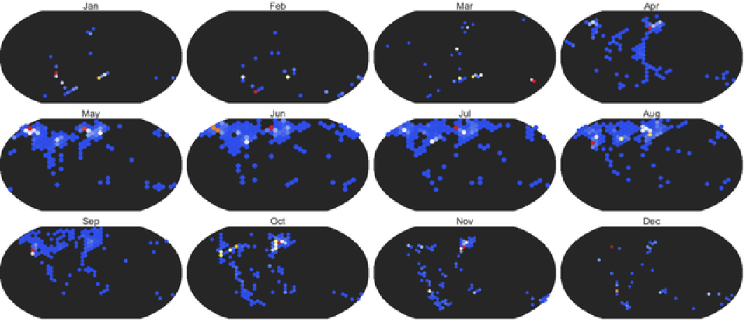
Figure 2.1 Monthly occurrence density of the Arctic tern from the GBIF / eBird Observation Dataset (2014–2024), one panel per calendar month, 750-km hex bins, Robinson projection. The northward breeding-season concentration (May–July) and the long southbound Atlantic passage are both visible. But read the next caption before trusting any apparent geography.
The honest caveat: effort bias. Occurrence records do not report where the birds are — they report where the observers are. eBird coverage is overwhelmingly concentrated in North America and Western Europe, where most contributors live, and is sparse across the open ocean, the tropics, and the Southern Hemisphere. A naive density map therefore conflates “many birds here” with “many birders here.” Any honest analysis of citizen-science occurrence data must correct for this sampling bias before drawing geographic conclusions — which is exactly what the centroid method in §3 is built to do.
3. From checklists to centroids (method)
3. From checklists to centroids (method)
The idea. To summarise “where the population is” in a given month with a single point, we compute the monthly population centroid — a weighted average location of that month's occurrences. Done naively this inherits all the effort bias of §2 and is geometrically wrong for a round planet. Two corrections fix both problems.
3.1 Correction one: presence weighting on a coarse grid
3.1 Correction one: presence weighting on a coarse grid
A raw average over occurrence points is dominated by a handful of intensely-birded hotspots — a single famous reserve can contribute tens of thousands of records and drag the centroid toward itself. To blunt this, we lay down a coarse 2° grid and weight each occupied cell equally (presence = 1 per cell), rather than weighting by the number of records in the cell. A cell with 40,000 checklists and a cell with one both count once. This converts “where were people looking” into “where was the species present,” which is far closer to the quantity we want.
A subtlety for the specialist. A 2°×2° cell is not equal-area: its true area shrinks toward the poles in proportion to cos(lat). For high-latitude species this matters, and the spherical mean below handles it correctly by construction — each presence point is converted to a unit vector whose contribution is naturally weighted by the geometry of the sphere, not by a flat lon×lat rectangle.
3.2 Correction two: a proper spherical centroid
3.2 Correction two: a proper spherical centroid
The deeper problem is that you cannot average longitudes arithmetically. Longitude wraps at ±180°: the mean of +170° and −170° is not 0° (the Atlantic) — it should be 180° (the dateline). For a circumpolar bird like the Arctic tern, whose occurrences ring the entire planet, a naive longitude average is simply meaningless. The correct construction embeds each point on the unit sphere, averages the 3-D vectors, and projects back:
(*Weightedsphericalmeanof(lat,lon)points.Returns{lat,lon}indegrees,orMissing["DegenerateCentroid"]whentheresultantvectoris~0(antipodallysmearedpointscancel)--weneverfabricateanarithmetic-meanlongitude.(Thisisthehelperinthepackage.)*)sphericalCentroid[lats_,lons_,w_]:=Module[{v,m},v=MapThread[Function[{la,lo,wt},wt{Cos[laDegree]Cos[loDegree],Cos[laDegree]Sin[loDegree],Sin[laDegree]}],{lats,lons,w}];m=Total[v];If[Norm[m]<10^-9,Return[Missing["DegenerateCentroid"]]];m=m/Norm[m];{ArcSin[m[[3]]]/Degree,ArcTan[m[[1]],m[[2]]]/Degree}];
The Missing["DegenerateCentroid"] branch is not defensive boilerplate — it is the honest answer when a population is spread so evenly around the globe (or split into antipodal clumps) that no single point represents it. Returning a fabricated longitude there would be worse than returning nothing. As we will see in §4, this is precisely the situation a global centroid walks into for a multi-flyway species, and the reason we must split by flyway first.
4. The multi-flyway trap (the key lesson)
4. The multi-flyway trap (the key lesson)
The trap. A spherical centroid is only meaningful if the points it averages belong to a single, coherent population. Many species do not: they split into geographically disjoint flyways that never mix. Averaging across flyways produces a “centre” that lies where no birds are — the midpoint of two crowds is the empty space between them.
The red knot is the textbook case. Pool its Americas, European/African, and Asian-Australasian flyways into one global centroid and the result drifts out into the open mid-Atlantic, on average ~4,670 km per month away from where the Americas (rufa) population — the one a North American reader actually sees — truly is. The number is not a rounding artefact; it is the signature of averaging across populations that should never have been combined.
(*Thefix:restricttoonecoherentflywayBEFOREtakingthecentroid.Eachboxis{lon->{min,max},lat->{min,max}}.*)swift=monthlyCentroids[5228676,<|"lon"->{-30,145},"lat"->{-40,75}|>];(*Afro-Palearctic*)knot=monthlyCentroids[2481765,<|"lon"->{-110,-30},"lat"->{-56,85}|>];(*Americasflyway*)tern=monthlyCentroids[5229230,<|"lon"->{-80,20},"lat"->{-90,90}|>];(*Atlanticbasin*)(*TheBROKENcontrast:noflywayfilter->meaninglessmid-oceancentroid*)knotGlobal=monthlyCentroids[2481765,All];
With each species reduced to a single coherent flyway, the monthly centroids trace clean, interpretable migration loops. The common swift's Afro-Palearctic flyway needs no special handling — it is already one population, and its centroid simply works. The red knot is shown on its Americas flyway. The Arctic tern is shown as an Atlantic-basin centroid (and, separately, as a latitude-versus-month curve, since its defining signal is the pole-to-pole north–south sweep):
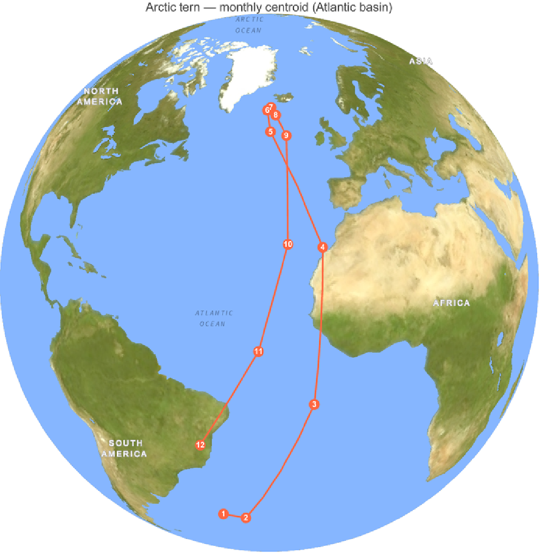
Figure 4.1 Arctic tern — monthly population centroid on the Atlantic-basin flyway, orthographic globe over relief. Numbers mark the calendar month; the track sweeps from southern winter quarters up to high-Arctic breeding latitudes and back.
Figure 4.2 Common swift — monthly population centroid on the single Afro-Palearctic flyway. Breeding-season concentration over Europe (months ~5–8) and the sub-Saharan wintering shift (months ~11–2) are both clear; no flyway splitting is needed because there is only one population.
Figure 4.3 Red knot — monthly population centroid restricted to the Americas flyway. Compare this coherent loop with the broken global centroid (the knotGlobal contrast above), which would sit uselessly in the mid-Atlantic, ~4,670 km/month from this track. A caveat in the other direction: presence weighting blunts but does not erase effort bias. The Americas winter centroid here sits around Panama/northern Colombia rather than at the iconic rufa wintering grounds in Tierra del Fuego (~54°S): the densely-birded USA and Caribbean still outweigh the sparsely-observed Patagonian coast, and the centroid blends several wintering areas. The shape of the journey is right; the precise southern extreme is pulled north.
Robustness check — is the seasonal loop real, or just where the birders are?
Robustness check — is the seasonal loop real, or just where the birders are?
A fair challenge to everything so far: perhaps these loops are not migration at all, but the seasonal pattern of where observers happen to be. We can test that head-on. Take each species' occurrences, shuffle the month labels — every record keeps its location but is reassigned a random month — and recompute the centroid loop. Repeat 500 times. If the apparent migration were a sampling artifact, the shuffled loops would swing as widely as the real one; if it is real, the true loop's north–south span will sit far beyond anything the shuffles produce. (We permute the ~60,000 individual records, not a twelve-point series, so a full shuffle is the right null here; the autocorrelation caveat that weakens the photoperiod test later applies only to that 12-month correlation.)
Figure 4.4 Permutation null test. Grey histograms: the latitude span of the monthly centroid loop under 500 random month-label shufflings (locations kept, the month–location link broken). Coloured line: the observed span (Arctic tern 110.8°, common swift 63.6°, red knot 33.6°). Every observed span is five to seven times the largest shuffled value (and seven to ten times the average shuffle; p < 0.002, n = 500) — the seasonal loop is a real signal in the data, not an artifact of a static, seasonally-mislabelled range.
Robustness check — how sharply is each monthly centroid pinned?
Robustness check — how sharply is each monthly centroid pinned?
A point on a map invites false confidence. Each monthly centroid is an estimate from a finite, uneven sample, so it deserves an error bar. We attach one by block-bootstrapping over years: for each month we resample the 2014–2024 years with replacement, recompute the gridded centroid, repeat 300 times, and draw the 95% confidence ellipse of the resulting cloud. Tight ellipses mark well-sampled months; sprawling ones mark the sparse, oceanic stretches where the centroid is barely constrained.
Figure 4.5a Arctic tern — monthly centroids with their 95% block-bootstrap confidence ellipses (resampling years with replacement). The contrast is the point: the ocean-crossing months reach a mean 95%-ellipse radius of about 23.8° over the open Atlantic, but tighten to ~2.° at the densely-watched Greenland/Iceland breeding grounds.
Figure 4.5b Common swift — one coherent Afro-Palearctic flyway is well sampled year-round, so the ellipses stay small (mean radius down to ~0.7°).
Figure 4.5c Red knot — the Americas flyway. The honest reading of a centroid map: trust the tight months, treat the sprawling ones as directional, not precise. (Ellipse radii are mean centre-to-edge distances in degrees, combining latitude and longitude.)
5. Animating the population centroid
5. Animating the population centroid
Stringing the twelve monthly centroids together and interpolating along great circles between them turns the static loops of §4 into the animated comet-trail globe shown at the top of this post. Each species' centre of mass glides through the year over its faint annual route — the most compact possible summary of “where is this population, right now, on average.”
We can also quantify each loop. Summing the great-circle distances between consecutive monthly centroids (over observed months only) gives the annual centroid displacement — how far the centre of mass travels in a year:
Figure 5.1 Annual displacement of the monthly population centroid along each species' primary flyway: common swift (Afro-Palearctic) ≈ 14,000 km, red knot (Americas) ≈ 7,900 km, Arctic tern (Atlantic basin) ≈ 24,100 km. The deliberately broken global red-knot track is excluded.
Crucial caveat — read before quoting these numbers. This is the displacement of the population centre of mass, NOT how far any individual bird flies. The two differ enormously, and in both directions. For the Arctic tern the centroid figure understates the journey: because the species is nearly circumpolar, east–west motion in different longitudes cancels in the mean, so the centroid mostly captures the north–south sweep. Tracked individual Arctic terns average about 70,900 km per year (Egevang et al. 2010) — roughly three times the ~24,100 km centroid displacement. The centroid is a population statistic; the geolocator figure is an individual's odometer. Do not conflate them.
5.1 From one point to a flock
5.1 From one point to a flock
A centroid is one point; the population is millions of birds. The same twelve monthly positions, resampled along great circles and seeded with a flock, turn the journey into motion — not to add new information, but to make the seasonal sweep legible at a glance:
The flock frames are generated by wolfram/flock.wls, which jitters a small swarm around each species' resampled monthly centroid path and renders the orthographic globe frame by frame.
6. Speeds and stopovers
6. Speeds and stopovers
The basic question. If the centre of mass of a population moves across the planet over a year, how fast does it move, and when does it pause? A migration is not a steady glide: it is bursts of hard travel separated by long stationary spells on the breeding and wintering grounds. The monthly centroid track of §4 already contains that rhythm — we just have to differentiate it.
The quantity. For each species we take the great-circle distance between consecutive monthly centroids and divide by the number of days in the step, giving a centroid ground speed in km/day. Read off the per-flyway tracks, the means and peaks differ sharply: the Arctic tern's centre of mass averages about 66 km/day and peaks near 135 km/day during passage; the common swift averages about 38 km/day and the red knot about 22 km/day.
Figure 6.1 Monthly centroid ground speed for each species along its primary flyway. The tall passage peaks (Arctic tern ~135 km/day; red knot ~74 km/day) separate the near-zero plateaux of the breeding and wintering seasons.
Crucial caveat — this is a lower bound. Centroid speed is the speed of the population centre of mass, which is a lower bound on individual ground speed: when birds in different parts of the range move in opposing directions, those motions cancel in the mean, so the centroid moves more slowly than any of them. Equally, the low-speed months are not necessarily true en-route “stopovers” — they mostly mark the breeding/wintering turn-around, when the whole population sits still. Read these as the tempo of the population statistic, not of an individual bird.
6.1 Does day length pace the journey?
6.1 Does day length pace the journey?
A natural hypothesis: migrants might travel fastest when the photoperiod is changing fastest, since day length is the most reliable seasonal cue a bird has. We can test it directly against our own numbers — correlate each month's centroid speed with that month's rate of change of day length. The honest answer is: not really. Across the twelve monthly steps the correlation is weak, and under a cyclic permutation that respects the annual cycle (the only null that does not pretend the twelve months are independent draws), it is not significant. The red knot is the strongest case, at r = 0.71, and even there p = 0.08 (n = 12). Suggestive at best — a hypothesis to take to tracking data, not a result to report. (With only twelve months, the cyclic permutation has just twelve distinct rotations, so the smallest p it can return is 1/12 ≃ 0.083: this test can never reach p < 0.05, which is itself an honest admission of how little a 12-point annual series can prove.)
Figure 6.2 Day length experienced along each centroid track through the year. The Arctic tern, following summer from one hemisphere to the other, sits under a ~19 h midsummer day at its breeding latitudes — more daylight over the year than any other animal. Whether day length actually paces the speed in Figure 6.1, however, our 12-point series cannot establish (see the photoperiod test above).
7. The energy of migration
7. The energy of migration
Cheap per kilometre, ruinous per year. Flapping flight is one of the most energetically expensive activities in nature per unit time, yet astonishingly cheap per kilometre — a migrating bird converts fat to distance with an efficiency no land animal approaches. The catch is the sheer length of the journey: a cost-per-kilometre that looks trivial becomes an enormous annual fuel bill when multiplied by tens of thousands of kilometres.
The model. We estimate flight power with the standard Pennycuick flapping-flight model (Pennycuick 2008), which sums three terms: induced power (the cost of generating lift, dominant at low speed), parasite power (drag on the body, dominant at high speed), and profile power (drag on the flapping wings). Their sum is the classic U-shaped power curve, whose two landmark speeds are the minimum-power speed Vmp (cheapest per hour, where you would loiter) and the higher maximum-range speed Vmr (cheapest per kilometre, where the tangent from the origin touches the curve). A bird minimising the fuel needed to cover distance should cruise near Vmr — and that is the speed at which we evaluate the fuel cost below.
For our three species the model gives a max-range speed Vmr of about 49 km/h (Arctic tern), 48 km/h (common swift), and 59 km/h (red knot), with a cost of transport of roughly 0.25, 0.12, and 0.41 kJ/km respectively. Expressed as fuel, each 1,000 km of flight burns about 5.9%, 7.9%, and 7.7% of body mass respectively — which is why a long-haul migrant can nearly double its weight in fat before departure.
Figure 7.1 Pennycuick power curves for the three species. Each U-shaped curve is induced + parasite + profile power; the minimum marks Vmp and the tangent from the origin marks the max-range speed Vmr, where cost per kilometre is lowest and where a fuel-minimising migrant should cruise.
Figure 7.2 Cumulative flight energy along each species' centroid path over the year. This is explicitly a lower bound on the true annual energy: it integrates the ~24,115 km centroid displacement, whereas a tracked Arctic tern actually flies ~70,900 km (Egevang et al. 2010) — roughly three times as far — so its real annual fuel bill dwarfs the centroid-path figure shown here.
A note on rigour. These are first-order estimates — a point-mass bird in still air in steady level flight, with literature default coefficients. They are meant for cross-species comparison, not as physiology: real flight involves wind, climb, gliding (the swift especially), variable payload, and individual variation the model does not capture. Treat the numbers as order-of-magnitude, and the ranking between species as more trustworthy than any single absolute value.
8. Finding the way: the magnetic landscape
8. Finding the way: the magnetic landscape
How does a bird know where it is? Navigation over an ocean with no landmarks is the deepest puzzle of migration, and the answer is emphatically multimodal: migratory birds draw on a sun compass, a star compass, polarised-light cues at dawn and dusk, learned landmarks, olfaction, and — the part Wolfram Language lets us actually compute — the Earth's magnetic field, used both as a compass (direction) and, more controversially, as a map (position). The compass sense is an inclination compass: birds read the dip angle between the field and the horizon rather than its polarity (Wiltschko & Wiltschko 1972). For the broader mechanism see Mouritsen (2018).
What we can compute. Wolfram Language ships the IGRF/WMM geomagnetic models through GeomagneticModelData, so we can evaluate the field everywhere along each flyway and ask what magnetic landscape the birds traverse. The map below shows magnetic inclination (dip) as a global backdrop with the three centroid tracks laid over it:
Figure 8.1 Magnetic inclination (dip angle) across the globe, with the three population-centroid tracks overlaid. Dip runs from −90° at the south magnetic pole through 0° at the magnetic equator to +90° at the north magnetic pole; the contours run almost east–west, nearly parallel to geographic latitude.
Figure 8.2 Magnetic dip and total-field intensity sampled month by month along each species' centroid route — the magnetic “signature” a bird on that flyway would experience through the year.
What this shows — and what it cannot. All three tracks cross a wide span of magnetic dip — about 132° for the Arctic tern, 109° for the common swift, and 36° for the red knot — so the field carries a strong, monotone latitude signal along each route. In fact, along these tracks inclination is almost perfectly a function of latitude (corr(dip, lat) ≈ 0.99), exactly as the geocentric-dipole relation tan I = 2 tan λ (with λ the magnetic latitude) predicts; the longitude-only contribution to dip is tiny (≤ 2.7°). So the field does provide a usable latitude gauge in principle. But occurrence centroids cannot test whether the birds actually use it. We are showing the magnetic landscape these populations traverse, not a navigational mechanism: nothing here demonstrates that the birds read, follow, or steer by the field. That would require individual tracking, not where-the-crowd-is data.
9. Cross-check: eBird Status & Trends
9. Cross-check: eBird Status & Trends
Are our occurrence-based centroids actually right? A method built from biased citizen-science occurrences deserves an independent check. Cornell's eBird Status & Trends (S&T) is the professional answer to the same question: it fits machine-learning models that explicitly correct for observer effort and detectability, and outputs bias-corrected weekly relative abundance on a fine grid — a far more sophisticated product than our coarse occurrence centroid (Fink et al., eBird Status and Trends).
As a private validation, we computed abundance-weighted centroids directly from the S&T rasters — inside the same flyway boxes used in §4 — by driving the R ebirdst package from Wolfram Language via ExternalEvaluate, then measuring the great-circle separation between Cornell's modelled centroids and ours, month by month. The pattern of code (our code, not Cornell's data) is:
The result. Our occurrence-based centroids agree with Cornell's professionally modelled abundance centroids to within roughly 1,300–1,750 km on average, along flyways thousands of kilometres long: common swift ~1283 km, red knot ~1392 km, Arctic tern ~1742 km mean monthly separation. For a coarse, presence-weighted method built from raw occurrence data, agreeing with a full effort-corrected model to within a small fraction of the flyway length is a strong endorsement that the centroid approach captures the real seasonal signal.
Why you see no S&T figure here. The eBird Status & Trends Data Products are released under Cornell's own terms, which permit non-commercial use and validation but do not permit publishing derived figures or maps. We therefore show none — the cross-check above is reported as numbers only — and we point readers to Cornell's official, professionally produced visualizations instead: eBird Status and Trends (https://science.ebird.org/en/status-and-trends).
This material uses data from the eBird Status and Trends Project at the Cornell Lab of Ornithology, eBird.org. Any opinions, findings, and conclusions or recommendations expressed in this material are those of the author(s) and do not necessarily reflect the views of the Cornell Lab of Ornithology.
9b. Live now: recent sightings via the eBird API
9b. Live now: recent sightings via the eBird API
The centroids summarise a decade of history. For a sense of where these birds are this month, we add a live layer pulled from the eBird API 2.0 recent-observations endpoint (/v2/data/obs/{region}/recent/{speciesCode}), which returns the last 30 days of checklisted sightings for a species in a region. We sweep a representative spread of countries and plot the result:
Figure 9b.1 Arctic tern — recent eBird sightings (last 30 days, as of late June 2026), swept across a spread of countries. Source: eBird.org (Cornell Lab of Ornithology).
Figure 9b.2 Common swift — recent eBird sightings (last 30 days, as of late June 2026). Source: eBird.org (Cornell Lab of Ornithology).
Figure 9b.3 Red knot — recent eBird sightings (last 30 days, as of late June 2026). Source: eBird.org (Cornell Lab of Ornithology).
Privacy and attribution. Live coordinates are coarsened to one decimal place (~11 km) before plotting or storage, so no precise observer or sensitive-species location is republished. All live data are attributed to eBird.org (Cornell Lab of Ornithology) per the eBird Terms of Use.
10. What each journey reveals
10. What each journey reveals
Read together, the three tracks tell three different stories about how a bird can solve the problem of seasonal survival. Plotting the centroid latitude against the month for all three at once makes the contrast plain:
Figure 10.1 Annual latitude profile of each population centroid. The Arctic tern's deep pole-to-pole swing, the common swift's moderate Europe↔sub-Saharan shuttle, and the red knot's Americas-flyway loop are immediately distinguishable by amplitude and phase.
Arctic tern — the pole-to-pole Atlantic sweep. The latitude-versus-month signal is the cleanest in the dataset: a centroid that climbs to high-Arctic breeding latitudes in the boreal summer and plunges toward the Southern Ocean in the austral summer. The centroid displacement (~24,100 km) is large yet still understates the individual journey (~70,900 km), because circumpolar east–west motion cancels in the population mean — a vivid illustration of the difference between a population statistic and an individual track.
Common swift — the Europe↔sub-Saharan shuttle. A single coherent flyway, and therefore the easiest centroid to trust: a tight summer concentration over Europe collapses into a sub-Saharan African wintering centre and back, ~14,000 km of annual centroid travel. The swift shows what the method looks like when nothing has to be corrected for multiple populations — it just works.
Red knot — the Americas long-haul (and the cautionary tale). On its Americas flyway the knot traces a coherent ~7,900 km loop between Arctic breeding grounds and southern wintering areas, with the Delaware Bay stopover embedded in the spring leg. It is also the species that exposed the multi-flyway trap: pooled globally, its centroid is nonsense. The knot is the reason this post insists on per-flyway analysis.
Side by side, the quantitative summaries of §4–§8 — annual centroid displacement, peak and mean centroid speed, max-range speed, cost of transport, and the magnetic span crossed — form a compact cross-species scorecard:
Figure 10.2 Cross-species scorecard pulling together the headline numbers from the preceding sections. Read it as a comparison of population-level summaries, not individual physiology; the per-section caveats (centroid ≠ individual; energetics first-order; magnetic landscape, not mechanism) all still apply.
11. New ideas, and how to test them
11. New ideas, and how to test them
Beyond reconstructing known journeys, this post surfaced two testable ideas. Neither is settled here — both are hypotheses that our occurrence-centroid data can frame but not decide — and saying so plainly is the point.
Idea 1 — magnetic inclination as a latitude gauge. We showed (§8) that along all three flyways magnetic dip is almost a pure function of latitude (corr ≈ 0.99), so the field could in principle tell a bird how far north or south it is. What we could not do is test whether the birds use it: occurrence centroids show the magnetic landscape traversed, not the cue employed. What would settle it: individual tracking (Movebank archival tags, light-level geolocators) combined with magnetic-displacement experiments, not where-the-crowd-is data.
Idea 2 — migration speed paced by photoperiod. We tested whether centroid speed rises when day length changes fastest (§6). The signal is weak and, under a cycle-respecting permutation null, not significant (best case red knot, r = 0.71, p = 0.08, n = 12). What would settle it: a much longer time series — eBird Status & Trends weekly relative abundance gives 52 effort-corrected steps per year rather than our 12, and individual tracks give departure dates that can be regressed directly on local photoperiod.
Limitations, in one place. Three caveats run through everything above. (1) Centroid ≠ individual: a population centre of mass moves more slowly and more shortly than any bird in it (opposing motions cancel), so all speeds and distances here are lower bounds on the individual journey. (2) Effort bias: presence weighting on a coarse grid blunts but does not erase the over-representation of densely-birded regions; southern and oceanic extremes are pulled toward where the observers are. (3) Sample, not census: these are occurrence records, not a complete count, and the magnetic and energetic layers are model overlays, not measurements of the birds themselves.
Test it yourself. Every figure and number above regenerates from the public repository with four commands:
wolframscript -file wolfram/run_all.wls # centroids, maps, animations
wolframscript -file wolfram/geomag.wls # magnetic landscape (§8)
wolframscript -file wolfram/journey_metrics.wls # speeds + photoperiod test (§6)
wolframscript -file wolfram/energetics.wls # Pennycuick flight energy (§7)
wolframscript -file wolfram/geomag.wls # magnetic landscape (§8)
wolframscript -file wolfram/journey_metrics.wls # speeds + photoperiod test (§6)
wolframscript -file wolfram/energetics.wls # Pennycuick flight energy (§7)
12. Conclusions
12. Conclusions
With open data and a careful method, you can reconstruct continental-scale bird migration from a laptop. Hundreds of millions of volunteer observations, republished under an open licence with a citable DOI, plus a few dozen lines of Wolfram Language, are enough to recover the annual journeys of three of the planet's great migrants and to cross-validate them against a professional abundance model.
But the central lesson is a cautionary one. Naive pooling misleads. A single global centroid placed the red knot in the empty mid-Atlantic, ~4,670 km/month from any real bird. Two disciplines rescue the analysis: bias-awareness (presence weighting on a coarse grid, so birders are not mistaken for birds) and per-flyway analysis (so disjoint populations are never averaged together), all on a proper spherical geometry (so longitudes are never averaged arithmetically). Get those three right and citizen-science occurrence data yield a faithful, validated picture of where the birds actually are.
13. References
13. References
Egevang, C., Stenhouse, I. J., Phillips, R. A., Petersen, A., Fox, J. W., & Silk, J. R. D. (2010). Tracking of Arctic terns Sterna paradisaea reveals longest animal migration. Proceedings of the National Academy of Sciences 107(5), 2078–2081. [Geolocator tracking; ~70,900 km/yr round trip.]
Hedenström, A., Norevik, G., Warfvinge, K., Andersson, A., Bäckman, J., & Åkesson, S. (2016). Annual 10-month aerial life phase in the common swift Apus apus. Current Biology 26(22), 3066–3070. [Common swifts remain airborne for ~10 months.]
Fink, D., Auer, T., Johnston, A., Strimas-Mackey, M., Ligocki, S., Robinson, O., Hochachka, W., et al. eBird Status and Trends. Cornell Lab of Ornithology, Ithaca, New York. science.ebird.org/en/status-and-trends (https://science.ebird.org/en/status-and-trends). [Effort-corrected weekly relative-abundance models used for the §9 validation.]
GBIF.org. eBird Observation Dataset (EOD), datasetKey 4fa7b334-ce0d-4e88-aaae-2e0c138d049e, accessed via the GBIF Occurrence Download API (CC BY 4.0). Per-species download DOIs: Arctic tern — https://doi.org/10.15468/dl.87f228; common swift — https://doi.org/10.15468/dl.pkrrb6; red knot — https://doi.org/10.15468/dl.3kmcbn.
Sullivan, B. L., Wood, C. L., Iliff, M. J., Bonney, R. E., Fink, D., & Kelling, S. (2009). eBird: A citizen-based bird observation network in the biological sciences. Biological Conservation 142(10), 2282–2292. [The eBird platform.]
Newton, I. (2008). The Migration Ecology of Birds. Academic Press. [Comprehensive reference on flyways, energetics, and migratory strategy.]
Baker, A. J., González, P. M., Piersma, T., Niles, L. J., et al. (2004). Rapid population decline in red knots: fitness consequences of decreased refuelling rates and late arrival in Delaware Bay. Proceedings of the Royal Society B 271, 875–882. [Red knot / horseshoe-crab stopover coupling.]
Pennycuick, C. J. (2008). Modelling the Flying Bird. Academic Press. [Flapping-flight power model — induced, parasite, and profile power, Vmp/Vmr — used in §7.]
Mouritsen, H. (2018). Long-distance navigation and magnetoreception in migratory animals. Nature 558, 50–59. [Multimodal-navigation review underpinning §8.]
Wiltschko, W., & Wiltschko, R. (1972, 2005). Magnetic compass of European robins; the inclination compass of migratory birds. Science 176, 62–64; Journal of Comparative Physiology A 191, 675–693. [The inclination-compass sense cited in §8.]
14. Acknowledgements & data licences
14. Acknowledgements & data licences
With thanks. This work rests entirely on the labour of others: the global community of eBird volunteers who contributed the underlying observations, the Cornell Lab of Ornithology which runs eBird and the Status & Trends project, and GBIF which curates and openly republishes the data with persistent, citable DOIs.
• GBIF / eBird Observation Dataset is licensed CC BY 4.0 — freely publishable with attribution; we cite the per-species download DOIs in §13 (or mark them “DOI pending (rerun after the GBIF download completes)” when the archive build is still in progress).
• eBird Status & Trends is released under Cornell's custom, non-commercial terms. We use it for private validation only and publish no derived S&T figures here; see Cornell's official visualizations instead. As required:
This material uses data from the eBird Status and Trends Project at the Cornell Lab of Ornithology, eBird.org. Any opinions, findings, and conclusions or recommendations expressed in this material are those of the author(s) and do not necessarily reflect the views of the Cornell Lab of Ornithology.
• eBird API 2.0 live data are used under the eBird Terms of Use, attributed to eBird.org (Cornell Lab of Ornithology), with observer coordinates coarsened to ~11 km for privacy.
Tools. All numerics, maps, and animations are pure Wolfram Language. The notebook was assembled programmatically via wolframscript. No AI-generated illustrations are used anywhere in this post; every figure is computed from data.
15. Reproducibility
15. Reproducibility
All source code lives in the public repository github.com/mthiel74/BirdFlightPaths (https://github.com/mthiel74/BirdFlightPaths). The pipeline is pure Wolfram Language; the .wls scripts are the source of truth, and the committed .nb is browseable without running anything. To rebuild from scratch on a machine with Wolfram Language installed (plus, for the optional §9 validation, R with the ebirdst package):
# 1. Mint citable GBIF downloads (DOIs) + fetch full occurrence CSVs
wolframscript -file wolfram/gbif_download.wls
# 2. Centroids, seasonal maps, centroid-track globes, hero animation
wolframscript -file wolfram/run_all.wls
# 3. (optional, private) S&T cross-check via R / ebirdst -- stays local
wolframscript -file wolfram/ebirdst_r.wls
# 4. Build this notebook (bird_migration.nb + .pdf)
wolframscript -file community/build_notebook.wls
wolframscript -file wolfram/gbif_download.wls
# 2. Centroids, seasonal maps, centroid-track globes, hero animation
wolframscript -file wolfram/run_all.wls
# 3. (optional, private) S&T cross-check via R / ebirdst -- stays local
wolframscript -file wolfram/ebirdst_r.wls
# 4. Build this notebook (bird_migration.nb + .pdf)
wolframscript -file community/build_notebook.wls
GBIF download DOIs. The citable DOIs minted by step 1 are recorded in data/gbif_dois.json: Arctic tern — https://doi.org/10.15468/dl.87f228; common swift — https://doi.org/10.15468/dl.pkrrb6; red knot — https://doi.org/10.15468/dl.3kmcbn.
Generated on June 30, 2026.
CITE THIS NOTEBOOK
CITE THIS NOTEBOOK
Bird migration paths: seasonal maps and population centroids from massive eBird datasets
by Marco Thiel
Wolfram Community, STAFF PICKS, June 30, 2026
https://community.wolfram.com/groups/-/m/t/3742012
by Marco Thiel
Wolfram Community, STAFF PICKS, June 30, 2026
https://community.wolfram.com/groups/-/m/t/3742012