Bubble Chart Comparisons of Countries
Bubble Chart Comparisons of Countries

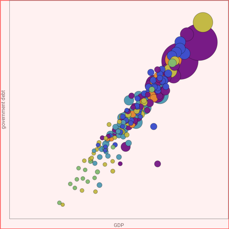
Bubble charts allow the display of three-dimensional data in two dimensions, with the position of the center of the bubble indicating two of the values, and the size of the bubble the third.
This Demonstration shows different economic and demographic attributes for the and axes for the different countries of the world. The countries are colored according to region, and the size of the bubble relates to the size of the population. The attributes can be viewed on either log or linear scales, and the size of the bubbles can be adjusted.
x
y
Permanent Citation
Permanent Citation
Brett Champion
"Bubble Chart Comparisons of Countries"
http://demonstrations.wolfram.com/BubbleChartComparisonsOfCountries/
Wolfram Demonstrations Project
Published: January 1, 1999