You can freely download the data used in this notebook directly from the ESS Data Portal here: https://ess.sikt.no/en/datafile/242aaa39-3bbb-40f5-98bf-bfb1ce53d8ef.
While working on the content of our new Social Sciences webpage, I kept wanting to get my hands on some data and apply the full power of Wolfram Language to it. Now that the content is done and the webpage is live, I can go down the rabbit hole.
The European Social Survey (ESS) provides freely available datasets that measure public attitudes, beliefs and behaviors across Europe. For this exploratory analysis, we will focus on a specific dataset: the ESS11, which measures how important different human values are, according to hundreds of thousands of respondents from 39 countries.
It comes with a “codebook” that explains what each measure means, so we’ll import both the raw data and the HTML codebook, which we’ll use to give the variables more reasonable names:
In[]:=
codebook=Import[FileNameJoin[NotebookDirectory[],"ESS Theme - Human values codebook.html"],"XMLObject"];
In[]:=
data=Import[FileNameJoin[NotebookDirectory[],"ESS Theme - Human values.csv"],"Tabular"];
Notice that we are importing the main data as a Tabular object: that gives us a much more efficient representation that we can work with from our notebook. In practice, this means that we can manipulate huge datasets, and each manipulation happens in sub-second times. It’s hard to overstate how much that contributes to the pleasant experience, especially of exploratory data analyses, where you are typically trying many different things and slicing the data in many different ways. Speaking of huge datasets, let’s see what we are dealing with in the ESS dataset:
In[]:=
Dimensions[data]
Out[]=
{540671,55}
Over half a million rows across 55 columns. Let’s get into it.
Data transformations
Data transformations
The first order of business is to give our data columns/variables meaningful labels. As is typical of huge datasets like this, the labels in the original data are abbreviated and not immediately meaningful:
In[]:=
ColumnKeys[data]
Out[]=
{name,essround,edition,proddate,idno,cntry,dweight,pspwght,pweight,anweight,prob,stratum,psu,impdiff,impdiffa,impenv,impenva,impfree,impfreea,impfun,impfuna,imprich,impricha,impsafe,impsafea,imptrad,imptrada,ipadvnt,ipadvnta,ipbhprp,ipbhprpa,ipcrtiv,ipcrtiva,ipeqopt,ipeqopta,ipfrule,ipfrulea,ipgdtim,ipgdtima,iphlppl,iphlppla,iplylfr,iplylfra,ipmodst,ipmodsta,iprspot,iprspota,ipshabt,ipshabta,ipstrgv,ipstrgva,ipsuces,ipsucesa,ipudrst,ipudrsta}
Instead of “iphlppla”, we could get more human-readable labels from the codebook that comes with the data itself, in a separate HTML file. We could manually extract the human-readable labels for the variables, but we do have first-class support for XML objects in Wolfram Language, so we might as well use it:
In[]:=
labels=Association[Map[Function[p,varName=Cases[p,XMLElement["h3",{___,"id"->varId_String,___},_]:>varId,Infinity][[1]];varLabel=Cases[p[[3]],XMLElement["div",{},{s_String}]:>StringTrim[s],1][[1]];varName->varLabel],Cases[codebook,XMLElement[_,_,children_]/;AnyTrue[children,MatchQ[#,XMLElement["h3",{__Rule},_]]&],Infinity]]];
What this does is represent the structure of where the labels live in the HTML (represented as an XML) file. XML objects have a tree-like structure that is very easy to procedurally leverage to extract information. While you could simply manually check what each column in the datasets is labeled in the codebook, understanding how to operate on XML objects is a skill that will serve you well in many unexpected areas of data analysis (e.g. web scraping). Let’s see if our XML object parsing was accurate:
In[]:=
labels[[7;;16]]
Out[]=
dweightDesign weight,pspwghtPost-stratification weight including design weight,pweightPopulation size weight (must be combined with dweight or pspwght),anweightAnalysis weight,probSampling probability,stratumSampling stratum,psuPrimary sampling unit,impdiffImportant to try new and different things in life,impdiffaImportant to try new and different things in life,impenvImportant to care for nature and environment
Much more understandable.
Let's also store countries as actual Wolfram Language entities rather than dumb strings; the simplest way to do that would be to run Interpreter on each row's value in the country column, but with that many data points, we need to be a bit smarter. Get all the unique country codes first:
In[]:=
uniqueCodes=DeleteDuplicates[Normal[data[All,"cntry"]]]
Out[]=
{AT,BE,CH,CZ,DE,DK,ES,FI,FR,GB,GR,HU,IE,IL,IT,LU,NL,NO,PL,PT,SE,SI,EE,IS,SK,TR,UA,BG,CY,RU,HR,LV,RO,LT,AL,XK,ME,RS,MK}
Instead of doing manual mappings, let's offload that work to Interpreter and just check that it has interpreted them correctly:
In[]:=
countryMap=AssociationThread[uniqueCodes,Map[Interpreter["Country"],uniqueCodes]]
Out[]=
AT,BE,CH,CZ,DE,DK,ES,FI,FR,GB,GR,HU,IE,IL,IT,LU,NL,NO,PL,PT,SE,SI,EE,IS,SK,TR,UA,BG,CY,RU,HR,LV,RO,LT,AL,XK,ME,RS,MK
Perfect—now we can use this to replace the raw strings with the actual country entities in our dataset:
In[]:=
dataWithEntities=Tabular[Map[<|#,"cntry"->countryMap[#["cntry"]]|>&,Normal[data]]];
Respondents’ stats
Respondents’ stats
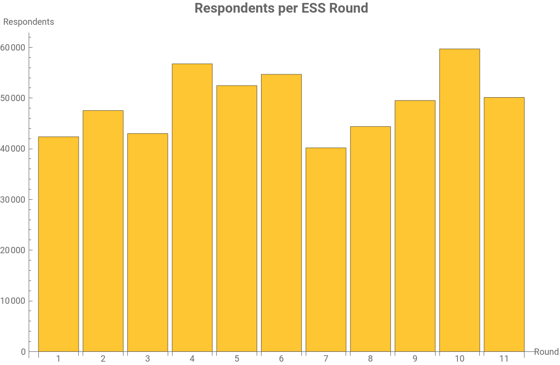
The data was collected in 11 separate rounds. Let's see how many respondents were in each round:
In[]:=
roundCounts=KeySort[Counts[Normal[data[All,"essround"]]]]
Out[]=
142359,247537,343000,456752,552458,654673,740185,844387,949519,1059685,1150116
Some variations between the rounds, but overall a reasonable consistency. A quick bar chart to visualize this:
p1=BarChartroundCounts,
Out[]=
The data obviously spanned a broadly European region, but it is unlikely that each country had the same number of respondents; let's check by tallying up the data by column 7 (the country column):
In[]:=
countryCounts=Tally[Normal[dataWithEntities[[All,6]]]]
Out[]=
,17579,,19045,,18309,,20090,,36845,,12408,,21296,,21095,,20809,,22663,,15315,,18760,,24250,,17124,,13043,,3187,,20024,,17402,,19131,,19254,,19446,,14732,,18149,,4817,,12734,,4272,,12648,,15479,,6750,,12458,,8098,,5173,,2146,,13017,,1201,,1295,,4087,,5111,,1429
The data does actually differ quite wildly, with Germany having 35 times more respondents than Albania. Still, even the lowest bracket has 1000+ respondents, which is still a healthy number. Let’s visualize:
In[]:=
GeoBubbleChart[countryCounts,GeoRange->"Europe",ImageSize->Full]
Out[]=
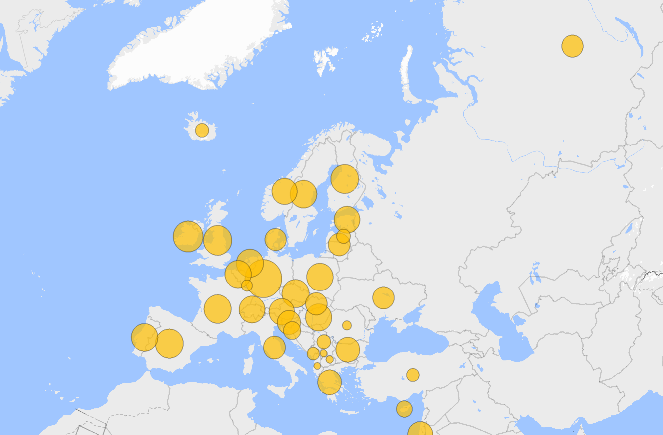
Here, the size of the bubble is proportional to the number of respondents from this country. By eyeballing, we can see a cluster of smaller bubbles in Eastern Europe, as well as in some smaller (by area and population) countries in Western Europe, such as Luxembourg, with 3031 respondents.
Means
Means
Let’s get into what is actually being measured: the human values. First, to know what we are dealing with, let’s just dump all the values that are being measured with their means for the whole dataset. Here, a lower mean score means that a value is more important as ranked by the respondents:
(*Valuecolumns:allcolumnsexceptmetaand'a'-suffixmirrors*)metaCols={"name","essround","edition","proddate","idno","cntry","dweight","pspwght","pweight","anweight","prob","stratum","psu"};allCols=Normal[Keys[data[1]]];valueCols=Select[allCols,!MemberQ[metaCols,#]&&!StringEndsQ[#,"a"]&];(*Removerowswhereanyvaluecolumncontainsasentinel(7=refusal,8=don'tknow,9=noanswer)*)data=Tabular[Select[Normal[data],Function[row,AllTrue[valueCols,Function[col,MissingQ[row[col]]||row[col]<=6]]]]];dataWithEntities=Tabular[Map[<|#,"cntry"->countryMap[#["cntry"]]|>&,Normal[data]]];(*Computecolumnmeans,ignoringmissingvalues—forcefloatwithN[]*)colMeans=Association[#->N[Mean[DeleteMissing[Normal[data[All,#]]]]]&/@valueCols];(*Renamewithhuman-readablelabelsandsortascending*)namedMeans=KeyMap[labels,colMeans];sortedMeans=ReverseSort[namedMeans];n=Length[sortedMeans];overallMean=Mean[Values[sortedMeans]];(*Coloreachbarwithagreen→yellow→redgradient(lowmean=important=green)*)cmap=ColorData[{"RedGreenSplit","Reverse"}];barColors=Table[cmap[(i-1)/(n-1)],{i,n}];(*Buildlabeledvalues:eachbargetsitsmeanroundedto2dpafterit*)labeledVals=MapThread[Labeled[#1,Style[ToString[Round[#1,0.01]],8,GrayLevel[0.3]],After]&,{Values[sortedMeans]}];meanChart=BarChartlabeledVals,
A few things we can see immediately: loyalty to friends is by far the value that is ranked as the most important across the whole dataset. On the other end, having money is ranked as the least important value. There are several slight surprises: seeking adventures is very unimportant, so is the need to get respect. Overall means can only give us so much food for interpretation though; to get a more interesting story, we need to break down the data by country.
Values per country
Values per country
A very common way to represent continent-level data is by breaking it down by country and plotting it on a map. There are many ways we can slice the current data, but a fairly obvious one is to create a dataset where the keys are the countries in the dataset, and the values are the "human values" that they rank as most important:
Good, now we just need to format that data and do some geo styling so we can plot it on the map of Europe. The first thing to check is how many unique values there are in our data. We would expect that there would be plenty of values in the dataset that are not ranked as the most important in any of the countries in the dataset:
Good, we only have 6: this would make for a nice geoplot where each value gets its own color. There are plenty of built-in options in ColorData, but I like to define my own.
Now apply the colors to their corresponding countries. Since we are dealing with country entities, we can leverage that again to get the country’s CommonName property to create a nice tooltip that will display more information about the top human value on hovering over with the mouse:
Build a legend:
And build the final infographic:
There are notable clusters: central and northern Europe around "Loyalty to friends," France and Spain (and Romania) around "Equal treatment/opportunities" and a good chunk of Eastern Europe around "Strong government/safety." There are a few interesting outliers as well: only two countries ranked "Care for nature/environment" as the most important value (Italy and Estonia), and the Netherlands was a sole outlier in "Own decisions/freedom," as was Turkey in "Follow traditions."
Infographics like this are nice "at-a-glance" snapshots, but they tend to flatten complexities in the data. To illustrate this, we can pick one of the distinctive values and drill down to see if there is more to the story.
Let's create a helper function that will take a country entity and return its ratings for each value:
And test it:
Indeed, the data shows that respondents from the Netherlands rank "Own decisions/freedom" as the most important value. Yet, the actual score (2.01211) doesn't seem particularly strong. Is there a country in the dataset that ranks that value more strongly? Another helper function that takes a human value as a string and returns the country in which it has the highest ranking would serve us well:
Now let's see where "Own decisions/freedom" is the most important:
In Switzerland! Let's see:
Interesting: respondents from Switzerland rank "Own decisions/freedom" significantly higher than those from the Netherlands, but they rank "Loyalty to friends" even higher.
Now that we have a list of associations that map the "human values" as keys and each country's ratings as values, we can build a more interactive element very easily:
Now we can select a value and immediately see how important it is for each country on the map (a darker value indicates higher importance).
Correlations with country-level indicators
Correlations with country-level indicators
Since the countries in the dataset are Wolfram Language entity objects, we can pull socioeconomic indicators directly from the Wolfram Knowledgebase and correlate them against the per-country human value means computed above. Six indicators are used: GDP per person employed (productivity proxy), Gini index (income inequality), unemployment rate, median age, life expectancy and population density:
The heat map gives a quick overview of the full correlation landscape. To drill into any individual pair, the scatter plot below shows the country-level data points with a regression line; hover over a point to see the country name:
Conclusion
Conclusion
Between some descriptive statistics and geo visualizations, this gives us a nice introduction of how to approach exploratory analyses of social science data in Wolfram Language. There are many further directions in which this data can be taken.
To name a few: have any of the values shifted significantly across the 11 collection rounds? What is the biggest delta between two of the means values in one country? Can we do any inferential statistics and move from correlation to causation based on this dataset alone?
CITE THIS NOTEBOOK
CITE THIS NOTEBOOK
What do Europeans care about? Exploratory data analysis on an ESS dataset
by Dimitar Krastev
Wolfram Community, STAFF PICKS, June 3, 2026
https://community.wolfram.com/groups/-/m/t/3726084
by Dimitar Krastev
Wolfram Community, STAFF PICKS, June 3, 2026
https://community.wolfram.com/groups/-/m/t/3726084