The following Histogram3D plots a list of data about final board states where each entry follows the format : {# of black pieces, # of white pieces}. This means that the x and y axes are the # of pieces, and the vertical axis is the frequency of that entry. Interestingly, it seems like the highest frequencies of entries are where the number of pieces for each player are more balanced.
In[]:=
scores=Map[Length,Select[VertexList[rgg],VertexOutDegree[rgg,#]==0&],{2}];data=Map[Lookup[#,{1,2}]&,scores];Histogram3D[data]
Out[]=

To do more with scores, we might as well make a function that extracts that data given a game graph. This function returns an association where the keys are the number of pieces on the board, and the values are a list of score differences for all the possible games that end after the given number of pieces. Score differences are computed as the # of black pieces - # of white pieces.
In[]:=
finalScoresData[graph_]:=Module[{scores,data},scores=Map[Length,Select[VertexList[graph],VertexOutDegree[graph,#]==0&],{2}];data=Map[Lookup[#,{1,2}]&,scores];data=Map[{#[[1]]+#[[2]],#[[1]]-#[[2]]}&,data];GroupBy[data,First->Last]]
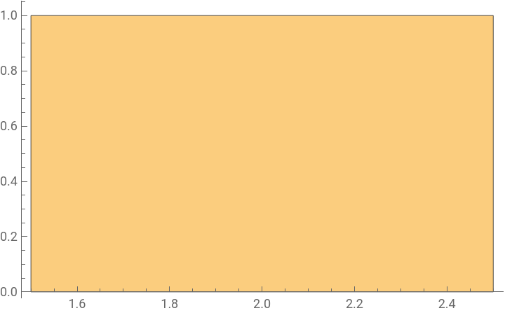
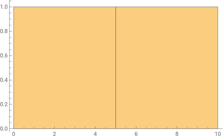
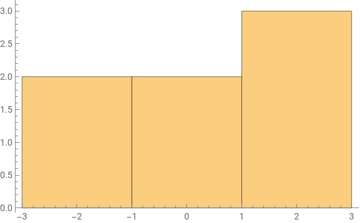
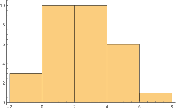
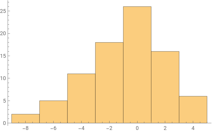
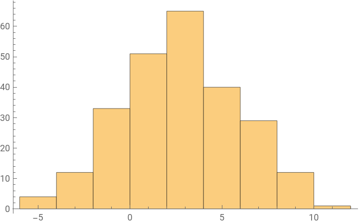
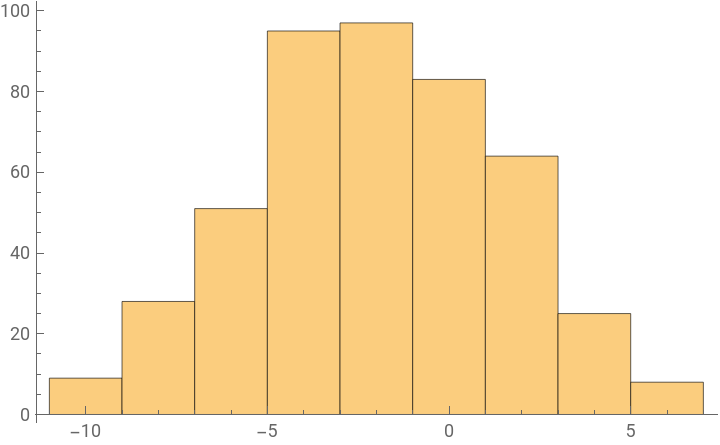
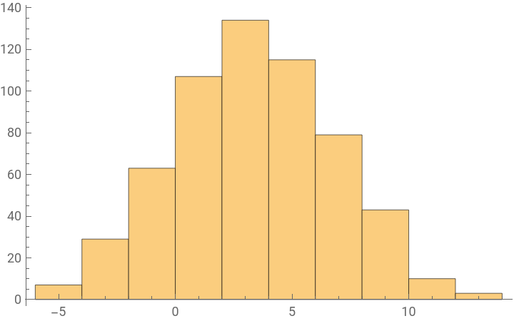
If we make a histogram of that data, we can get some cool graphs (x-axis is the score differences, y-axis is the frequency). Most notably, the distributions alternate between skewing negative then positive. This makes sense, because Reversi alternates between players and whoever has taken a turn most recently is more likely to have more pieces in their favor.
In[]:=
Histogram/@finalScoresData[rgg]
Out[]=
8
,9
,10
,11
,12
,13
,14
,15
,16
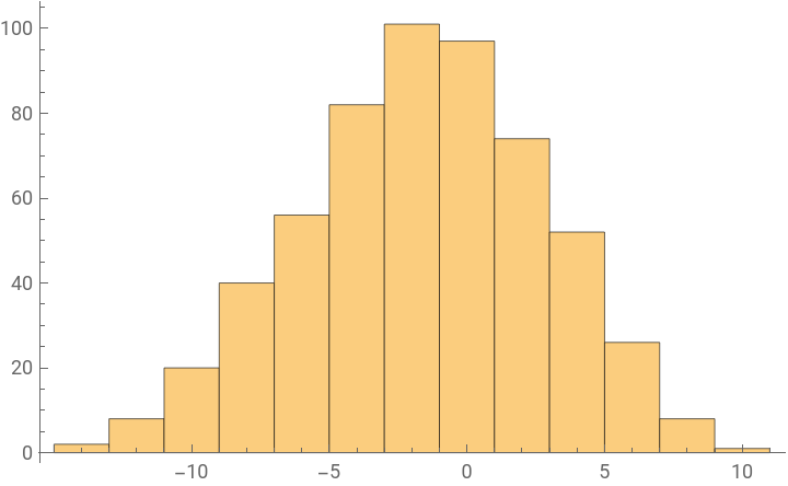
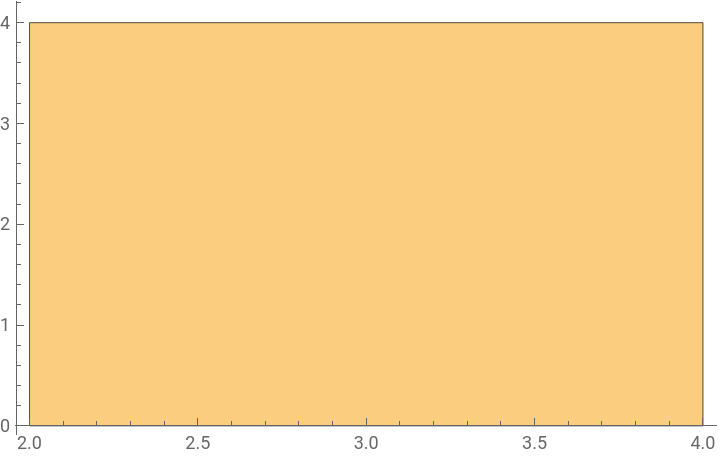
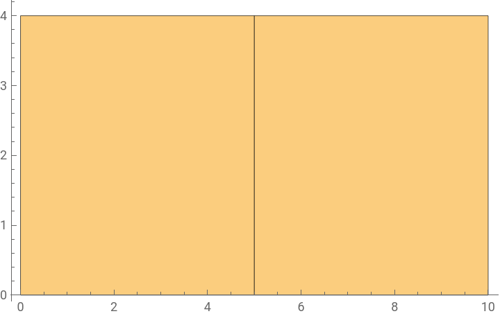
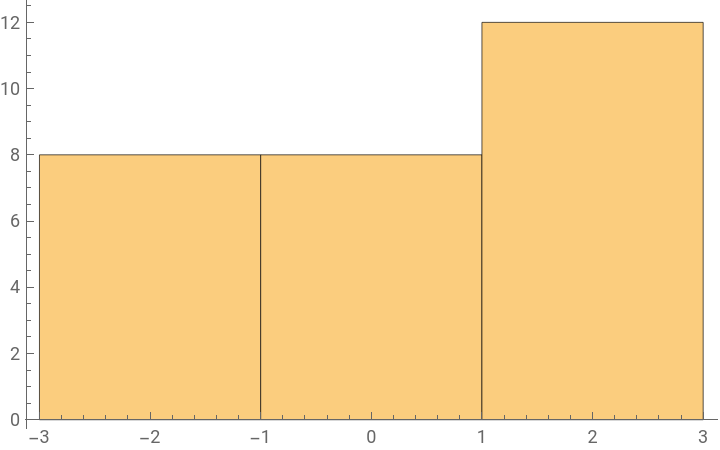
Then comes the question, did canonicalization affect score distributions at all? Visually looking at the histograms for the same calculation computed on our larger game graph, there seems to be no difference.
In[]:=
Histogram/@finalScoresData[gameGraph]
Out[]=
8
,9
,10
,11
,12
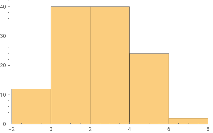
,13
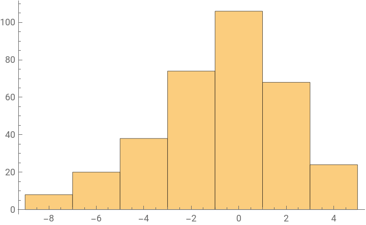
,14
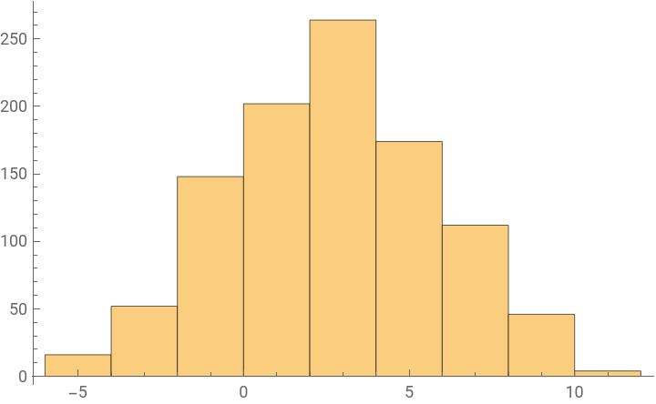
,15
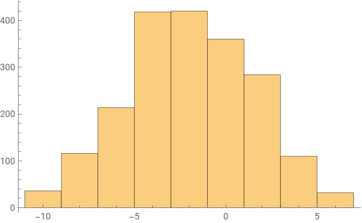
,16
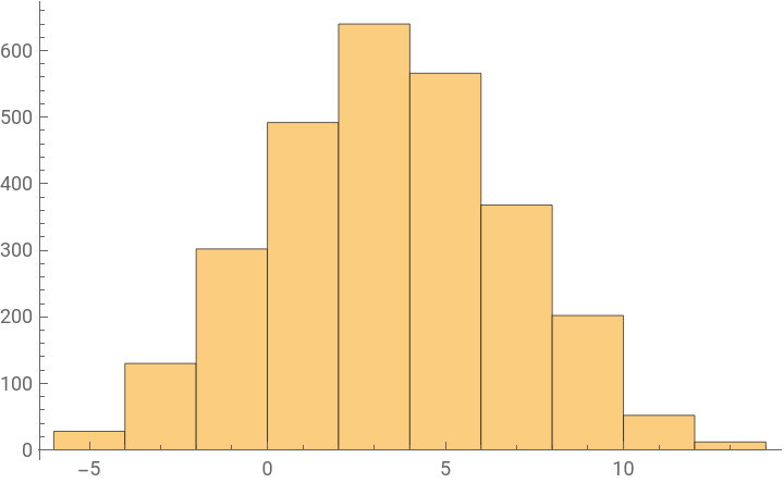
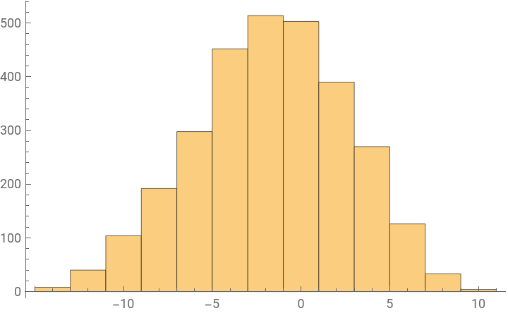
We can also look at the means of the distributions plotted on a line, and the distance between the yellow and blue dots are incredibly small.
ListPlot[{Mean/@finalScoresData[gameGraph],Mean/@finalScoresData[rgg]}]
Out[]=
Maybe visual inspection fails, so let’s actually examine the numerical values we get for differences. The final output has number of pieces on the board associated to a “z-score.” We first compute the “diff,” which are the distances between the yellow and blue points we plotted above. “Scale” is the standard deviation of each distribution. Dividing “diff” by “scale,” we can standardize our interpretation of how big the difference between the large game graph and canonicalized game graph is, depending on the variance of the distribution. Note that we dropped the key for 8 because only one board state has 8 pieces on it, and we can’t find the standard deviation of one value. The final numbers are very, very small.
In[]:=
diff=Merge[N@{Mean/@finalScoresData[gameGraph],Mean/@finalScoresData[rgg]},Subtract@@#&];scale=Merge[N@{StandardDeviation/@finalScoresData[gameGraph],StandardDeviation/@KeyDrop[finalScoresData[rgg],8]},Mean@#&];Merge[KeyDrop[{8}]/@{diff,scale},Divide[#[[1]],#[[2]]]&]
Out[]=
90.,100.,11-0.0388039,120.0313765,13-0.0234901,140.0126886,150.0129365,16-0.00707549