Emily and Lakisha [TEACHER NB]
Emily and Lakisha [TEACHER NB]
AP Research CT [Social Science]

JulianJacklin
In this lesson, students learn to apply computational thinking to sociological and econometric data using the Bertrand and Mullainathan resume dataset. Aligned with the AP Research QUEST Framework, students will practice generating aligned research questions, evaluating data types, analyzing data distributions, and interpreting empirical results through statistical and econometric modeling.
Lesson Overview
- Warm-up: Research Question (10 minutes)
- Activity 1: Data Collection (5 minutes)
- Activity 2: Data Visualization (15 minutes)
- Activity 3: Results (15 minutes)
- Cool-down: Next Steps & Limitations (15 minutes)
Teacher-Facing Goals
- Question and Explore (LO 1.1A): Formulate a specific, feasible, and discipline-aligned social science research question using available labor market variables.
- Synthesize Ideas (LO 4.2A): Interpret and synthesize quantitative data outputs (Linear Probability Models and Logistic Regressions) to develop and support an empirical argument regarding systemic bias.
Student-Facing Goal
Let's use programming code and statistical models to answer our own social science research questions about racial discrimination in the labor market.
Learning Target
I can design a specific social science research question, choose the best data visualization to show demographic trends, and use regression tables (like Odds Ratios and Parameter Coefficients) to prove my empirical conclusion.
Required Materials
- Internet-enabled device.
- Wolfram Language environment (cloud or desktop).
Lesson Overview
- Warm-up: Research Question (10 minutes)
- Activity 1: Data Collection (5 minutes)
- Activity 2: Data Visualization (15 minutes)
- Activity 3: Results (15 minutes)
- Cool-down: Next Steps & Limitations (15 minutes)
Teacher-Facing Goals
- Question and Explore (LO 1.1A): Formulate a specific, feasible, and discipline-aligned social science research question using available labor market variables.
- Synthesize Ideas (LO 4.2A): Interpret and synthesize quantitative data outputs (Linear Probability Models and Logistic Regressions) to develop and support an empirical argument regarding systemic bias.
Student-Facing Goal
Let's use programming code and statistical models to answer our own social science research questions about racial discrimination in the labor market.
Learning Target
I can design a specific social science research question, choose the best data visualization to show demographic trends, and use regression tables (like Odds Ratios and Parameter Coefficients) to prove my empirical conclusion.
Required Materials
- Internet-enabled device.
- Wolfram Language environment (cloud or desktop).
Research Question
Research Question
Background
Background
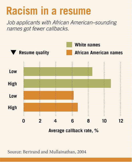
Do Black and White applicants differ in their likelihood of receiving a job callback, and does that depend on resume quality or gender? This is the central question that Bertrand and Mullainathan (2004) ask in their seminal paper, but there are several other factors, including applicants' years of experience, education levels, computer skills, military service, and neighborhood socioeconomic indicators, that can lead to different questions regarding racial discrimination in the labor market.
[TEACHER FACING]
By this point, student's should have already read and analyzed the research paper associated with this module. Methods of instruction for that activity are left to the discretion of the educator, as completion of the critical majority of this module does not rely on the primary document. Every module in the AP Research CT series uses its primary document as a backdrop for conducting computational work with real-world applications. The accompaniment of the primary document also allows AP Research instructors to simultaneously satisfy more traditional curricular goals, such as reading and analyzing research papers.
[TEACHER FACING]
By this point, student's should have already read and analyzed the research paper associated with this module. Methods of instruction for that activity are left to the discretion of the educator, as completion of the critical majority of this module does not rely on the primary document. Every module in the AP Research CT series uses its primary document as a backdrop for conducting computational work with real-world applications. The accompaniment of the primary document also allows AP Research instructors to simultaneously satisfy more traditional curricular goals, such as reading and analyzing research papers.
Consider this!
Consider this!
To generate your own question, think about:
Swapping the outcome – Instead of job callbacks , ask about differences in resume characteristics across candidate profiles (e.g., do resume features like honors or computer skills vary by race?).
Swapping the grouping variable – Compare application outcomes by geographic location (city, which looks at Boston vs. Chicago) instead of applicant gender (sex).
Change the relationship – Test whether one specific resume asset predicts a callback (e.g., years of experience) instead of comparing demographic groups.
And before finalizing, check your question:
- Can it be answered with variables that actually exist in the data?
- Is it specific (names exact variables/comparison)?
- Is there enough data in each group (as in groups of people) to compare meaningfully?
- Is this genuine research or just a quick, online search?
[TEACHER-FACING]
If a student decides to use a variable not included in the list above, then their code will run them an error later in the module. However, this could serve as an important learning moment, so long as they are redirected at some point toward choosing variables that are available in the dataset.
A note on redirection: If a student chooses "applicant age" as a variable, for instance, encourage them to tell you more about that variable. Do the researchers talk about age? Is age included in the list of variables? Students should firmly understand the limitations of the data they are working with, but should also be encouraged to think deeply about how extending a research sample (to include, for instance, an age variable) could actually be meaningful in practice.
Here are some useful sentence frames and examples that will fit perfectly into the rest of the module. At their core, students should align with the following:
1) Swapping the outcome - "Do applicant's [INSERT VARIABLE] differ by race?
2) Swapping the grouping variable - "Do applicants of the same [INSERT GROUPING VARIABLE] share similar callback rates?
3) Change the relationship - "Can [INSERT VARIABLE] be used to predict if someone will receive a callback?"
EXAMPLES:
- Do applicant's computer skills differ by race?
- Do applicants of the same city share similar callback rates?
- Can years of experience be used to predict if someone will receive a callback?
Swapping the outcome – Instead of job callbacks , ask about differences in resume characteristics across candidate profiles (e.g., do resume features like honors or computer skills vary by race?).
Swapping the grouping variable – Compare application outcomes by geographic location (city, which looks at Boston vs. Chicago) instead of applicant gender (sex).
Change the relationship – Test whether one specific resume asset predicts a callback (e.g., years of experience) instead of comparing demographic groups.
And before finalizing, check your question:
- Can it be answered with variables that actually exist in the data?
- Is it specific (names exact variables/comparison)?
- Is there enough data in each group (as in groups of people) to compare meaningfully?
- Is this genuine research or just a quick, online search?
[TEACHER-FACING]
If a student decides to use a variable not included in the list above, then their code will run them an error later in the module. However, this could serve as an important learning moment, so long as they are redirected at some point toward choosing variables that are available in the dataset.
A note on redirection: If a student chooses "applicant age" as a variable, for instance, encourage them to tell you more about that variable. Do the researchers talk about age? Is age included in the list of variables? Students should firmly understand the limitations of the data they are working with, but should also be encouraged to think deeply about how extending a research sample (to include, for instance, an age variable) could actually be meaningful in practice.
Here are some useful sentence frames and examples that will fit perfectly into the rest of the module. At their core, students should align with the following:
1) Swapping the outcome - "Do applicant's [INSERT VARIABLE] differ by race?
2) Swapping the grouping variable - "Do applicants of the same [INSERT GROUPING VARIABLE] share similar callback rates?
3) Change the relationship - "Can [INSERT VARIABLE] be used to predict if someone will receive a callback?"
EXAMPLES:
- Do applicant's computer skills differ by race?
- Do applicants of the same city share similar callback rates?
- Can years of experience be used to predict if someone will receive a callback?
My Question:
My Question:
Data Collection
Data Collection
Methodology
Methodology
How do the researchers collect data? What are two important considerations for collecting said data? These can be of your own making, or directly from the study.
[TEACHER-FACING]
Students are expected to refer to the research paper to identity that the researchers sent out roughly 5,000 fake profiles to various job postings in Boston and Chicago. Importantly, the profiles were nearly identical, and randomly assigned a white-sounding or African American-sounding name. Discussion around considerations should be peer-facilitated, whether in a group or whole-class fashion where and when applicable. This is so that students can engaged in more depth with the topic of research methodology, and come to a shared intuition around data collection. Such considerations may include selection bias—where choosing only two cities to submit applications in may have limited overall findings.
[TEACHER-FACING]
Students are expected to refer to the research paper to identity that the researchers sent out roughly 5,000 fake profiles to various job postings in Boston and Chicago. Importantly, the profiles were nearly identical, and randomly assigned a white-sounding or African American-sounding name. Discussion around considerations should be peer-facilitated, whether in a group or whole-class fashion where and when applicable. This is so that students can engaged in more depth with the topic of research methodology, and come to a shared intuition around data collection. Such considerations may include selection bias—where choosing only two cities to submit applications in may have limited overall findings.
Import
Import
To work with our data, we need to first import it into our environment—meaning, we just need to have it on our screen, to be able to work with it. For our purposes, this data will be imported as a spreadsheet (CSV) from the cloud. Run the following line of code to view the dataset.
In[]:=
data=Import["https://www.wolframcloud.com/obj/84c36c9e-b19c-459f-81e6-40a900f03617","Dataset"][All,{"education","n_jobs","years_exp","honors","volunteer","military","computer_skills","special_skills","first_name","sex","race","call","city"}]
Out[]=


How many different resumes are in this dataset? How many variables were used, and what were they? You should use the Dimension and ResourceData functions to help answer these questions
Hint! You can begin typing any function in Wolfram Language input, and info will appear that may help you understand how to use it.
[TEACHER-FACING]
Below is the code students should be running to get their answers:
Hint! You can begin typing any function in Wolfram Language input, and info will appear that may help you understand how to use it.
[TEACHER-FACING]
Below is the code students should be running to get their answers:
In[]:=
Dimensions[data]
Out[]=
{4870,13}
In[]:=
ColumnKeys[data]
Out[]=
{education,n_jobs,years_exp,honors,volunteer,military,computer_skills,special_skills,first_name,sex,race,call,city}
The first output tells us that there are 4870 rows (or applicants) and 13 columns (or variables). The second input provides us a list of all the variables in the dataset and how they should be written. Take note that many of these variables are binary (1="yes",0="no"). So if an applicant's row in the dataset has a 0 in the "military", for instance, then that means the applicant has no military experience.
Data Visualization
Data Visualization
Variables
Variables
Before visualizing anything, lets first identify what variables we'd like to use to answer our research question, and take note of how they are written in the dataset (First Name is not the same as first_name—why do you think that is?).
In[]:=
grouped:=GroupBy[Normal[data],Key["race"]];grouped2:=GroupBy[data,Function[row,{row["race"],row["INSERT GROUP VARIABLE"]}]]
[TEACHER-FACING]
Ensure that the variables students choose align with the ones they used in their research question. Here are the names of those variables as they should be inserting them:
[TEACHER-FACING]
Ensure that the variables students choose align with the ones they used in their research question. Here are the names of those variables as they should be inserting them:
{education,n_jobs,years_exp,honors,volunteer,military,computer_skills,special_skills,first_name,sex,race,call,city}
Notice that one of the variables has already been chosen for students, and that is "race". Students may choose an additional variable to analyze. In the line of code above where we are creating a variable called "grouped2", students can use ANY of the variables listed EXCEPT "n_jobs" , "years_exp", "first_name", or "call". The rest of the variables group the applicants by some common factor (i.e. all applicants from Boston; all applicants with no computer skills; all female applicants). If I were to use as my grouping variable, the code would like like such:
In[]:=
grouped2:=GroupBy[Normal[data],Function[row,{row["race"],row["sex"]}]];
Graphing
Graphing
Graphs and plots allow us to communicate trends in data clearly, typically catering towards wider audiences (why might this be?). In WL, there are several ways to plot data. Using the dataset and your chosen variables, your task is to determine which of the plots below communicates trends in your data the best (i.e. which graphs work, and which give you an error).
Means:=Mean[ToExpression/@Normal[#[[All,"INSERT NUMERICAL VARIABLE"]]]]&/@grouped2;rawKeys=Keys[Means];cleanLabels=StringRiffle[#," / "]&/@rawKeys;BarChart[Values[Means],ChartStyle"Pastel",PlotLabel"Barplot",ChartLabelscleanLabels]
callByGroup:=Mean[ToExpression/@Normal[#[[All,"call"]]]]&/@grouped;rawKeys=Keys[callByGroup];BarChart[Values[callByGroup],ChartLabelsrawKeys,ChartStyle{RGBColor[0.4,0.7,0.4],RGBColor[0.6,0.4,0.7]},AxesLabel{None,"Callback Rate (%)"},LabelStyleDirective[FontFamily"Helvetica",12]]
toNum[x_?NumberQ]:=x;toNum[x_String]:=Quiet[Check[ToExpression[x],Missing[]]];toNum[_]:=Missing[];xyPairs=Cases[Map[{toNum[#["INSERT NUMERICAL VARIABLE"]],toNum[#["call"]]}&,#],{_?NumberQ,_?NumberQ}]&/@grouped;lm1=LinearModelFit[xyPairs[[1]],x,x];lm2=LinearModelFit[xyPairs[[2]],x,x];quantity=Cases[ToExpression/@Normal[data[[All,"INSERT NUMERICAL VARIABLE"]]],_?NumberQ];Show[Plot[lm1[x],{x,Min[quantity],Max[quantity]},FrameTrue,FrameLabel{"","Predicted Probability of Callback"},PlotLabel"Linear Plot",PlotStyleDirective[Thick,RGBColor[0.070,0.929,0.930]],GridLinesAutomatic,PlotLegends{ToString[Keys[callByGroup][[1]]]}],Plot[lm2[x],{x,Min[quantity],Max[quantity]},FrameTrue,FrameLabel{"","Predicted Probability of Callback"},PlotLabel"Linear Plot",PlotStyleDirective[Thick,RGBColor[1.000,0.276,0.395]],GridLinesAutomatic,PlotLegends{ToString[Keys[callByGroup][[2]]]}]]
[TEACHER-FACING]
Look closely: Each cell contains its own code for its own graph. This means that students can run each individually and decide which (if not all) they would like to have. Common errors will include typos in variable names (Years_Exp is not the same as years_exp), not placing the variable names within the doubles quotes, and simply altering any code that does not ask them to insert a variable. The rest of the code besides these portions should remain untouched. Below is some example code, assuming my research question is "Can years of experience be used to predict if someone will receive a callback?":
Look closely: Each cell contains its own code for its own graph. This means that students can run each individually and decide which (if not all) they would like to have. Common errors will include typos in variable names (Years_Exp is not the same as years_exp), not placing the variable names within the doubles quotes, and simply altering any code that does not ask them to insert a variable. The rest of the code besides these portions should remain untouched. Below is some example code, assuming my research question is "Can years of experience be used to predict if someone will receive a callback?":
NOTICE! Part of what this graph is communicating is that female applicants tended to have more years of experience than their male counterparts, regardless of race. While this graph is adding context, it does not directly answer my research question. Hence, students should not internalize this as. stopping point, but rather, a springboard for further exploration. Ultimately, this work is not about simply what we compute, but what we compute for. Students should begin to understand, at least intuitively, that certain visualizations will work for certain types of questions.
To create this graph, students only have to run the cell as is. There is no place for them to insert a new variable, as this graph is simply communicating differences in Callback rate by group, and the chosen group is race. Notice, however, that if student scroll up and temporarily swap out "race" for another grouping variable in the grouped variable, then this graph can look very different. For example:
Now, a different story is being told. Not accounting for race, applicants without computer skills received callbacks at a slightly higher rate than applicants who did have computer skills.
In the final graph below, the year_exp variable is used to examine the relationship between years of experience, race, and callback rate.
In the final graph below, the year_exp variable is used to examine the relationship between years of experience, race, and callback rate.
This graph is communicating that generally, applicants with more years of experience have a higher likelihood of receiving a callback. But, even for the same experience, white applicants have a higher callback rate, and having more years of experience tends to help black applicants slightly less than it does white applicants. For the latter analysis, notice that the red line is slightly flatter than the blue line, which is more steep. This means that for every year of experience, white applicants gain a greater likelihood of receiving a callback than black applicants.
Trends
Trends
What trends or patterns seem to appear in your data? What might these say about your research question? Do your findings make sense to you intuitively?
[TEACHER-FACING]
Answers here may vary, but it is OK if they are obvious. The point of a data visualization is for a viewer to be able to parse and interpret information quickly and easily. This activity can be facilitated via students sharing their trends with a peer. This also provides a "check" for students who may be misinterpreting the data.
[TEACHER-FACING]
Answers here may vary, but it is OK if they are obvious. The point of a data visualization is for a viewer to be able to parse and interpret information quickly and easily. This activity can be facilitated via students sharing their trends with a peer. This also provides a "check" for students who may be misinterpreting the data.
Results
Results
Now that we've got some visualizations for our data, it is time to use statistics to make empirical conclusions in regards to our research question.
Logistic Regression: What are the odds?
Logistic Regression: What are the odds?
Logistic regression is a tool we use when dealing with variables that are binary, or have only two values. For our purposes, we will be looking at the call variable, which takes the values 1 (applicant received a call back) and 0 (applicant did not receive a call back). Ultimately, we would like to learn if an applicant is on average more likely to receive a call back if they are thought to be white, rather than black.
The following code cell has already been written and evaluated for you.
The following code cell has already been written and evaluated for you.
This result tells us that you are roughly e^(0.4318), or 1.5, times more likely to receive a call back if you are white applicant, than if your were a black applicant, based on the data of the study.
[TEACHER-FACING]
Students shouldn't alter any of the code above.
Please refer to the Technical Cheat-sheet for support in reading this table. Only students who have taken a high school statistics course, or a class with similar content, may be familiar with Logistic Regression. Focus only on the most essential metrics for answering the research question, and refrain from analyzing anything else too deeply.
Here's something to think about: Employers want to hire people with X quality, and perhaps the white applicants just have more of those qualities than the black applicants. Is this true? We can again use logistic regression find out. By adding a covariate, or another variable into our model, we can effectively control for it. In other words, we can ask the question: assuming we have two applicants with the same X quality (education level, for instance), how much more likely are they to get a call back soley due to their race. Use the code below, and any covariate of your choosing, to come to a conclusion:
This result tells us that you are roughly e^(0.4318), or 1.5, times more likely to receive a call back if you are white applicant, than if your were a black applicant, based on the data of the study.
[TEACHER-FACING]
Students shouldn't alter any of the code above.
Please refer to the Technical Cheat-sheet for support in reading this table. Only students who have taken a high school statistics course, or a class with similar content, may be familiar with Logistic Regression. Focus only on the most essential metrics for answering the research question, and refrain from analyzing anything else too deeply.
Here's something to think about: Employers want to hire people with X quality, and perhaps the white applicants just have more of those qualities than the black applicants. Is this true? We can again use logistic regression find out. By adding a covariate, or another variable into our model, we can effectively control for it. In other words, we can ask the question: assuming we have two applicants with the same X quality (education level, for instance), how much more likely are they to get a call back soley due to their race. Use the code below, and any covariate of your choosing, to come to a conclusion:
[TEACHER-FACING]
Students only insert an additional variable where specified, and alter nothing else. Here is an example of the completed code:
[TEACHER-FACING]
Students only insert an additional variable where specified, and alter nothing else. Here is an example of the completed code:
These results tell us that even when controlling for years of experience, white applicants are still about 1.5 times more likely (e^(0.4384)) to receive a callback compared to their African American counterparts. In other words, the data tells us that between applicants with the same years of experience, an employer is far more likely to call back an applicant if they are white, rather than African American—or, experience has little to no effect on mitigating the effects of racial discrimination in the labor market.
Conclusion
Conclusion
Discussion
Discussion
Given everything you have learned in this module, were you able to answer your research question? If you were able to, detail what empirical evidence you've collected that supports this claim(s).
If you were not able to adequately answer your research question, ask yourself: could I have answered my question using only the data provided? Was there something meaningful you learned about the topic regardless?
If you were not able to adequately answer your research question, ask yourself: could I have answered my question using only the data provided? Was there something meaningful you learned about the topic regardless?
Next Steps
Next Steps
How would you expand on the work of these researchers? Is there a different sample you would consider? A different research focus? Would you change how the research was conducted. Discuss this below.
[TEACHER-FACING]
For this activity, consider having students independently form their closing thoughts, as they should be culmination of the work they have done this module. Then, as responses to the Next Steps section may be scarce at first, invite small to large group discussion. This is where the module can conclude.
[TEACHER-FACING]
For this activity, consider having students independently form their closing thoughts, as they should be culmination of the work they have done this module. Then, as responses to the Next Steps section may be scarce at first, invite small to large group discussion. This is where the module can conclude.