This notebook series is designed to introduce selected dynamic economic models to both advanced undergraduate and graduate students. Economists have relied on a series of economic models to better understand the otherwise highly complex causal relationship among many economic variables. Dynamic economic models set up by systems of either difference or differential equations are particularly useful in tracing the change in the quantity of unknown economic variables (e.g., the capital stock, demand for labor, aggregate output, etc.) and their interactions over time.
This notebook series aims to help students better understand the depth, usefulness, and limitations of major existing micro and macroeconomic models by demonstrating how we can use Wolfram Mathematica to replicate and reconstruct the core ideas and find dynamic solution of the model.
The model introduced in this notebook series include, among others, (1) the cobweb model of the quantity and price adjustment, (2) Keynes’s aggregate demand model, (3) Hicks’s ISLM model, (4) Samuelson’s investment accelerator model, (5) Kalecki’s investment delay model, (6) the predator-prey interaction model, (7) the epidemic model, (8) Ricardo’s three dimensional business cycle model, (9) Marx-Goodwin business cycle and growth model, (10) Smith’s and Ricardo’s growth model, (11) the Harrod-Domar growth model, (12) the Solow growth model, (13) the RBC model, (14) Romer’s new growth model, and (15) the circuit of capital model.
Epidemic Models of Infectious Diseases
Introduction
Introduction
An epidemic model is one important application of a system of differential equations designed to capture a spread of a particular infectious disease. Even though the rapid spread of the infectious disease is not that common, a particular pathogen can create an acute emergency situation in which a normal economic activity is seriously disrupted. The recent COVID-19 pandemic in 2020 and afterward was the prime case in point.
This notebook introduces how to build and solve the famous epidemic model known as the SIR model (Kermack and McKendrick 1927) using Wolfram Mathematica. Each section of this note provides a step-by-step guide for building and solving the canonical SIR epidemic model and shows how we can develop and modify the original model in order to account for more complex and realistic features of any epidemic situation.
Interested readers can find the following reference useful: Blanchard, Devaney, and Hall (2012) provides a concise introduction to relevant mathematical tools used for building the original SIR model. Both Cooper, Mondal, and Antonopoulos (2020) and Shin (2021) show how one can apply this model to active COVID-19 pandemic situations across the country.
The baseline SIR model
The baseline SIR model
Introduction
Introduction
The original SIR model classifies the population into the three basic categories and shows the dynamic changes in each group of population over time. The three categories are the susceptible (S), infected (I), and recovered (R; or removed) population group. When developing the original SIR model, Kermack and McKendrick (1927) introduced some demographic variables such as the natural birth rate and death rate that affect the size of the susceptible population group. But some infectious diseases and viruses spread rather rapidly without significantly affecting these demographic variables. Therefore, when replicating the SIR-based epidemic models, it is often convenient to ignore these “vital dynamic” variables.
The model structure
The model structure
Following the SIR model without demographic variables, let us define the system of first-order differential equations for s(t), i(t), and r(t), which respectively represents the susceptible population, infected population, and recovered population. Here, alpha and beta are all positive parameters that represent the infection rate and recovery rate (Note):
In[]:=
ClearAll[SIR,α,β,s,i,r,t];SIR={s'[t]-αs[t]i[t],i'[t]αs[t]i[t]-βi[t],r'[t]βi[t]}
Out[]=
{[t]-αi[t]s[t],[t]-βi[t]+αi[t]s[t],[t]βi[t]}
′
s
′
i
′
r
(Note: The three population stocks should have been denoted by corresponding capital forms of letters such as S(t), I(t), and R(t) by convention. But they are all indicated by lower case letters in this note. This unconventional notation is for avoiding a technical issue associated with variable definitions unique to Wolfram Mathematica. In Mathematica, the capital I is retained to represent the imaginary number unit; the capital letter E introduced below is also retained to denote the exponential function. For this reason, all stock variables in this note are represented by lower case letters.)
The analytical solution
The analytical solution
One way of solving this system involving a nonlinear interaction term (si) is to use NDSolve, after assigning some arbitrary values to unknown parameters. For our convenience, let us normalize the size of the entire population to be 1, and suppose that, at the beginning, there is only one percent of infected population group. That is, the initial value is given by S(0) = 0.99, I(0) = 0.01, and R(0) = 0. If we assume that α = 0.2 and β = 0.1, the number of susceptible, infected, and recovered population at time t can be found by:
In[]:=
ClearAll[SIR,α,β,s,i,r,t,sol];α=0.2;β=0.1;sol=NDSolve[{[t]-αi[t]s[t],[t]αi[t]s[t]-βi[t],[t]βi[t],s[0]0.99,i[0]0.01,r[0]0},{s[t],i[t],r[t]},{t,0,150}]//Simplify
′
s
′
i
′
r
Out[]=
s[t]InterpolatingFunction[t],i[t]InterpolatingFunction[t],r[t]InterpolatingFunction[t]


We can visualize the solution path of the three functions:
In[]:=
Plot[{s[t]/.sol,i[t]/.sol,r[t]/.sol},{t,0,150},PlotLabel"The Original SIR model",AxesLabel{"Time","Ratio"},PlotLegends{"Susceptible Population","Infected Population","Recovered Population"},PlotStyle{Blue,Red,Green}]
Out[]=
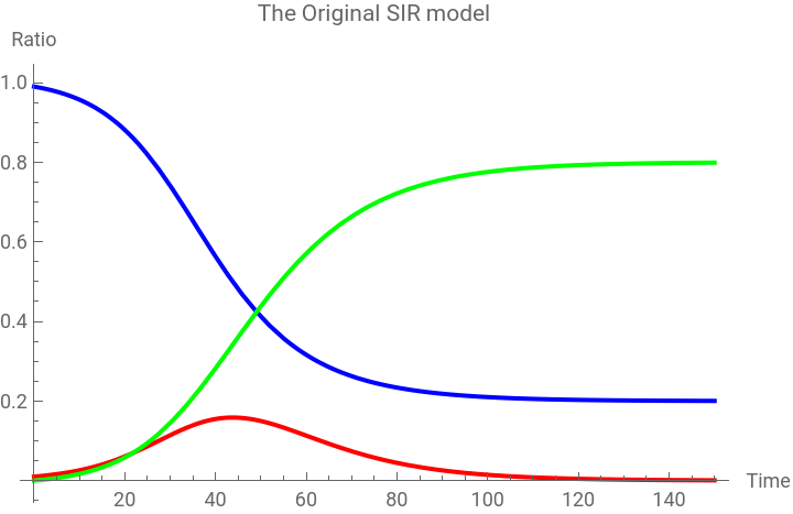


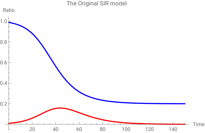
Alternatively, we can also solve this system only for both s(t) and i(t) because the entire population, which is the sum of the susceptible, infected and recovered, is normalized. In other words, we know that s(t) + i(t) + r(t) = 1. Therefore, r(t) = 1 - s(t) - i(t). In this case, the solution will be:
In[]:=
Plot[{s[t]/.sol,i[t]/.sol},{t,0,150},PlotLabel"The Original SIR model",AxesLabel{"Time","Ratio"},PlotLegends{"Susceptible Population","Infected Population"},PlotStyle{Blue,Red}]
Out[]=
Comparative static analysis
Comparative static analysis
As this model assumes that the total population consists of the three groups, it is natural to see that the number of susceptible population decreases as the number of infected population increases. After a certain period (duration) the infected group of population decreases as more and more people recover.
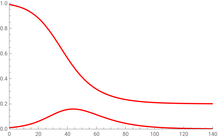
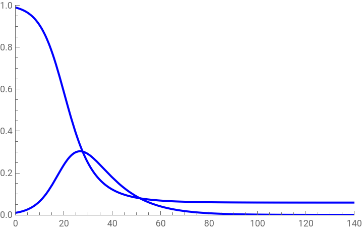
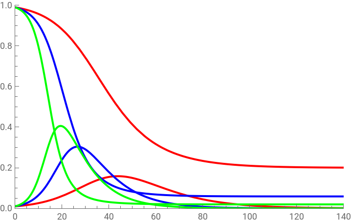
Of course, the exact shape and slope of the infection curve will depend on the infection rate, that is, how fast and strongly the virus spreads among the susceptible population. Similarly, the exact shape and slope of the susceptible population curve will depend on this infection curve. In order to illustrate this point, let us assign a different value to alpha, α = {0.2, 0.3, 0.4}, while leaving beta, the recovery rate, unchanged (β = 0.1).
When α = 0.2, both the susceptible population curve and the infection curve will be the same as plotted above.
In[]:=
legend=Grid[{{Graphics[{Red,Disk[{0,0},0.1]},ImageSize5],"α=0.2"}}];p1=Plot[{i[t]/.sol,s[t]/.sol},{t,0,150},PlotRange{{0,140},{0,1}},PlotStyleRed,PlotLegendslegend]
Out[]=
|
When α = 0.3, however, the infection curve becomes sharper, and as a result the curve for the susceptible population falls faster.
In[]:=
α=0.3;β=0.1;sol=NDSolve[{[t]-αi[t]s[t],[t]-βi[t]+αi[t]s[t],[t]βi[t],s[0]0.99,i[0]0.01,r[0]0},{i[t],r[t],s[t]},{t,0,150}]//Simplify
′
s
′
i
′
r
Out[]=
i[t]InterpolatingFunction[t],r[t]InterpolatingFunction[t],s[t]InterpolatingFunction[t]


In[]:=
legend=Grid[{{Graphics[{Blue,Disk[{0,0},0.1]},ImageSize5],"α=0.3"}}];p2=Plot[{i[t]/.sol,s[t]/.sol},{t,0,150},PlotRange{{0,140},{0,1}},PlotStyleBlue,PlotLegendslegend]
Out[]=
|
Finally, when the infection rate becomes higher to α = 0.4, we have a sharper fall in the susceptible population curve and a more drastic rise in the infection curve.
In[]:=
α=0.4;β=0.1;sol=NDSolve[{[t]-αi[t]s[t],[t]-βi[t]+αi[t]s[t],[t]βi[t],s[0]0.99,i[0]0.01,r[0]0},{i[t],r[t],s[t]},{t,0,150}]//Simplify
′
s
′
i
′
r
Out[]=
i[t]InterpolatingFunction[t],r[t]InterpolatingFunction[t],s[t]InterpolatingFunction[t]


In[]:=
legend=Grid[{{Graphics[{Green,Disk[{0,0},0.1]},ImageSize5],"α=0.4"}}];p3=Plot[{i[t]/.sol,s[t]/.sol},{t,0,150},PlotStyleGreen,PlotLegendslegend,PlotRange{{0,140},{0,1}}]
Out[]=
|
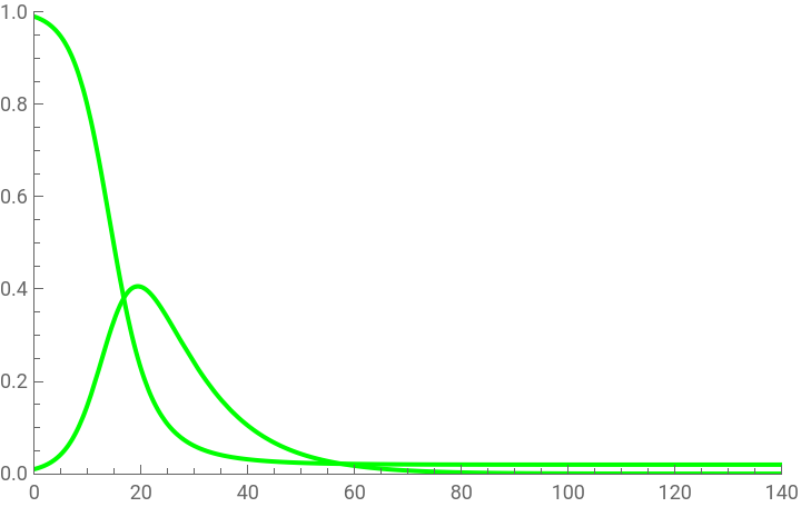
In each case, we have different numbers of infected patients out of the same susceptible population, and the shape of the infection curve for i(t) shows how fast the number of infected patients increases.
In[]:=
Show[{p1,p2,p3}]
Out[]=
|
An interactive visualization
An interactive visualization
There is another way of visualizing the epidemic trend. This time, let us visualize the dynamic interaction among the number of susceptible, infected, and recovered population by changing the parameters interactively. The following syntax allows us to create this interactive plot:
The reproduction ratio
The reproduction ratio
Suppose that the infection rate is zero (α = 0). Then no one will be infected by the virus. Conversely, suppose that the infection rate is 100% (α = 1), then the entire population will be infected when the recovery rate is zero. In between, we have potentially infinite numbers of possibilities resulting from different combinations of the positive infection and recovery rate. If the infection rate is 100%, while at the same time the recovery rate is also 100%, then only a minimal fraction of the population will be in the infected group. This is because even if the entire population is infected by the virus so quickly, the same number of people will recover soon. In the process, only a fraction of the population is in between.
The steady state value and the phase portrait
The steady state value and the phase portrait
Whatever the size of the reproduction ratio, the steady state solution of this system of differential equations can be found by setting the rate of change in both the susceptible and infected equal to zero.
Since this system is a dynamical system, we can also construct the direction field to conduct a phase diagram analysis:
First, let us construct the path of s(t) and i(t) with arbitrary parameter values and visualize the parametric solutions:
Next, using both VectorPlot and StreamPlot, we can also visualize the forces that affect the behavior of s(t) and i(t) in this system:
Finally, we can put the parametric solution inside the direction field, using Show function.
The SEIR model
The SEIR model
The model structure
The model structure
One immediate extension of the original SIR model is to introduce a new variable E (exposed) in between S and I in order to capture the time delay or duration between the exposure to the virus and the observed infection case. The ordinary differential equations for s(t), e(t), i(t), and r(t), which respectively represents the susceptible population, exposed population, infected patients, and recovered population, become:
The analytical solution
The analytical solution
Following the same procedure, let us use NDSolve after assigning arbitrary values to unknown parameters. In this modified model, the parameter α is the exposure rate, β is the infection rate, and γ is the recovery rate. Suppose α = 0.3, β = 0.2, and γ = 0.1 with the initial condition e(0) = 0.02 and i(0) = 0.01.
An interactive visualization
An interactive visualization
We can also visualize the dynamic interaction among the number of susceptible, exposed, infected, and recovered population by changing the parameters interactively.
The SIRS Model
The SIRS Model
The model structure
The model structure
One of the basic assumptions of the original SIR model is that individuals who recover from the infectious disease will not be infected again. But some viruses continually evolve and new strains can emerge, so that recovered individuals can be reinfected. In order to consider this reinfection scenario, we need to modify the original SIR model into the SIRS model where the second S represents the the possibility of reinfection. In other words, the recovered population reenters the initial susceptible group.
This kind of scenario is quite common in many infectious diseases. The antibody, a blood protein produced in response to and counteracting a specific antigen, is either weak or it does not last long enough to prevent the reinfection. It is also possible that the virus evolves so fast that the existing antibody fails to stop the reinfection related with a new virus variant.
One way of incorporating this idea is to introduce a new variable γ r(t) where γ > 0 represents the number of those who are infected again after being recovered from the first infection. This reinfection increases the number of susceptible population, while decreases the number of the recovered. Therefore, the corresponding system of differential equations becomes:
An interactive visualization
An interactive visualization
Following the same procedure, we can create an interactive plot that shows dynamic interactions among s(t), i(t), and r(t). As before, with the initial condition s(0) = 0.99 and i(0) = 0.01, we need to evaluate the solution of the system with varying values parameters α (infection rate), β (recovery rate), and γ (reinfection rate).
Compared to the original SIR model, a new dynamic pattern emerges in this SIRS simulation. The number of susceptible population rises up again, rather than monotonically decreasing, as the number of recovered population peaks and then slows down later. This behavior is consistent with what this model is designed to show because a certain fraction of those who are recovered becomes the susceptible population group. In addition, the number of the infected group never converges to zero; it may be getting very close to, but never reaches, zero. This also makes sense because there is a continuous flow into the susceptible population group, some of which will be infected by the given infection rate.
The SIRD Model
The SIRD Model
The model structure
The model structure
The SIRD is another slight modification of the original SIR model, which incorporates the number of population who die because of the infectious disease. The capital D in the SIRD represents this deceased group of population. In this model, we assume that d(t) is a constant fraction of those who are infected and γ > 0 captures this mortality rate. The system of differential equations now becomes:
An interactive visualization
An interactive visualization
As before, we can visualize the dynamic behavior of the number of susceptible, infected, recovered, and deceased population by changing parameters interactively. With the same initial conditions, now we have parameters α (infection rate), β (recovery rate), and γ (mortality rate) to estimate.
In addition to the existing three functions of variables, s(t), i(t), r(t), now we are adding the group of deceased individuals, d(t). In this model, the mortality rate is assumed to be a certain constant fraction of the infected population group. In the real-world, however, this mortality rate is widely different among different social groups that we can classify by their basic demographic characteristics (i.e., age, sex, race and ethnicity), the quality and accessibility of public health care system, as well as the patients’ existing health conditions.
The SASIRD Model
The SASIRD Model
The model structure
The model structure
Another implicit assumption behind the baseline SIR model is that those who are infected are relatively homogeneous in terms of their health and post-infection symptoms. But some groups of infected patients may show severe symptoms, while other do not even show any visible sign of infectious disease. The SASIRD model is an extension of the baseline SIR model to account for this divergent symptom. The capital ASI (standing for ASymptomatic Infection) represents a fraction of the asymptomatic patients among the infected population group.
Making a distinction between the two groups within the infected population, that is, the distinction between asymptomatic patients and those who are showing severe symptoms is very important for designing proper public health policies to contain the spread of the virus. For example, severely symptomatic patients need to be hospitalized and should receive intensive urgent cares, whereas asymptomatic patients would not need such treatments. For the latter group, a certain quarantine measure (i.e., self-isolation, enhanced sanitation, careful health monitoring, etc.) is sufficient to help them recover from the infectious disease. Of course, timely detection of the infected patients and proper classification and separate treatment of these infected patients can also help relieve the burden placed upon otherwise overwhelmed medical facilities.
In order to account for these two different groups within the infected population, we need to introduce a new variable asi’(t) = δ (α s(t) i(t)-β i(t)) as a sup-group of i’(t), where δ is a positive parameter that shows a certain fraction of infected patients. The notation asi(t) represents the changing number of ASymptomatic Infected group. This asi(t) variable appears not only as the fraction of the infected patients but also in the change in the deceased population, d(t), because 1- asi(t) represents the infected patient group under critical health conditions who will determine the change in the differential equation of d(t).
The corresponding system of differential equations becomes:
An interactive visualization
An interactive visualization
As before, we can create an interactive chart showing the number of susceptible, infected, infected but asymptomatic patients, recovered, and deceased population group by changing the parameters. To the same initial condition for s(t) and i(t), s(0) = 0.99, i(0) = 0.01, let us introduce a new initial condition for asi(t), asi(0) = 0.007. The parameters, α (infection rate), β (recovery rate), γ (mortality rate) remain the same as before. But a new parameter δ (a certain positive fraction of infected patients) is introduced to represent the asymptomatic infection case.
In this interactive chart, the asymptomatic patient group is a fraction of the infected population group. Therefore, the higher the value of the parameter δ, the lower the number of severely symptomatic patients. Conversely, if the estimated δ is lower, then there will be a greater number of infected patients who will be showing severe symptoms. The number of deceased population is also determined by the proportion of severely symptomatic infected patients (1-δ) given the overall mortality rate (γ).
Conclusion
Conclusion
This note reviews the basic structure of the SIR-based epidemic models and examines how to solve and visualize the solutions of the system of differential equations using Mathematica. Starting from the original SIR model, we have introduced and analyzed slightly modified models that account for (1) the exposure, (2) reinfection, (3) deceased, and (4) asymptomatic infection, in order. Though each model has its own unique feature and emphasis, the underlying mathematical structure and the solution procedure remain the same.
One important step moving forward is to use any of these models to empirically estimate some crucial parameters from real-world epidemic data. Of course, not every model in this section can be directly used for this empirical estimation because the real-world epidemic data does not show the full picture of the virus spread. For example, the data for reinfected patients does not exist (therefore, we cannot use the SIRS model), nor does the data for sub-group classifications among infected patients (therefore, we cannot use the SASIRD model) in the case of the ongoing COVID-19 epidemic. Therefore, the SIR(D) and SEIR(D) model are the only strongest candidates to use for empirical analysis of COVID-19 pandemic.
Another issue that we need to think about for this kind of statistical analysis is that in the real world some virus pathogens continuously evolve over time. More than 12 months of COVID19 pandemic has shown that the basic parameters such as the infection rate and mortality rate appeared in these models seldom remain constant. These parameters also seem to be affected by the government’s efforts to implement various non-pharmaceutical interventions. Therefore, one-time parameter estimation over the whole period may fail to generate realistic parameters that can be used to predict the likely pattern in the future. Perhaps, we need to separate out different time periods to conduct ‘time-varying’ parameter estimation.
Finally, from an economist’s point of view, it seems more intriguing to apply these epidemic models to the analysis of economic impacts. Unmitigated and widespread infection can directly affect the labor supply and demand, productivity, and aggregate output. The government’s non-pharmaceutical interventions such as mandatory social distancing and face-mask wearing also affect the way how a society and business entity organizes its production, distribution, and consumption activities. How we consistently integrate some epidemic models components with traditional macroeconomic models can be an important research agenda.
Reference
Reference
◼
Paul Blanchard, Robert L. Devaney, and Glen R. Hall, Differential Equations, Cengage Learning, 2012 (4th edition), pp.209-216.
◼
Hee-Young Shin “A multi-stage SEIR(D) model of the COVID-19 epidemic in Korea,” Annals of Medicine, Vol. 53, No. 1 (2021), pp.1159–1169 (https://doi.org/10.1080/07853890.2021.1949490)
◼
William O. Kermack and Anderson G. McKendrick, “A contribution to the mathematical theory of epidemics,” Proceedings of Royal Society of London, Vol.115, No. 772 (1927), pp.700–721.
CITE THIS NOTEBOOK
CITE THIS NOTEBOOK
Introduction to dynamic economic models: epidemic models of infectious diseases
by Hee-Young Shin
Wolfram Community, STAFF PICKS, December 26, 2025
https://community.wolfram.com/groups/-/m/t/3597072
by Hee-Young Shin
Wolfram Community, STAFF PICKS, December 26, 2025
https://community.wolfram.com/groups/-/m/t/3597072