Rentable bike stations are a critical part of modern urban infrastructure in many cities across the world. As a clean, cheap, and accessible option compared to owning a personal vehicle or relying on potentially inconsistent transportation, the implementation of bike station systems has high appeal across urban environments. Beyond the individual utility for users, extensive bike station programs can reduce traffic congestion for everyone in the city. However, many variables and decisions are associated with the development of these stations, one of which is their placement. This project first computationally analyzes placement in Chicago, evaluating and visualizing it based on flexible metrics. Additionally, it utilizes neural networks to suggest optimizations based on those metrics. Finally, it draws conclusions about existing bike station placement.
Introduction
Introduction
How can a city maximize the provided utility of public transportation systems? While simply spacing them out evenly is often somewhat reasonable, a lot of potential for optimization exists depending on important factors like where people live, work, and shop.
In this computational essay, the two questions of how well existing systems work as well as how stations should be placed given existing patterns are addressed. Chicago is used as the baseline and metrics are applied to the data in order to analyze its spacing. Additionally, a neural network is incorporated and built trained on the data from Chicago and Boston. Lastly, this neural network is applied to Seattle, which does not have a bicycle renting system.
In this computational essay, the two questions of how well existing systems work as well as how stations should be placed given existing patterns are addressed. Chicago is used as the baseline and metrics are applied to the data in order to analyze its spacing. Additionally, a neural network is incorporated and built trained on the data from Chicago and Boston. Lastly, this neural network is applied to Seattle, which does not have a bicycle renting system.
For the metric, four kinds of data are considered, namely where residents live, where jobs are, where the stations are, and where existing transportation like railways stations are. For the neural network, which prioritizes context and underlying logic rather than combined effect, local population, neighborhood population, distance to the center of the city, local jobs, neighborhood jobs, and distance to the nearest rail station.
Station placement from Divvy, the company organizing Chicago’s bicycle system . The data regarding residence for Illinois, Massachusetts, and Washington is pulled from the National Historical Geographic Information system).
Import a list of all blocks in the USA and their populations from the National Historical Geographic Information System (NHGIS)
In[]:=
blk=Import[CloudObject["https://www.wolframcloud.com/obj/0d3b9425-3b1e-48a5-8ce2-b7992eb8ebd8"],"CSV"];
Chicago Data
Chicago Data
To start, we extract Chicago’s data from the NHGIS.
Pull resident data
In[]:=
chicagodata = Pick[blk, StringStartsQ[blk[[All,1]],"G1700310"]];pop = N[chicagodata[[All, 4]]];
In[]:=
toex[x_]:=If[NumberQ[x],x,ToExpression[x]];
In[]:=
la=toex/@chicagodata[[All,2]];lo=toex/@chicagodata[[All,3]];
Pull job location data
In[]:=
illinoisJobData=CloudObject["https://www.wolframcloud.com/obj/jasonyao09/il_wac_S000_JT00_2020.csv/il_wac_S000_JT00_2020.csv"];
In[]:=
illinoisJobs=Import[illinoisJobData,{"CSV","Data",All,{1,2}}];jk=AssociationThread[ToString/@Rest[illinoisJobs][[All,1]]->N[Rest[illinoisJobs][[All,2]]]];job=Lookup[jk,("17031"<>StringDrop[#,8])&/@chicagodata[[All,1]],0.];
Pull the bike station data
In[]:=
st=Import["https://gbfs.lyft.com/gbfs/2.3/chi/en/station_information.json","RawJSON"]["data","stations"];sla=toex[#["lat"]]&/@st;slo=toex[#["lon"]]&/@st;capacityList=N[If[NumberQ[#],#,1]&/@(Lookup[#,"capacity",1]&/@st)];
Pull the railway data
In[]:=
railpath="https://www.wolframcloud.com/obj/jasonyao09/CTA_L_stops.csv.csv";railwayData=Import[railpath,{"CSV","Data"}];
In[]:=
parses[s_] := Module[ {texts, numbersx, numbers, Lat, Lon}, texts = ToString[s]; numbersx = StringCases[texts, NumberString]; numbers = ToExpression /@ numbersx; Lat = SelectFirst[numbers, 40 < # < 43 &, Null]; Lon = SelectFirst[numbers, -89 < # < -86 &, Null]; {Lat, Lon}]
In[]:=
rail=Cases[parses/@Rest[railwayData][[All,Position[First[railwayData],"Location"][[1,1]]]],{_?NumberQ,_?NumberQ}];
Lastly, store the locations of all blocks, stations, and railways through their 3d position relative to the earth
In[]:=
blockXYZ=GeoPositionXYZ[GeoPosition[Transpose[{la,lo}]]][[1,All,1;;3]];stationXYZ=GeoPositionXYZ[GeoPosition[Transpose[{sla,slo}]]][[1,All,1;;3]];railwayXYZ=GeoPositionXYZ[GeoPosition[rail]][[1,All,1;;3]];
Metrics
Metrics
In order to evaluate the placement of bike stations in Chicago, we need to determine which variables constitute an effective placement. Average distance is not enough by itself, it is important to consider coverage by other transportation systems as well as the capacity each station can serve. The metrics used are based on the two-step floating catchment area (2SFCA) method, developed by Radke and Mu (2000) and formalized by Luo and Wang (2003) to measure spatial access with demand.
Before metrics are established, the key concept of a catch radius, or the maximum acceptable distance for users to walk to, has to be established. A system will probably not work well if 60% of target users have to walk two kilometers to get to a station. This radius varies for cities and situations, but a baseline is 400 (can be adjusted) meters as that equates to about a 5 minute walk at 1.3 m/s. El-Geneidy et al. (2014), measured real walking distances to transit stops, found average walk distances in this range, with the 400 m mark a threshold beyond which access drops off. With this, each station provides service to a circle of radius 400 meters centered at the station.
Catch Radius
In[]:=
catchRadius = 400.;
If we take this for now, the first step in evaluating metrics is to match each block to its nearest station. This is a simplification as it might make more sense for a user to choose a further station if it is more in route to their final destination, but it is used as a reasonable approximation for now.
Return nearest block for each station and station for each block.
In[]:=
nearestBlock = Nearest[blockXYZ -> Range[Length[blockXYZ]]];nearestStation = Nearest[stationXYZ -> Range[Length[stationXYZ]]];
Next, the concept of demand for bicycle stations at each block must be established to evaluate their weighting. This is estimated using the two variables of population and number of jobs in an area. However, existing railway infrastructure is one of the variables we consider as it means users will have alternatives. Cervero et al. demonstrated that roughly 30% to 45% of residents living within 800 meters of heavy rail in metro areas use them. Thus, we can evaluate railways as providing about 40% relief.
Distance to nearest rail station
In[]:=
railDistance = EuclideanDistance[#, First@Nearest[railwayXYZ, #]] & /@ blockXYZ;
Calculate demand, taking rail relief into account
In[]:=
maxRailRelief = 0.4;railRelief = maxRailRelief Exp[-railDistance/800];blockDemand = (pop + job) (1 - railRelief);
Set up list of demand for each block
In[]:=
demandInCatchment = Table[Total[blockDemand[[nearestBlock[stationXYZ[[k]], {All, catchRadius}]]]], {k, Length[stationXYZ]}];
Ratio of docks to people to evaluate average demand supplied.
In[]:=
docksPerPerson = MapThread[If[#2 > 0, #1/#2, 0.] &, {capacityList, demandInCatchment}];
Accessibility for each block, calculated by summing up provided supply of stations around
In[]:=
accessibleSupply = Table[Total[docksPerPerson[[nearestStation[blockXYZ[[i]], {All, catchRadius}]]]], {i, Length[blockXYZ]}];
Average accessibility, indexes
In[]:=
systemAverage = Total[blockDemand accessibleSupply]/Total[blockDemand];accessIndex = accessibleSupply/systemAverage;docksPer1000 = 1000. accessibleSupply;
Fraction of stations without station and with below average
In[]:=
fractionNoStation = Total[blockDemand UnitStep[-accessibleSupply]]/Total[blockDemand];fractionUndersupplied = Total[blockDemand UnitStep[systemAverage - accessibleSupply]]/Total[blockDemand];
Sum of deficits
In[]:=
dockDeficit = Total[blockDemand Ramp[systemAverage - accessibleSupply]];needMet = Total[blockDemand Clip[accessIndex, {0., 1.}]]/Total[blockDemand];
{<|"blocks" -> Length[blockDemand], "docksPer1000People" -> 1000. systemAverage, "noStationFrac" -> fractionNoStation, "undersuppliedFrac" -> fractionUndersupplied, "dockDeficit" -> dockDeficit, "needMetFrac" -> needMet|>};
Out[]=
{blocks83018,docksPer1000People3.01615,noStationFrac0.549593,undersuppliedFrac0.656008,dockDeficit12649.4,needMetFrac0.405347}
Visualization
Visualization
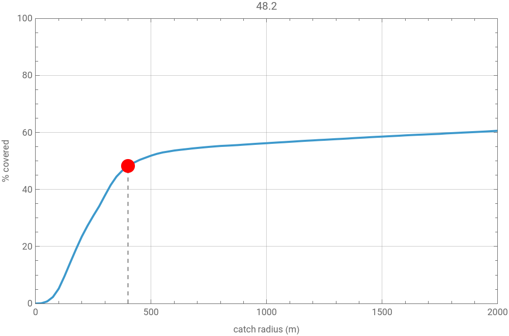
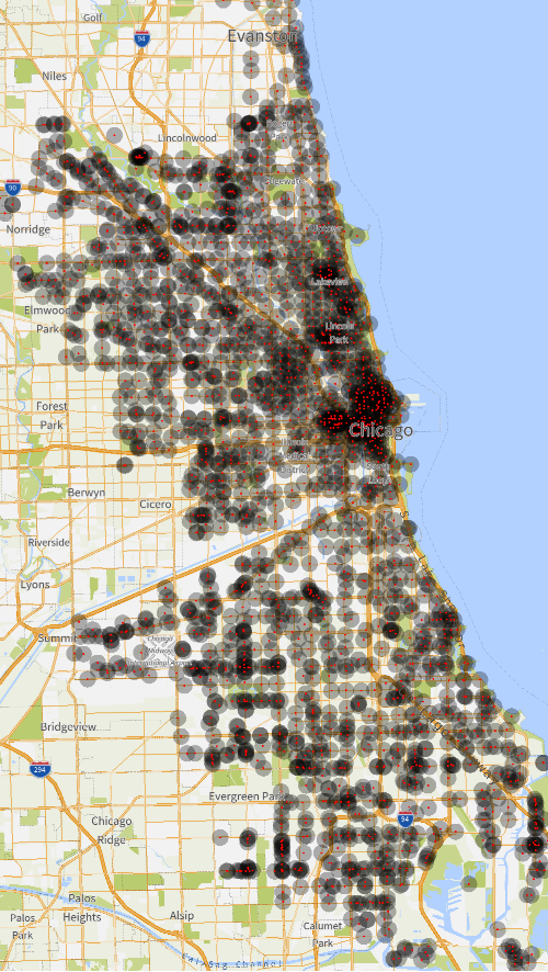
To visualize the pure coverage effectiveness depending on desired distance from stations, we can create a graph of percentage covered versus acceptable catch radius. as well as a map plot. For the graph, we start by pairing each population block to its closest station, as that is what determines pure coverage.
The structure of variables used and structure of the visualization cell were given by claude.ai, values were filled in. To get coverage, each block is matched to its nearest station. This is a simplification as it may make sense for users to walk slightly longer distances if it is in route to their final destination, or if the closest station has no more availability.
The structure of variables used and structure of the visualization cell were given by claude.ai, values were filled in. To get coverage, each block is matched to its nearest station. This is a simplification as it may make sense for users to walk slightly longer distances if it is in route to their final destination, or if the closest station has no more availability.
List of smallest distances
In[]:=
nd = MapThread[EuclideanDistance, {blockXYZ, First /@ Nearest[stationXYZ][blockXYZ]}];
Graph of population within chosen catch radius
In[]:=
cov[r_] := 100. Total[pop UnitStep[r - nd]]/Total[pop];
In[]:=
curve = Table[{x, cov[x]}, {x, 0, 2000, 25}];
Range of stations
In[]:=
grange = {MinMax[sla], MinMax[slo]};
I then created the graph of acceptable coverage radius vs coverage using the curve established. For the map visualization, we visualize through translucent disks. The code for the visualization is from Claude.
Graph of coverage versus catch radius as well as map representation of areas covered. May take some time to render.
In[]:=
Manipulate Column ListLinePlotcurve, , GeoGraphics{GeoDisk[#, Quantity[Max[rad, 1.], "Meters"]] & /@ Transpose[{sla, slo}], Red, PointSize[0.004], Point[GeoPosition[Transpose[{sla, slo}]]]}, , {{rad, 400, "catch radius (m)"}, 0, 2000, 10, Appearance -> "Labeled"}, ContinuousAction -> False, SaveDefinitions->True
Out[]=


Neural network
Neural network
The metric measures whether the stations that exist are serving people well. However, by itself, they do not offer an actionable plan to where stations should go next in a place that has none. One way to approach this issue is to assume the operators who built Divvy and Bluebikes placed their stations intelligently and treat their placement as optimal. With this, a neural network can be built for new cities that places stations based on the features associated with each cell. Neural networks struggle to process irregular shapes and large differences in numerical scales of variables (the range of populations and the range of distances may be very different). Thus, before beginning, the model’s input values are transformed into a spatial grids, smoothed, and scaled between 0 and 1.
Setup
Setup
As discussed above, this approach is grid-dependent, which makes raw latitude and longitude fairly awkward as a degree of longitude is a different number of meters than a degree of latitude. Thus, we start by projecting every point onto a flat local grid measured in meters, centered on the city. In those coordinates distance is ordinary distance and a location corresponds to one cell.
Cell parameters and transformations between lat/long and grid coordinates
We create a function to normalize the data necessary as the same process will be applied to the cities of Boston and Chicago to train the neural network. The cityrec function takes the state’s block-ID prefix (“G17” for Illinois, “G25” for Massachusetts) in order to extract the data, lgz — the path to that state’s LODES jobs file, rll — the city’s rail-station coordinates (a list of {lat, lon}), gbfs — the URL of that city’s bike-share feed, cbd — the downtown coordinate {lat, lon} for the distance-to-center feature. It returns a list of associations for each cell. The code for the function is from Claude.
Reaches out to a live GBFS (General Bikeshare Feed Specification) JSON feed and pulls the latitude and longitude of every active bike station
Filters for blocks starting with a specific geographic ID, adds bounding box around minimum and maximum latitude and longitude
Matches census block format with job dataset format
Builds a flat, localized coordinate system (Easting and Northing) centered on your city .
Helper to turn indexes into strings of the form "x,y"
Sums up data (like population or jobs) that fall into the exact same grid cell .
Calculates a "neighborhood score" for a cell by looking at a 5 x5 grid around it . Points further away contribute less to the score .
Creates the grid with an boundary of 1km from the minimum/maximum lat/long.
Calculates and scales (from 0 to 1) six variables local population, neighborhood population, distance to the Central Business District (CBD), local jobs, neighborhood jobs, and distance to the nearest rail station .
Pieces everything together, outputs list of associations.
Training
Training
To build the Neural Network, I extracted the requisite data for Chicago and Boston.
We take the top geographic 30% as testing, bottom 70% as training in order to avoid data leakage.
Pooling and formatting the training data from Boston and Chicago
We note that an imbalance exists between the number of positive and negative entries, as most cells don’t have a bicycle station. If our data was purely trained on this, an imbalance would exists as always guessing no station would be too accurate. Thus, we artificially balance the ratio by drawing 2.5 random negative entries per positive entry.
In terms of the training, we choose to use two classification methods to provide a baseline for the effectiveness of the program. This allows for the accuracy to not be isolated and for us to tell whether the model is effective or whether the task is just easy. We choose a neural network and a random forest. A random forest function uses decision trees to assign importance to each feature, then uses those features to make a prediction. This is fundamentally different from a neural network system, which uses artificial neurons. This suggests that if both classifier methods agree, the features matter. Eventually however, we will only use the neural network on Seattle.
Running classifiers
We can now compare the two classifier methods through their recall, or the proportion of positives founds, as well as precision, the accuracy of predicted positives.
We can see that the classifier methods achieve comparable results, with the Neural Network having better recall but the Random Forest having better precision.
Application to Seattle
Application to Seattle
Pulls Washington blocks out of the same national table as Chicago.
Reads the latitude of each block
Filters for blocks around Seattle, constrained by latitude between 47.49 and 47.74 as well as longitude between -122.44 and -122.24.
Import data about Seattle’s jobs.
We can build a lookup table for jobs per block by using its 15 - digit block code from its GISJOIN ID (that StringTake/StringDrop pulls out the state, county, tract, and block digits) and finding its jobs, defaulting to 0 if the block has none .
For Seattle’s link light rail stations, we can use a list of their latitude and longitudes
In order to make the neural network work, we need to convert Seattle’s data into a grid structure.
First, we flatten it and convert longitude and latitude onto 2d distances
We establish the nearest rail station from downtown seattle (coordinates 47.6062, -122.3321).
Next, we lay 300 squares over the grid. blockToCell figures out which cell each block falls into. populationInCell and jobsInCell then total up the population and jobs per cell. The last two lines find the city’s bounding box and enumerate every cell in it
Next, we convert each cell so that the format matches up with the training format used on Chicago. We drop cells with no demand, such as cells occupied by water.
We compute the 6 features our model is trained on.
We apply the trained model to score every Seattle cell' s station-suitability .
We convert back to coordinates
Then, we order by suitability.
We walk the cells from most to least suitable, accepting a site only if it' s at least 300 m from every one already chosen. The code for this is from Claude. Here, the number of stations chosen is constrained by choosing cells with probability greater than one half as well. This can be increased or lowered by adjusting the probability requirements or through a manual limit.
Artificial limit, redundant here
Evaluation
Finally, we can visualize the results with a temperature map of each cell’s suitability as well as the suggested station placements. In the first visual, blue represents a low suitability with red as high suitability. In the second visual, red dots represent the suggested placements
The model concentrates on Capitol Hill, which was a predictable result, as well as Victory Heights.
Conclusion
Conclusion
The metrics reveal that the Chicago region is actually quite under supplied by the metrics, with 54.9593% of the population not having access to a bicycle station within 400 meters and 65.6% of the population being under supplied. Looking at the map visualization, this seems to be by design with the downtown urban center seeing a high density of bicycle stations and large areas with no stations.
In the application of the neural network to Seattle, these trends are somewhat similarly reflected although key distinctions exist. In Seattle’s distribution, the stations are clumped around two centers rather than one. Amongst these two centers, Capital Hill has denser clumping whereas Victory Heights has sparser clumping.
In the application of the neural network to Seattle, these trends are somewhat similarly reflected although key distinctions exist. In Seattle’s distribution, the stations are clumped around two centers rather than one. Amongst these two centers, Capital Hill has denser clumping whereas Victory Heights has sparser clumping.
Future Steps
Future Steps
While the current neural net and results have value, room for strengthening exists. Most directly, training from more cities, and with more metrics could yield more nuanced and accurate results. Applying the trained model to a city with a station system like Washington D.C could show how far the variables and patterns generalize. Currently, the suggestions are determined by a suggestion probability of greater than 0.5 and distance, but as these are adjusted different trends may emerge. In this direction, a fairer method of determination rather than probability greater than 0.5 could be designed so that an equitable set of placements is given. Currently, the determination method is likely to neglect large areas with low probability scores, even if in an optimal placement a few stations exist.
Additionally, more sophisticated calculations could be incorporated to account for real behaviors. For example, the current graph visualization for Chicago is inaccurate in that the closest station may not be the most appropriate one for a user. A gravity model could be used to distributes a user’s demand across multiple nearby stations based on their distance and capacity, rather than dumping 100% of their demand onto the single closest point. If high accuracy is desired, functions could be built to understand where people travel to, then determine the most optimal and in-route station for peoples’ commuting habits rather than the closest station. Furthermore, the current visualization does not account for the possibility of the closest station running out of availability.
Combining the metrics with the neural network is also a possibility, in order to build a neural network that maximizes station placement around desired metrics. In comparing neural networks based on different metrics, interesting patterns may emerge.
Additionally, more sophisticated calculations could be incorporated to account for real behaviors. For example, the current graph visualization for Chicago is inaccurate in that the closest station may not be the most appropriate one for a user. A gravity model could be used to distributes a user’s demand across multiple nearby stations based on their distance and capacity, rather than dumping 100% of their demand onto the single closest point. If high accuracy is desired, functions could be built to understand where people travel to, then determine the most optimal and in-route station for peoples’ commuting habits rather than the closest station. Furthermore, the current visualization does not account for the possibility of the closest station running out of availability.
Combining the metrics with the neural network is also a possibility, in order to build a neural network that maximizes station placement around desired metrics. In comparing neural networks based on different metrics, interesting patterns may emerge.
Acknowledgements
Acknowledgements
First, foremost, most importantly, and with great enthusiasm, I would like to acknowledge, thank, and express my gratitude towards my mentor Nicholas Frieler. Through his judgment and help regarding project direction and neural networks, he has taught me that the formalization of one’s intuition using mathematics is simultaneously the most humbling and satisfying experience. Without him and his invaluable guidance, my project may have never been completed. I also appreciate my TA Bryan Chen and all the organizers of WSRP such as Rory, Eryn, Megan, Cyrus, and Stephen Wolfram.
Additional thanks to Stephen Wolfram for suggesting this project.
References
References
Jonathan Schroeder, David Van Riper, Steven Manson, Grace Cooper, Zachary Krause, Tracy Kugler, Tsu Zhu, and Steven Ruggles. IPUMS National Historical Geographic Information System: Version 21.0 [dataset]. Minneapolis, MN: IPUMS. 2026. http://doi.org/10.18128/D050.V21.0
Zhao, F., Chow, L. F., Li, M. T., Ubaka, I., & Gan, A. (2003). Forecasting transit walk accessibility: Regression model alternative to buffer method. Transportation Research Record, 1835(1), 34-41. doi.org
Shaheen, S., & Martin, E. (2015). Unraveling the Modal Impacts of Bikesharing. Access Magazine, 1(47), 8-15.
City of Chicago. (2023). Divvy Trip Data [Data set]. Chicago Data Portal. https://data.cityofchicago.org/
CITE THIS NOTEBOOK
CITE THIS NOTEBOOK
Optimizing rentable bike stations in urban environments
by Jason Yao
Wolfram Community, STAFF PICKS, July 9, 2026
https://community.wolfram.com/groups/-/m/t/3754048
by Jason Yao
Wolfram Community, STAFF PICKS, July 9, 2026
https://community.wolfram.com/groups/-/m/t/3754048